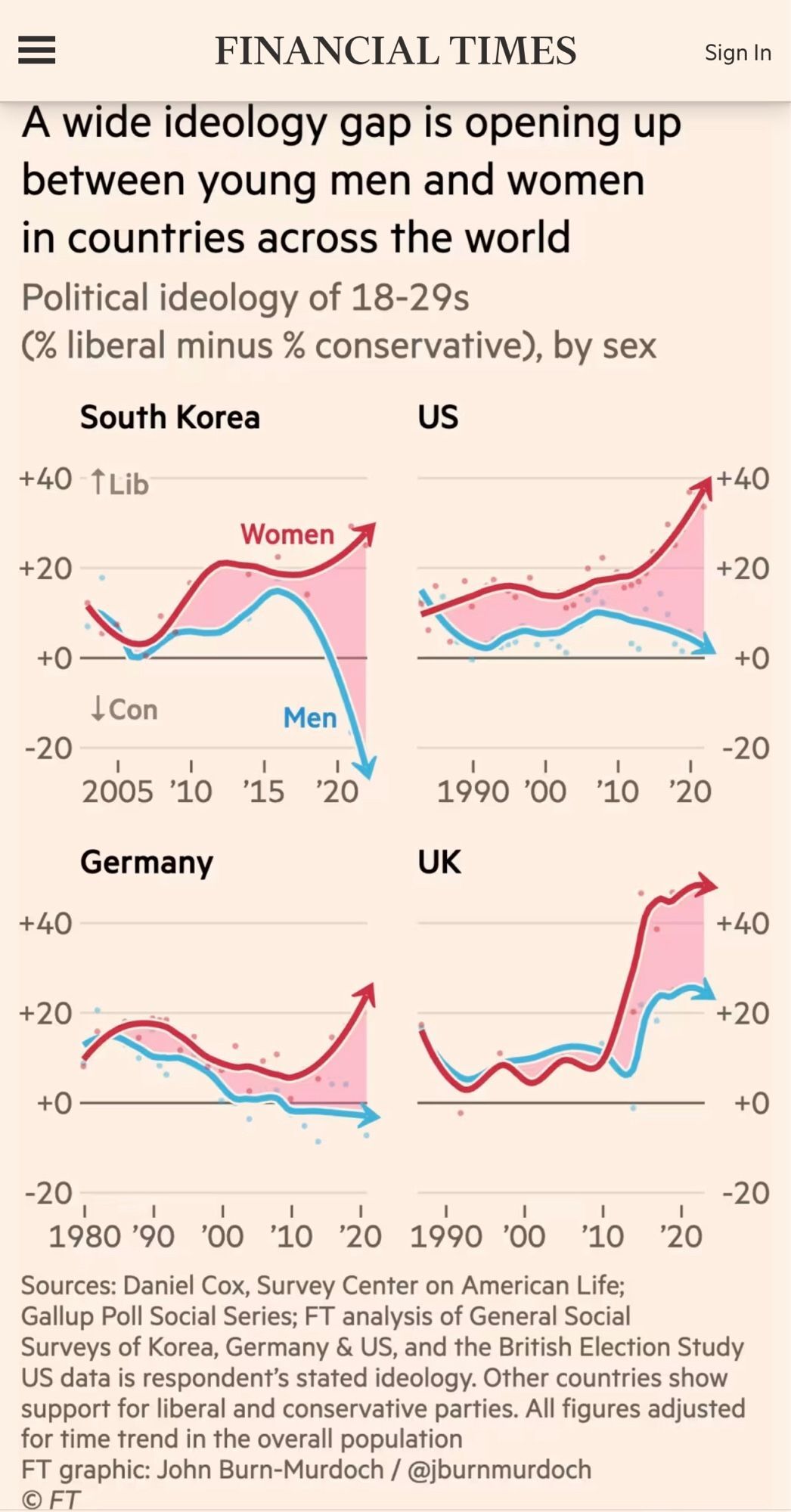
I really don't like that the graphs aren't across the same period of time.
Data Is Beautiful
A place to share and discuss data visualizations. #dataviz
(under new moderation as of 2024-01, please let me know if there are any changes you want to see!)
I didn't notice until you pointed it out. Because why wouldn't they be??
Because there's lies, damned lies, and statistics...
Presumably they are starting wherever the trend "started", although I'd like to see what it was doing before that to see if this is an unusual trend or not
Oh boy liberal vs conservative, what a wide variety of political opinion allowed for by the "financial times"
Yes, these graphs don't many any sense other than generating clicks.
not surprising. the american right is specifically catered to address male grievances.
not fix these grievances mind you, but exploit them
And how do they exploit them?
By keeping them at a hysterical fever pitch, 24/7.
Amplifying ignorance, weaponizing mental illness.
That is the right wing and republicans, with every profane breath.
I don't know about beautiful data. That's scary data :/
Do you know a community that fits?
No no, that's not what I meant. I wasn't trying to have a go at you. It fits here perfectly. I was just upset at the trend it was showing :\
If I am reading this correctly, men drifting towards conservative and women drifting towards liberal?
That would reflect the culture found in apps - I feel like men with andrew tate and things like truth social/rumble/kick and women drift more towards stuff like reddit/tiktok/instagram where you can usually see a lot more liberal idealogy.
The term you missed to use was, "echo chambers." Both both and all.
I've tried so many different social media platforms and every single one has been an echo chamber for their little slice of hell.
Lemmy just happens to be FOSS tech and liberal stuff. They're all echo chambers for sure.
I personally don't like how the top left one starts at 2005, unlike every other graph, but they all have the same x scale. (I nitpick things sometimes)
shcoking, women arent a fan en masse of being 'tradwifes' to tate blowhards
This data is poorly presented and unclear. It may well have some really useful insights, but it's definitely not beautiful.
I'm not sure how to even interpret it.
I came to the comments and still don't.
At that point it's barely data either.
And I don't like how sparse the data points are but they went with a wobbly interpolated curve anyway.
It looks like they only asked about five people in the UK.
