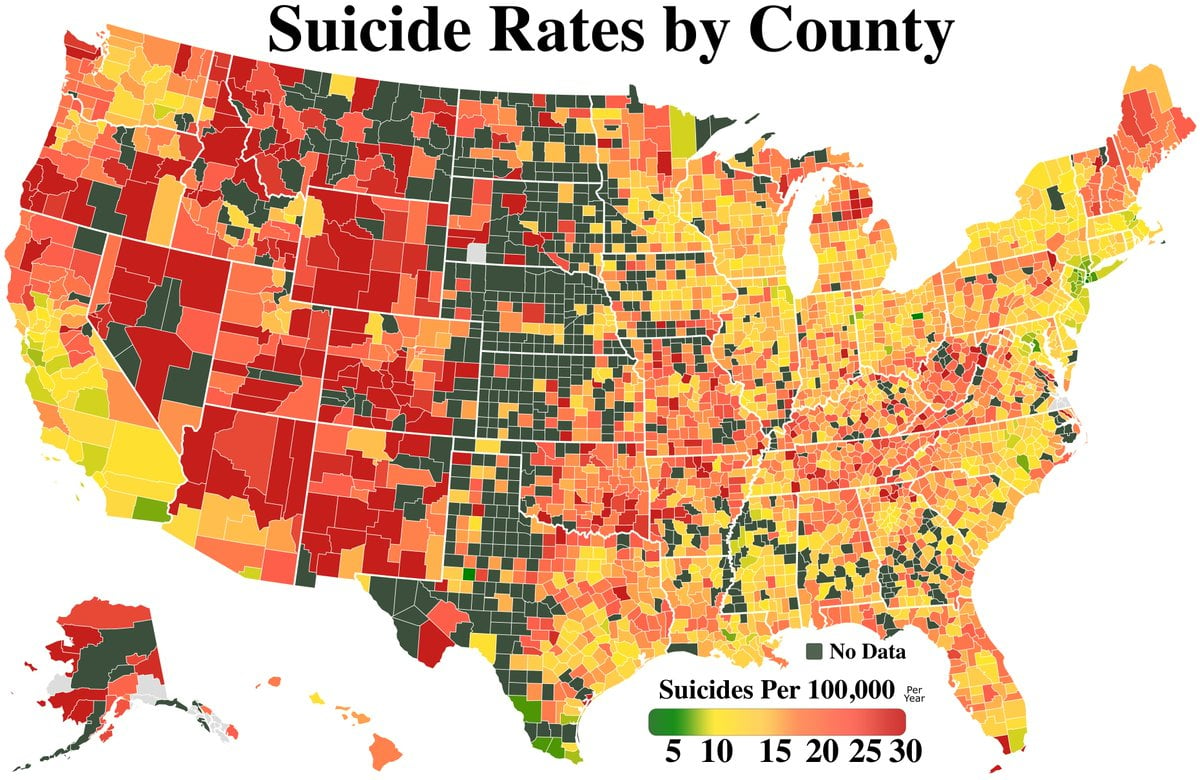
Why did they make the “no data” color nearly identical to the low value of the range? And yet there are still counties marked grey, which is what they should have picked for missing data.
Map Enthusiasts
For the map enthused!
Rules:
-
post relevant content: interesting, informative, and/or pretty maps
-
be nice
I am curious about the source for this. Very strange and unhelpful.
I'm colorblind and the low end and high end look exactly the same to me .
I wonder how many of those dark red are over native reservations...
Edit: Almost the same areas.
Yeah =(
The map tracks with high American Indian and White populations.

I grew up in one of the "no data" counties in the North East. My neighbor committed suicide 30 years ago or so. There, now there is data.
Redraw the map! Come on everybody, MOVE!
I went to highschool in Utah, every year we had at least one assembly about suicide prevention. We had more depending on if a suicide happened in one of the counties nearby. Not one for each since that would have taken a while.
There was a month or two where there were like six pretty rapid fire and one by a student at our school. We’d already had an assembly pretty recently, so they didn’t have another one. It was a very quiet week, but then everything went back to normal, as always.
Anyway if you’re wondering why it’s that bad in the Great Basin region of the US the answer is Mormonism, and lack of education/resources especially in rural areas.
The assemblies I mentioned weren’t “this is how you can deal with things” they were “no one in their right mind would do this, suicide and thinking about it is weak and stupid so stop” or they were “god doesn’t want you to die” neither were effective.
Then again I wouldn’t expect effective solutions from people who are the problem. Not sure any amount of words from men who use “gay” and “queer” as an insult would help queer kids feel like living in that hell was better than death.
Oh and if anyone is wondering, this was less than a decade ago, not in the very distant past. I think most of the staff in my highschool are still the same, and the majority of the residents in the town certainly haven’t moved, physically or “spiritually.” Honestly, with the trump rhetoric they’ve probably gotten worse.
you had assembly? Last year a girl committed and the school literally did jack squat. Nothing on announcements, no meeting, I don't think they even did a social media post. It was pretty maddening for me but nobody else seemed to care.
That's such an oddly specific north to south multi-state swath of No Data that I'd easily believe there was something going on with that particular longitude, even though that's a completely insane thing to imagine.
The tornadoes get you before the depression does
It took your content for me to realise that deep green was used as "no data". seems unorthodox
In a round about way, it probably is geographically related. So few people live there due to the land being pretty useless, but not so useless that the people there are spread out and when county lines were drawn they followed county sizes similar to Midwestern states. More western states drew larger counties but had similar population density averages so the number of people per county are high enough that there are enough suicides that someone may actually be tracking that on an annual basis
Arbitrarily cherry picking that squished pentagon county in northern Nebraska, there are only 769 people living in the entire county . If just one of them committed suicide that county would be off the charts lethal at 137. So when you take the US average suicide rate per year it could take up to ten years for someone in the county to commit suicide. So there probably isn't anyone keeping real statistics in that county
Realistically I think this is a bad map since counties with lower populations get disproportionately amplified suicide rates
Not very many people.
It's because noone lives there.
How come no one wants to live next to Noone? He's not that bad of a guy.
Jasper always seemed nice to me
He's a legend
Really curious how much higher than 30 per 100k is in Las Vegas. I saw a suicide once in The Excalibur. Poor guy shot himself in the lobby. When I came back 30 minutes later everything looked like nothing happened at all.
The money he lost probably more than paid for a quick cleanup.
That's because it wasn't their first rodeo with duicit and it won't be their last either.
Nothing will stop the flow of money
They usually include drug overdoses as suicide on these statistics, so it makes sense that Nevada and other rural areas are so red.
I’m having trouble with the colors. It tornado alley low rate or no data. TBH either of those would seem weird for the area.
The darker color in tornado alley is green for "no data", which is odd, but I assume it's similar to the darker orange and red around it.
This one’s not just a population density map in disguise, is it?
No, it's per capita.
if only the OP could read
Still, big cities seem to have a lower rate so I wonder if there's something about the methodology that depends on population density
big cities are generally better to live in (at least in the USA) since there are more amenities there and people can actually get to them reliably without a car.
Definitely more resources in a number of ways (healthcare, social programs, etc.), Possibly more community depending upon how rural an area you're comparing to (and possibly how long that and surrounding families have been there).
This feels like something that would be damn near impossible to get actually accurate.
Hilarious to see my county is an orange dot in a large swath of green. We’ve got just high enough a population that you REALLY notice there’s nothing to do.
How are things in Colby, Kansas these days?
you’re close enough that you might as well be right hahaha
Seems to be a multifactoral type of correlation. Poverty, race and population density all playing parts.
They hate the midwest
Who cares? They are mostly men... /s
Okay as an European, I finally understand why they say "west is best"
