It's not even more aesthetic. Just more unified in branding.
It's not even more aesthetic. Just more unified in branding.
And the interface of their apps are still incoherent af. I don't know how, but they manage to make things worse every time
It's ok, they'll just retire the service eventually.
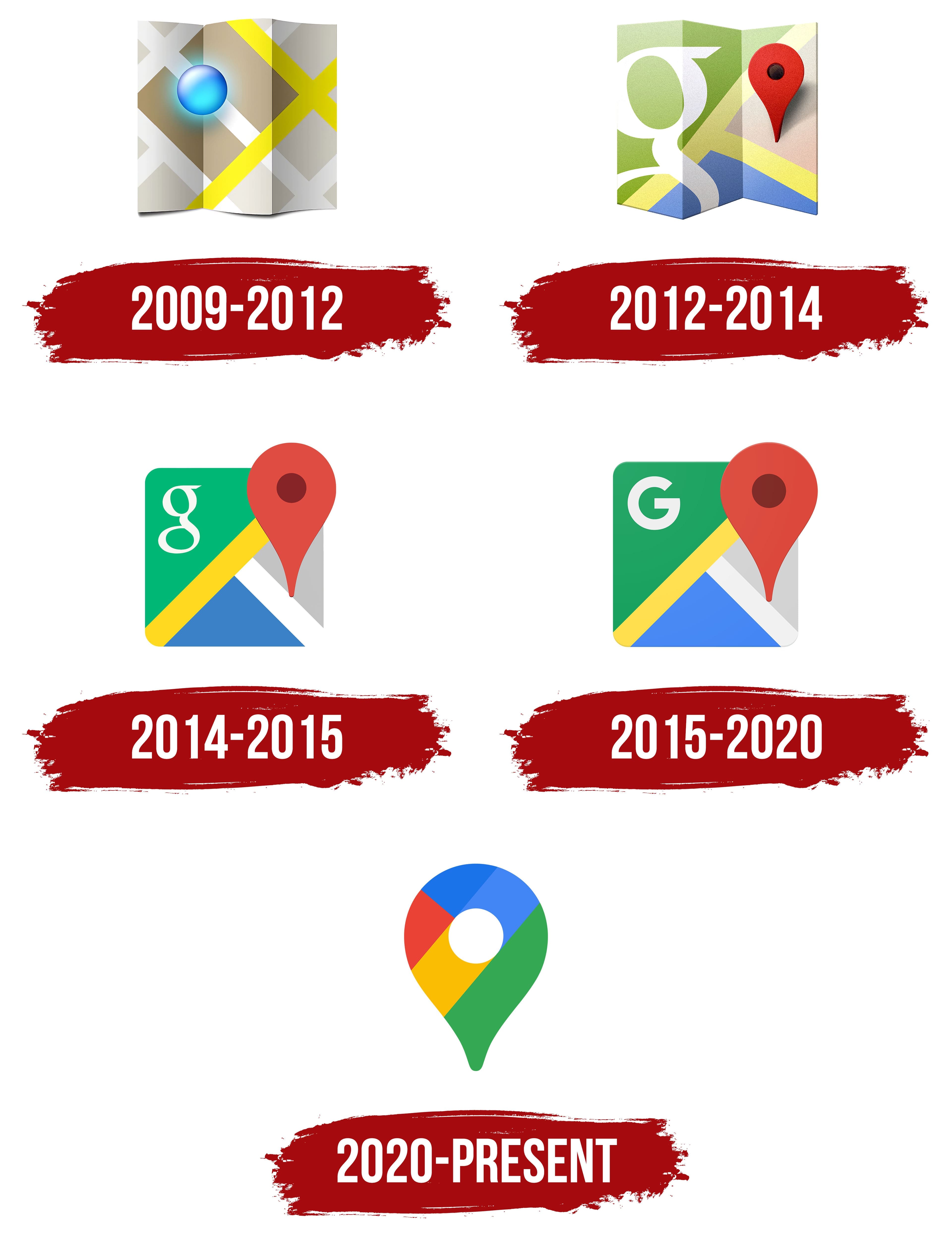
Yeah, the old logos were all over the place. At first glance it’s not obvious they’re all Google apps.
And? All of those being part of the same walled garden is a bug in the legal system not a feature.
Better be explicit about the walled garden rather than being diffuse about it
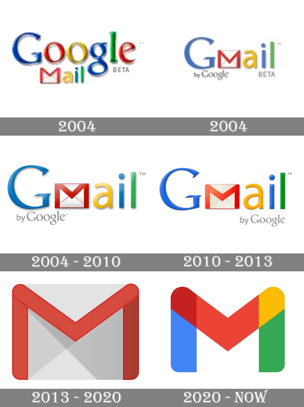
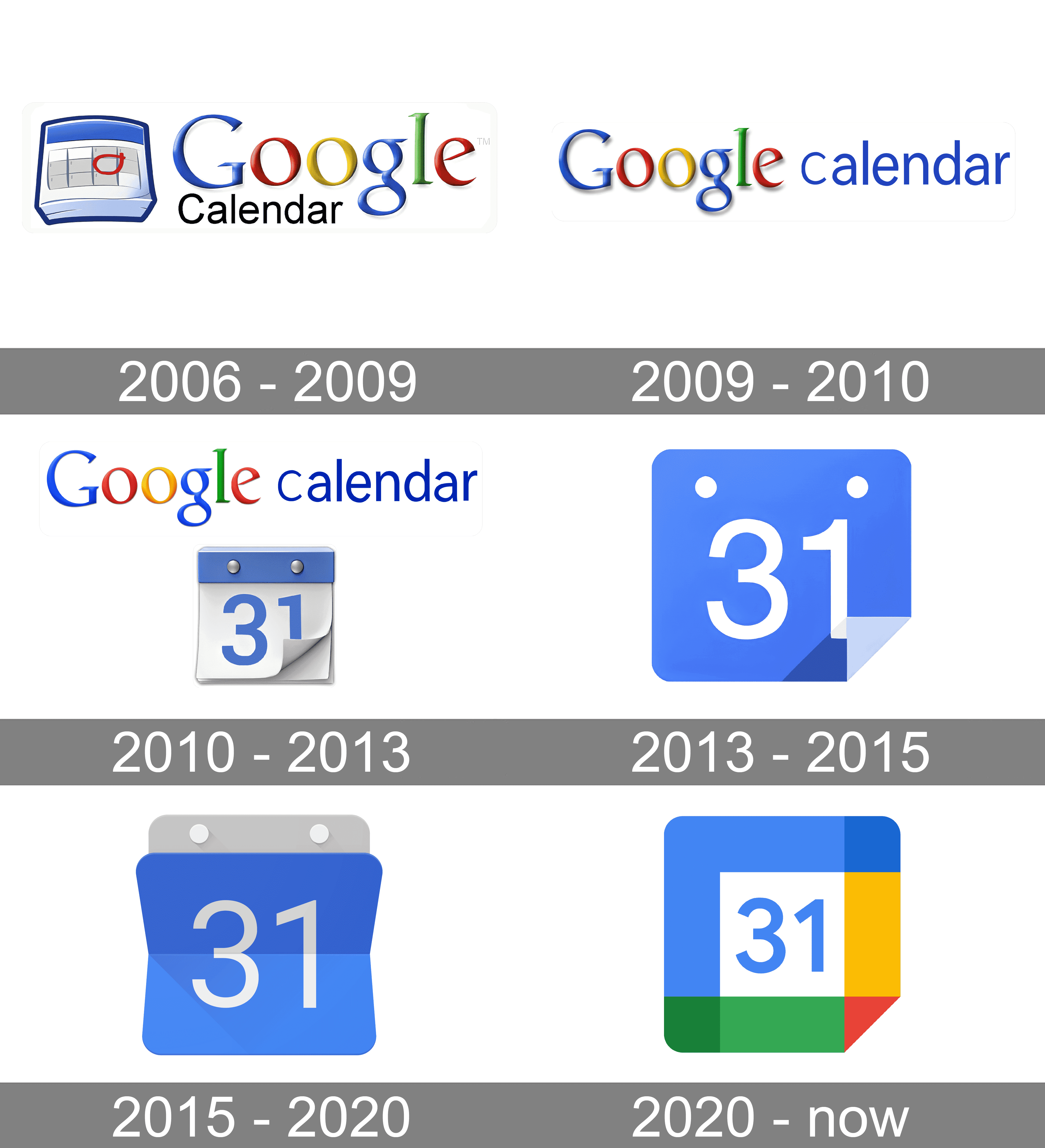
To me, that's just the case for camera and calendar. Maps is IMHO perfect (except the unnecessary G) and the red-and-white envelope is quite well-known.
i think they did need to unify the design and branding but i also agree they went too far with it. if they had only chosen 1-2 colors for each app icon that would have helped a lot.
gmail - red
drive - yellow
maps - green
meet - blue
calendar - lighter blue
problem solved
Problem solved! If we ignore the world's ~300 million colorblind people.
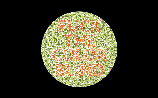
is that the one that says "fuck the color blind" because if so hey!! that's not nice

Hey, color blind people deserve sex, too!
No way dude, it's the other one that says, "we love the color blind." Really.
i think they forgot to mention: they're not all the same shape.
True. Colorblind people come in all shapes and sizes.
I wouldn't even call this "aesthetics". Rather "conceptual homogeneity" or something like that. It's what happens when you strive for a uniform look over a useful or visually pleasing one.
The homogenization of these icons has been a long source of consternation for me.
They're barely functional as icons; you can scroll right by them and miss them; which makes finding the apps in a list of apps a bit annoying sometimes. Removing each icon's unique color scheme and replacing it with the 'company 4 colors' was the stupidest fucking idea ever.
Even more infuriating is how they keep renaming the applications to unexpected things every so often; so they move around; and it's dreadfully annoying to remember if they prefixed the name of the app with a G or something else completely different, which renders strict alphabetical sorting a bit moot.
I keep all my Google icons quarantined in one folder. Case in point:

I use nova launcher. It allows you to replace any app icon by any png file. So you can download the old icons from the internet and use them on your phone. It's a lot of work and I agree Google shouldn't have done this, but at least you can revert it if you want to put in the effort.
Plus the art they started using in gdrive. The art on its own is cool but within the Google ecosystem just feels like… what is it even… why… ugh I hate it.

Corporate Memphis. It's an art style a lot of people hate, and I can understand why.
soulless corps trying to seem friendly, that's why
I've recognized this style as a generic corpo art, but never had a name to put to it. Thanks for that.
Sanitized, pandering, and insincere, Wikipedia describes it perfectly.
Yeah like in 50 years I can absolutely imagine people loving it as a style of a time. I recognize I like pop art far more than I would if I was in its target demographic. But also I don’t hate it, it’s just so everywhere and so soulless. It’s the style of “money please” in a time of great socioeconomic inequality. It’s art deco but demanding friendship and comfort rather than respect and awe. But more than anything it’s art for business people, and I just don’t care for business people.
Triumph of visual design over interactive design. These days, most “designers” only care about graphics visually. The much deeper science of how people use and understand things is beyond them. Worse, they think the problem is that everybody else does not “get” visual design.
Style over substance.
[It could be sooo easy to solve, but noooo...

Without the distracting colors, now I can see this says MAPOD
People simultaneously justifying their jobs but not willing to make significant, meaningful changes
Since Gmail doesn't have the obvoious envelope anymore I often open it when I want to open Maps. My brain ist like "M for Maps".
What would happen if people deserted Google products in droves?
Mail:
Cloud:
Maps:
Meet:
Calendar:
Here's an exhaustive list of Mostly excellent “free” software that I use.
Please also consider supporting the myriad of developers who offer their superior products for free, open source, without ads.
“What if I paid for all my free software?
I've always felt guilty by taking for granted the rare breed of virtuous humans that provide free excellent software without relying on advertising. Let's change that and pay, how much would I “lose” anyway?” —https://www.cynicusrex.com/file/takemymoney.html
Anyone else this there's actually nothing at all wrong with the "New" row of icons? Except for the triangle one, which is terrible in its "Original" version as well, as it indicates absolutely nothing about its app (I believe it's Google Drive, right?). All the rest are clearly distinguishable, and have relevance to what the app does.
I actually think these are fine. If I can quickly recognise each on my homescreen (I don't use labels) then it's fine, and I've never had a problem with any of these.
I like it because each company each has its own set of apps, and they have somewhat unified app icons.
Proton is the same, which similar icons as google but with their own unified branding.
I like it, personally.
Not Google related, but whoever decide that the best color scheme for an Office suite should be light grey text on a white background deserves to be flogged.
I filed a very irritated Radar / Feedback (Apple's terms for bug reports) with Apple when the icons for apps all turned to rounded squares. I compared them to Google's icons and challenged them on making everything harder to distinguish.
I hate contemporary GUI design. Not all of it, but probably half.
What I see:
💩 💩 💩 💩 💩
What's the font used in the heading? Is it some flavour of Helvetica?
What I keep seeing: $ $ $ $ $
Also I'm sure the designs are absolutely as humanly possible adapted to perfectly achieve their goal. Too much money, people, and time involved for this not to be the case.
And the goal was never ease of use, that doesn't bring in any more money when you have a monopoly. Engagement & forced ads do.
(By 'forced ads' in this case I do not mean directly advertising a specific product, but forcing you to pause your thoughts to specifically and consciously think about Google making the name/brand ever more part of your actual life and as such its shitty behaviour gets normalised, even trusted - thats just how our brains work even when we think otherwise ... and I hope we all think of Google as a curse on humanity.)
There's always a yoyo effect with design. I fully expect Google to swing back to gothic palette and highly detailed icon within the next decade.
Hey show some respect! A whole team of people each racked up tens of thousands of dollars of student loan debt and spent months tweaking their designs, just for upper management to wreck it all on a whim in order to get you those new icons.
Remember way back when, when you could set icons to be whatever you want?
I was yelling about how windows 11 swapped out text listingzs for copy, paste, etc from its contextual menus for stupid icons just the other day. Modern UIs are becoming so “streamlined” to the point of uselessness.
I use an icon pack on Android to revert them to their previous icon, the new ones are indeed terrible..