this post was submitted on 30 Aug 2024
1524 points (96.8% liked)
Memes
46041 readers
1809 users here now
Rules:
- Be civil and nice.
- Try not to excessively repost, as a rule of thumb, wait at least 2 months to do it if you have to.
founded 5 years ago
MODERATORS
you are viewing a single comment's thread
view the rest of the comments
view the rest of the comments

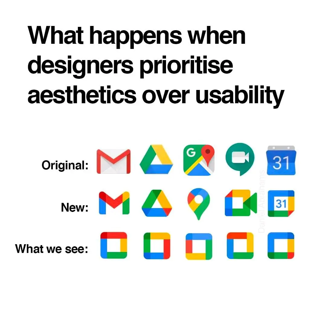
Anyone else this there's actually nothing at all wrong with the "New" row of icons? Except for the triangle one, which is terrible in its "Original" version as well, as it indicates absolutely nothing about its app (I believe it's Google Drive, right?). All the rest are clearly distinguishable, and have relevance to what the app does.
The Google drive logo is even worse when you compare it to the play store logo which is also a triangle. I mix them up all the time
I’m mad that the Gmail icon is no longer an envelope, but other than that they’re fine.