


Voting has ended! Congrats to @fer0n@lemm.ee with option B. Thanks everyone for participating! :)
First off, thanks to everyone that participated in our icon contest last week!
I'm excited to show the final three options for you to vote on below!
Overview
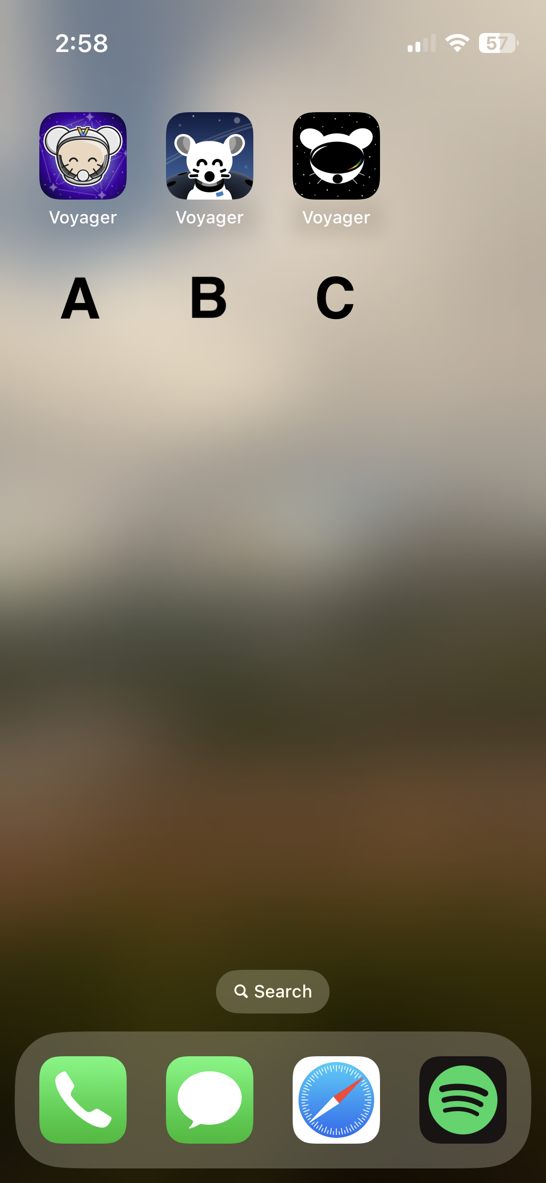
Option A
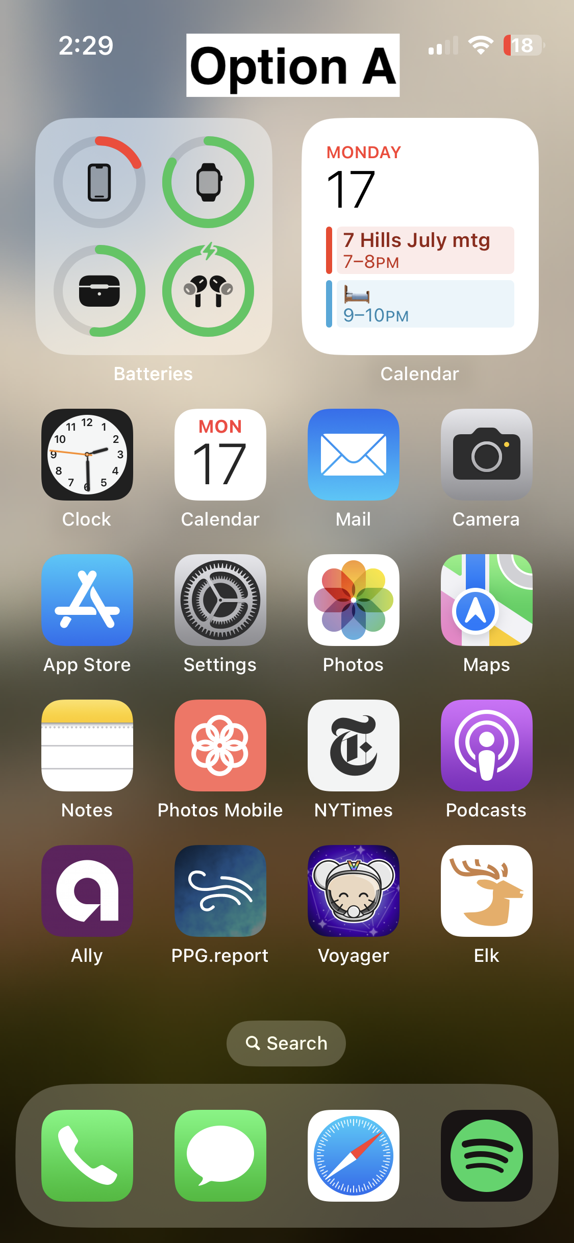
Option B
- 📸 On homescreen
- 📸 Icon
- Credit: @fer0n@lemm.ee
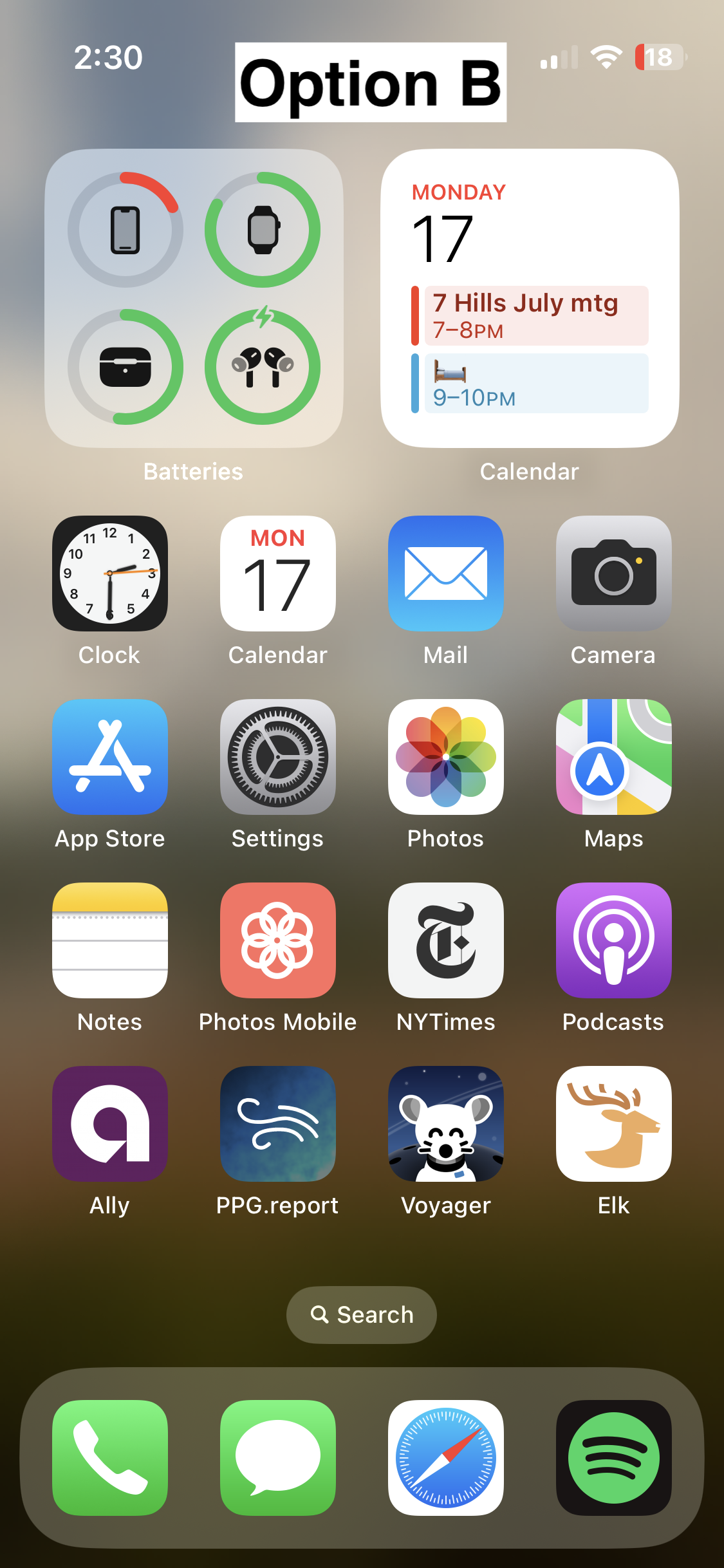
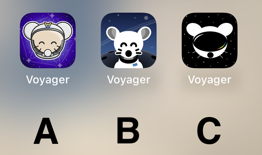
Option C
🗳️ Vote!
⚠️ BEFORE VOTING I encourage you to tap through the links above to see what it's like on your homescreen!
Results of the poll will not be available until it has ended, so no need to make a rushed decision.
~~VOTE HERE: https://strawpoll.com/BDyNEbKeqZR~~
~~Polling ends in ~24 hours! If there is a tie, I will cast the final vote.~~