


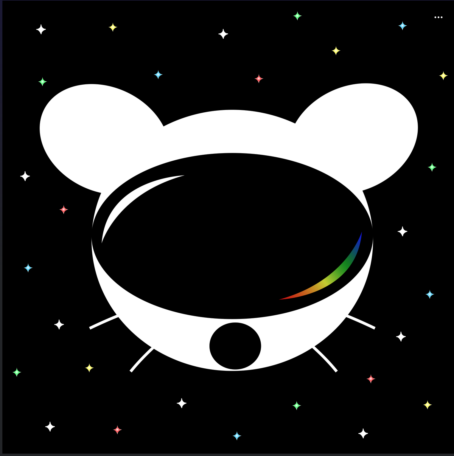
Voting has ended! Congrats to @fer0n@lemm.ee with option B. Thanks everyone for participating! :)
First off, thanks to everyone that participated in our icon contest last week!
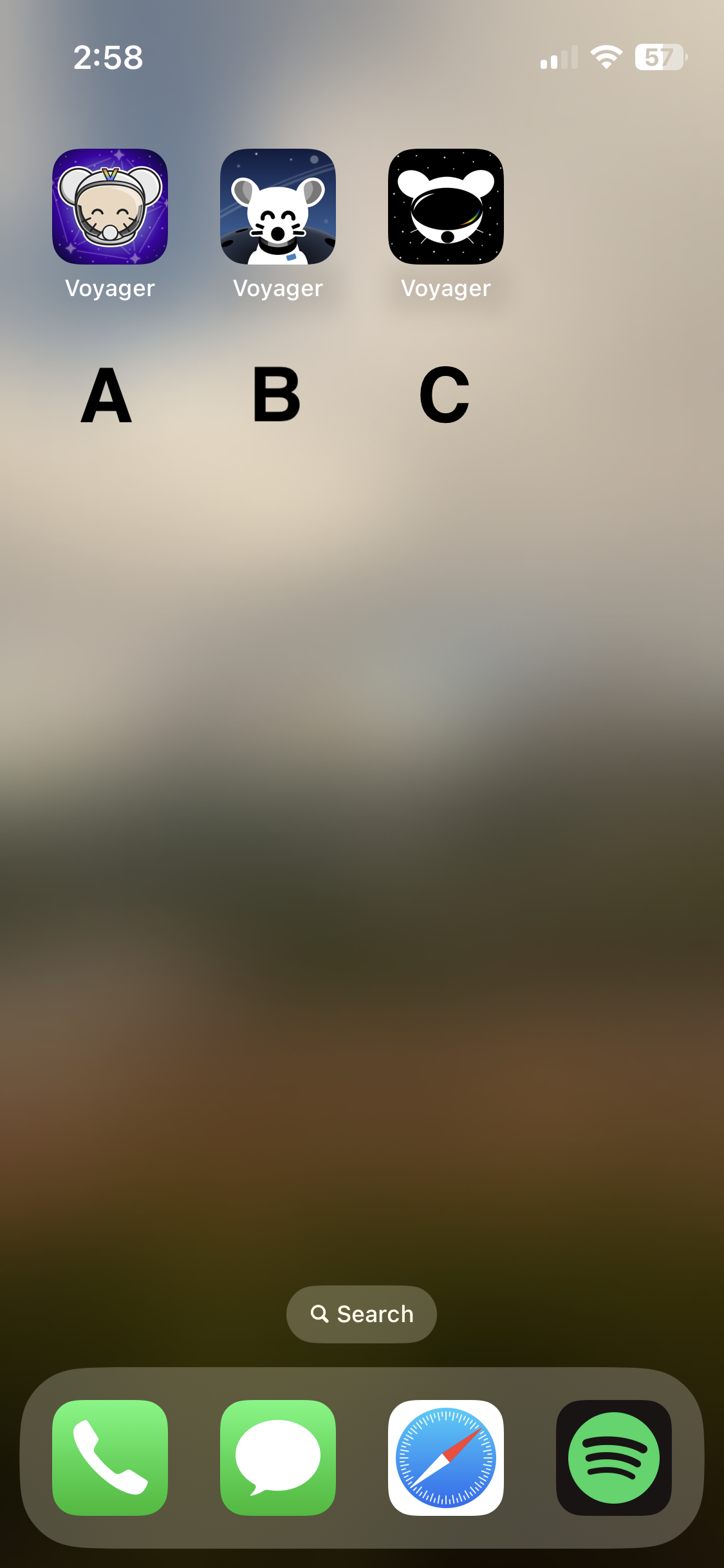
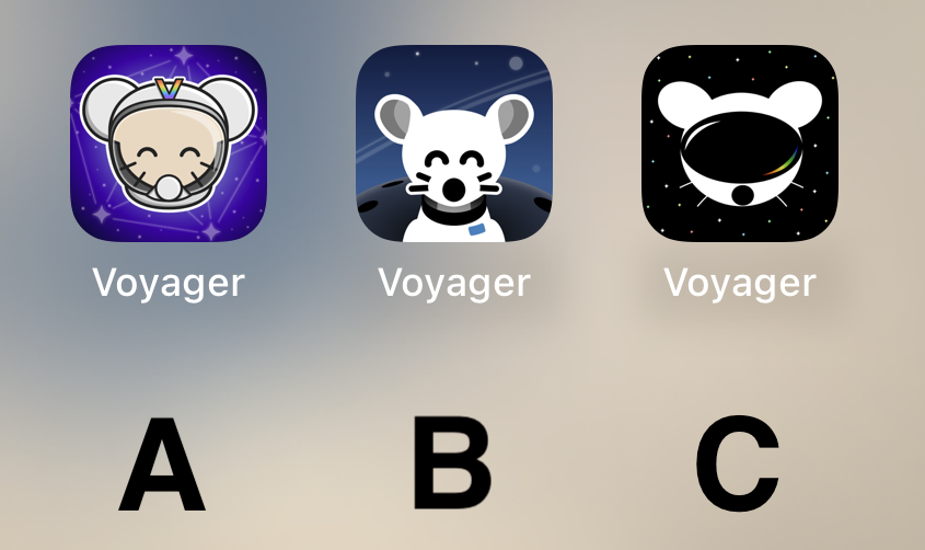
I'm excited to show the final three options for you to vote on below!
Overview
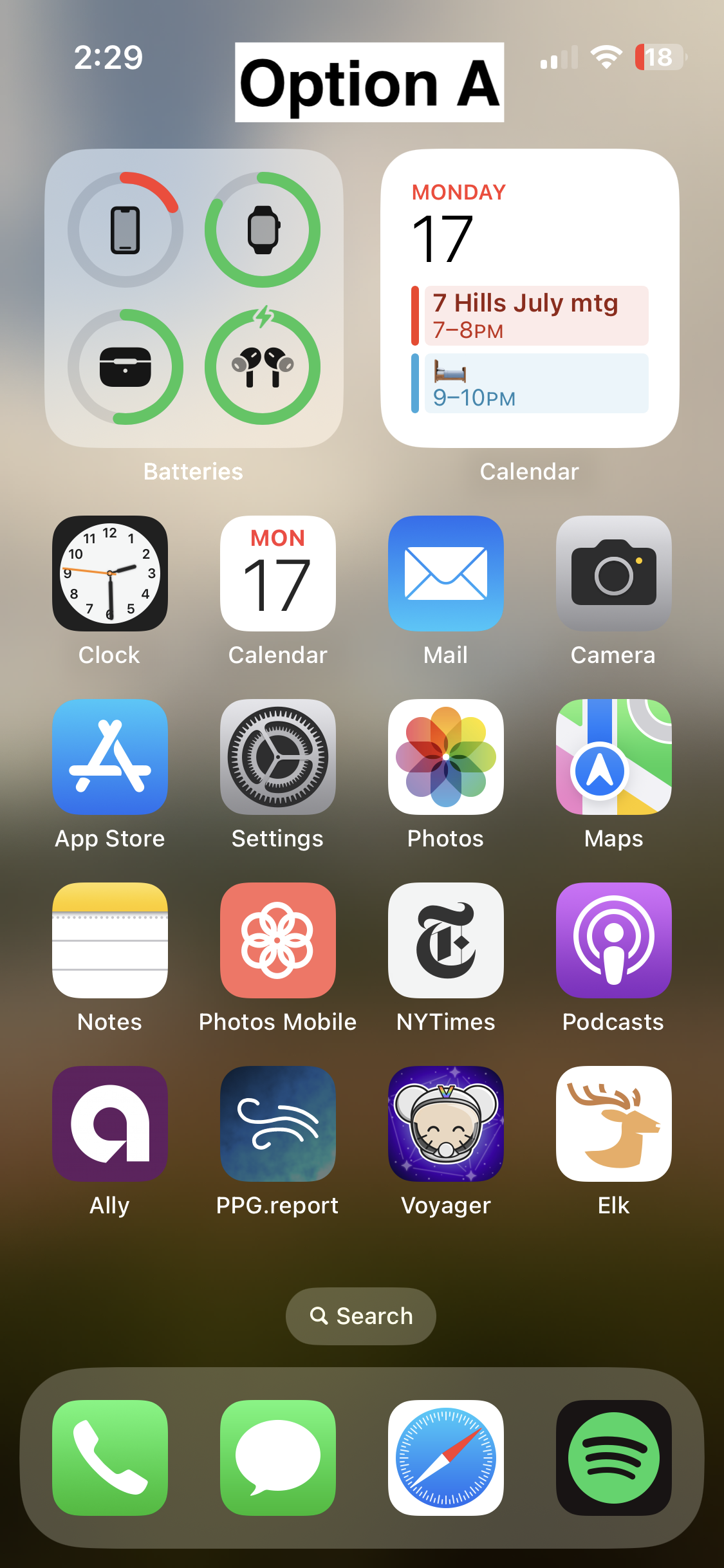
Option A
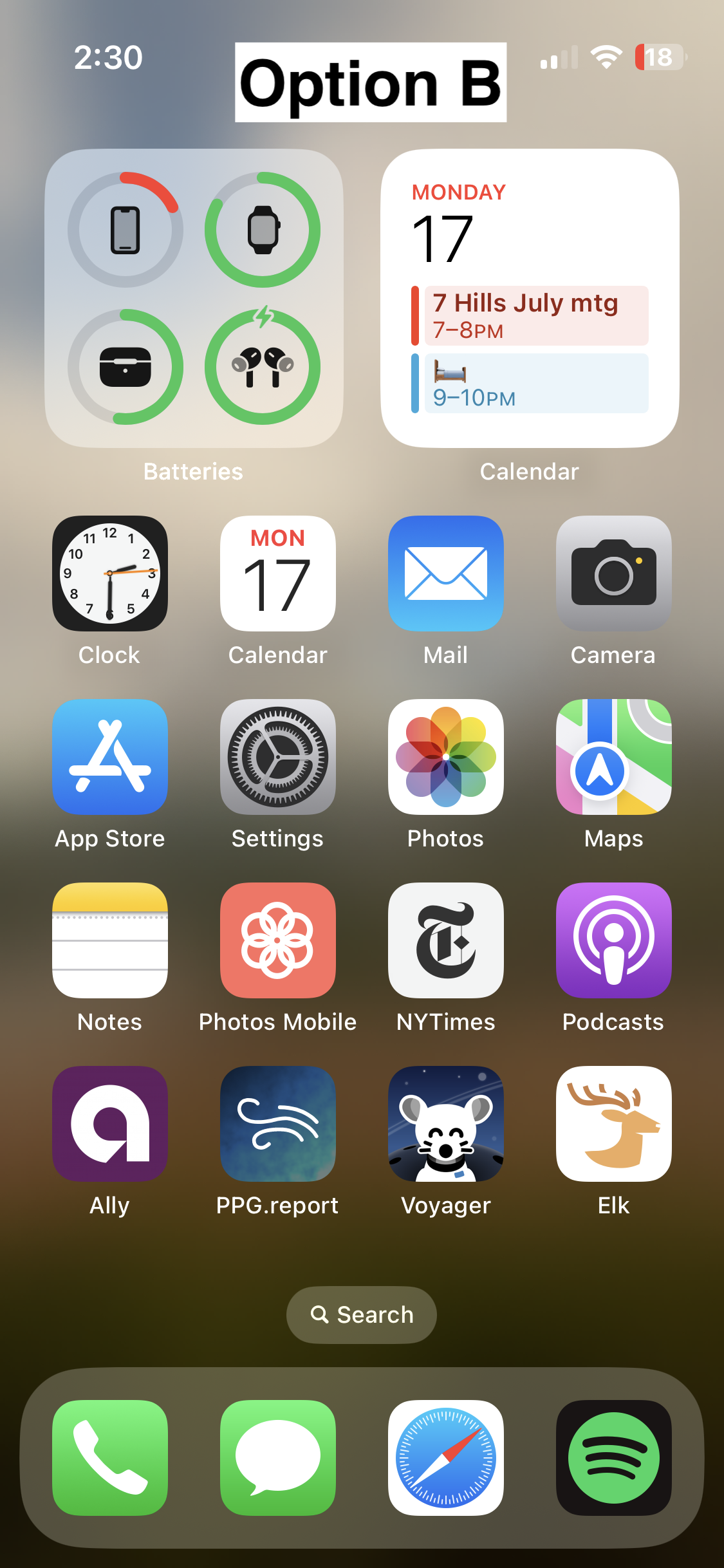
Option B
- 📸 On homescreen
- 📸 Icon
- Credit: @fer0n@lemm.ee
Option C
🗳️ Vote!
⚠️ BEFORE VOTING I encourage you to tap through the links above to see what it's like on your homescreen!
Results of the poll will not be available until it has ended, so no need to make a rushed decision.
~~VOTE HERE: https://strawpoll.com/BDyNEbKeqZR~~
~~Polling ends in ~24 hours! If there is a tie, I will cast the final vote.~~
That's the word I was trying to avoid, "amateurish" (not to sound harsh). There are a lot of cool ideas out there, but definitely not the work of a professional designer (disc.: I work with graphic designers and app developers, I'm a web developer myself). Maybe the Lemmy community needs to grow a little, so we can get more options.
I also think the contest guidelines are partly to blame. The whole, "avoid the corporate vector look, look at these super detailed illustrations" thing is horrendous advice. It basically translates to, "avoid doing what the most talented app icon designers in the world do."
Yes, the icon should be fun and stand out. Yes, the Facebook "f" is boring as fuck. But some of the greatest app icons are extremely simple, and there are reasons for that. Fine details don't display well in the actual contexts that icons are used in; they make the design seem muddy and confused. People resonate with clear design that knows its purpose.
IMO you just hit the nail on its head: it's an icon not a miniature fanart, it can be simple, yet creative, original and most important, easily recognizable, less is more. These options look like Apollo knockoffs.