Lemmy Shitpost
Welcome to Lemmy Shitpost. Here you can shitpost to your hearts content.
Anything and everything goes. Memes, Jokes, Vents and Banter. Though we still have to comply with lemmy.world instance rules. So behave!
Rules:
1. Be Respectful
Refrain from using harmful language pertaining to a protected characteristic: e.g. race, gender, sexuality, disability or religion.
Refrain from being argumentative when responding or commenting to posts/replies. Personal attacks are not welcome here.
...
2. No Illegal Content
Content that violates the law. Any post/comment found to be in breach of common law will be removed and given to the authorities if required.
That means:
-No promoting violence/threats against any individuals
-No CSA content or Revenge Porn
-No sharing private/personal information (Doxxing)
...
3. No Spam
Posting the same post, no matter the intent is against the rules.
-If you have posted content, please refrain from re-posting said content within this community.
-Do not spam posts with intent to harass, annoy, bully, advertise, scam or harm this community.
-No posting Scams/Advertisements/Phishing Links/IP Grabbers
-No Bots, Bots will be banned from the community.
...
4. No Porn/Explicit
Content
-Do not post explicit content. Lemmy.World is not the instance for NSFW content.
-Do not post Gore or Shock Content.
...
5. No Enciting Harassment,
Brigading, Doxxing or Witch Hunts
-Do not Brigade other Communities
-No calls to action against other communities/users within Lemmy or outside of Lemmy.
-No Witch Hunts against users/communities.
-No content that harasses members within or outside of the community.
...
6. NSFW should be behind NSFW tags.
-Content that is NSFW should be behind NSFW tags.
-Content that might be distressing should be kept behind NSFW tags.
...
If you see content that is a breach of the rules, please flag and report the comment and a moderator will take action where they can.
Also check out:
Partnered Communities:
1.Memes
10.LinuxMemes (Linux themed memes)
Reach out to
All communities included on the sidebar are to be made in compliance with the instance rules. Striker
view the rest of the comments

Some good discussion about this trend on HN:
https://news.ycombinator.com/item?id=32040506
Better:
Worse:
The rest just go from meh to slightly different meh 🤷
I liked the old aibnb one.
Microsoft went from "boring with a bit of attitude" to just plain boring
Microsoft went from 90s corporate to 10s corporate
DF gets points dedacted for missing the ü dots on both, looks absolutely stupid to a german speaker
Spot on.
Those old fashion logos are actually sick. Concerning that an industry that sells style would make these their logos.
Except eBay, that was always trash.
Their business is literally selling people's trash so it's amusingly appropriate lmao
I wonder how much correlation there is between logo blandification and being owned by giant corporations.
All these minimalist labels save .0005¢ every time they’re printed, probably even more on promo booths, banners, and the like.
Aaaah then indeed that makes sense (and this is not ironic).
Oh, I wasn’t being entirely serious, though there is an element of truth to it. It probably is a measurable cost savings over the scale of the business.
I still think these unremarkable corporate logos are boring AF. Just makes them visually soulless along with just being corporate soulless.
I completly agree these logos are boring. The brand lost so much character and flare.
However I totally see "cost less" as one of the reason why these changes were pushed (especially for clothing brands).
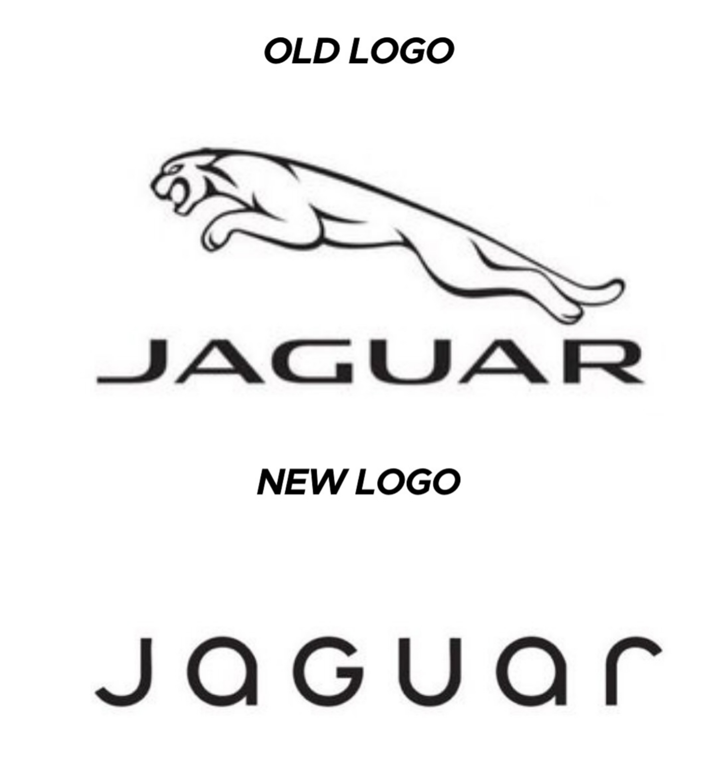
I think it has more to do with being readable on small screens, like mobile phones. It still doesn't make sense to me to completely remove your logo and replace it with a sans serif name of your company like jaguar just did.
All the companies are gonna merge over the next decade or so, leaving a handful of megacorporations to lord over our cyberpunk dystopia. It's just easier if all their logos already look the same.
Spotify and EBay made the right choices here, the new logos are way better.
It is subjective, I like the old eBay logo more, but dislike the old Airbnb one.
Well, they certainly fin in better with all the others.
Slightly misleading without showing the color, only slightly though
What's the reasoning behind? Or just a trend?
I think it's just a long-running trend across many different companies towards simplification. Here's the Apple logo for example:
Gotta say, the original Newton logo would've looked sick if engraved on the back of a product. Too bad nobody has ever done it.
I don't see it. In this case, I see basically the same since 1977, or being strict, 1998. Unless they go for just " A P P L E " next. It's, in my view, a big step to abandon a graphic for letters.