I don't disagree with the message (we should all eat less meat) but I have a couple of nitpicks with the data / presentation.
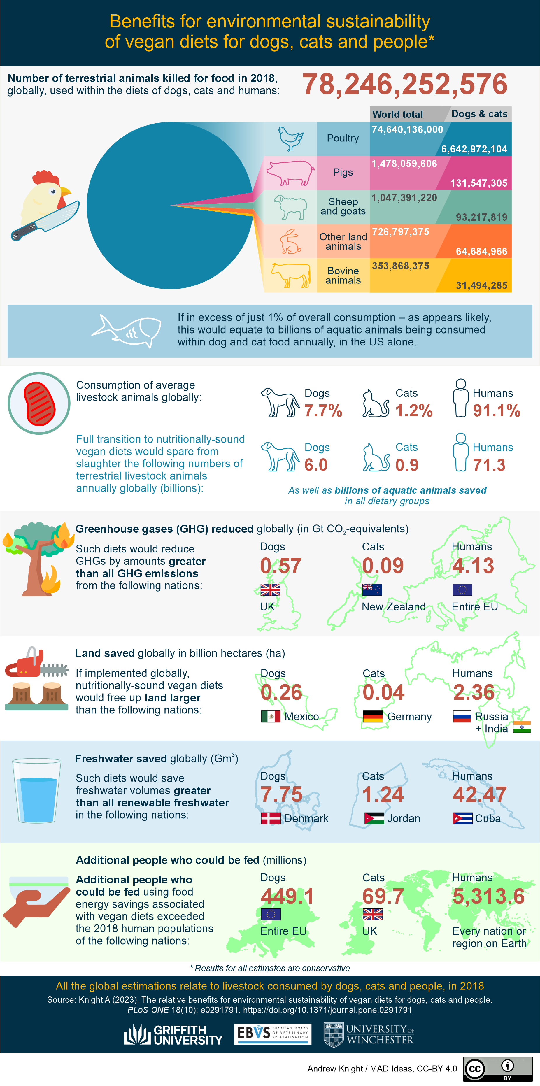
In a couple places there's mention of billions of aquatic animals being on the block. It's too broad of a descriptor - a billion whales looks different from a billion krill. A whale probably eats a billion krill on its own (note: I have no idea, I just know whales are big and krill are tiny)
Pie charts should almost always include percentage labels because people are in general bad at making visual comparisons within a circle. That may not be overly necessary here where the intended message seems to be that chicken vastly outnumber all combined livestock, but it's always something to keep in mind.
However, the most egregious issue: the final point says that 5,313 million (5.3B) additional humans could be fed, which is equated to every region/country on earth. So the global population. Which is fairly easily verifiable to be about 8 billion people - which means the quoted figure is only approximately 65% of the global population. This calls into question every other data point in the infographic.
While typing this up, I did give the last point a more charitable read and thought maybe the message was that if everyone switched to vegan diets, we could feed that many more people which means nobody in any nation would have to go hungry. But even if that's the interpretation, it doesn't seem to be in line with the other points being made, and it makes me question if I'm interpreting the rest of the graph incorrectly. So even with a charitable view it's still a confusing point.
Anyway, again, I like the overall message because it's clear to me that we should strive to eat less meat and this graphic outlines the myriad positive impacts that might have. But the goal is to educate people, and if there's a whiff of misinformation surrounding something that people feel most passionately about, it calls into question what other things people are misinformed about
