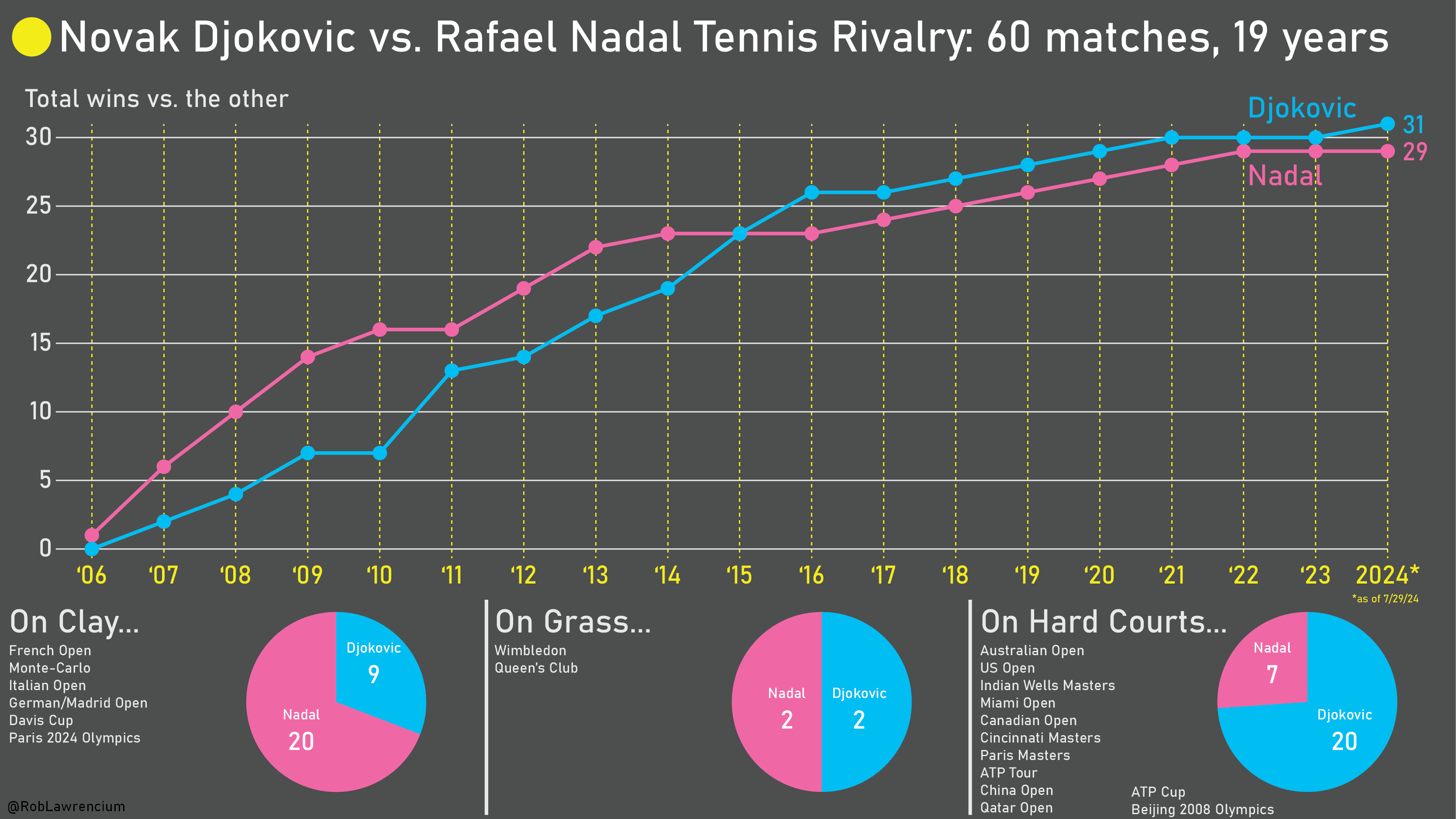
1
0
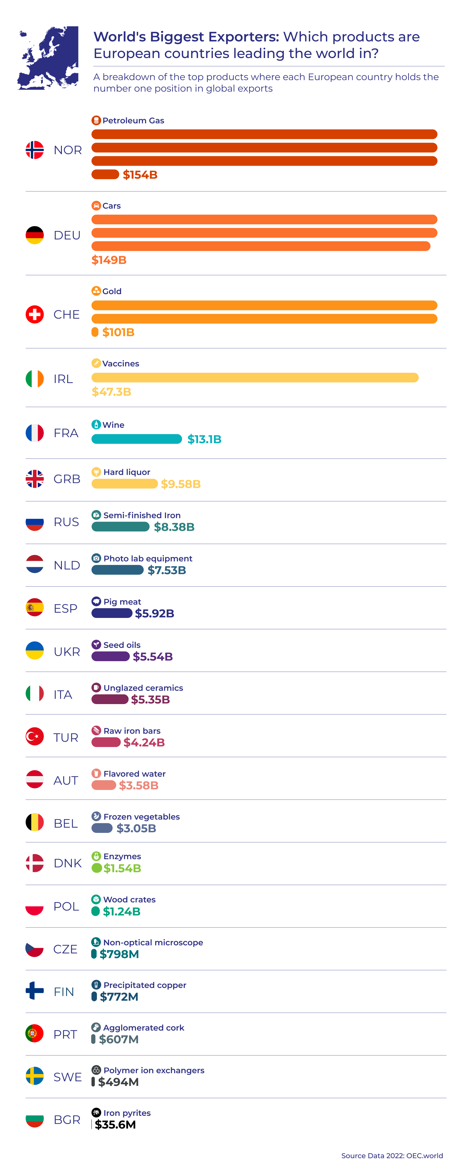
Which European Countries Dominate Global Exports in Specific Products? A Visual Breakdown of World Export Leaders
(files.catbox.moe)
Be respectful
For some years now, I have seen this graph go around on social media. I think it's a powerful image, because it shows us so clearly that it is happening in our lifetime and under our watch.
But when I use it in my work, I always add the disclaimer the the graph does not show when it was made.
Because that is a problem: the graph might show us that if you are currently 30 years old, 50% of all the CO2 that has been emitted since 1751 has been emitted in your lifetime. But that percentage changes over time.
By now, for people who are currently 30, the percentage will be higher, simply because the annual emissions have gone up since the graph was made.
So I made a new version of the graph, the interactive version of which you can find here: http://mishathings.org:8050/
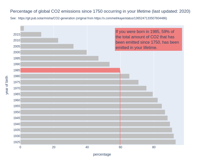
I wrote a post about this: https://mishathings.org/2024-08-12-how-much-co2-has-been-emitted-in-my-lifetime.html

cross-posted from: https://sh.itjust.works/post/23703271
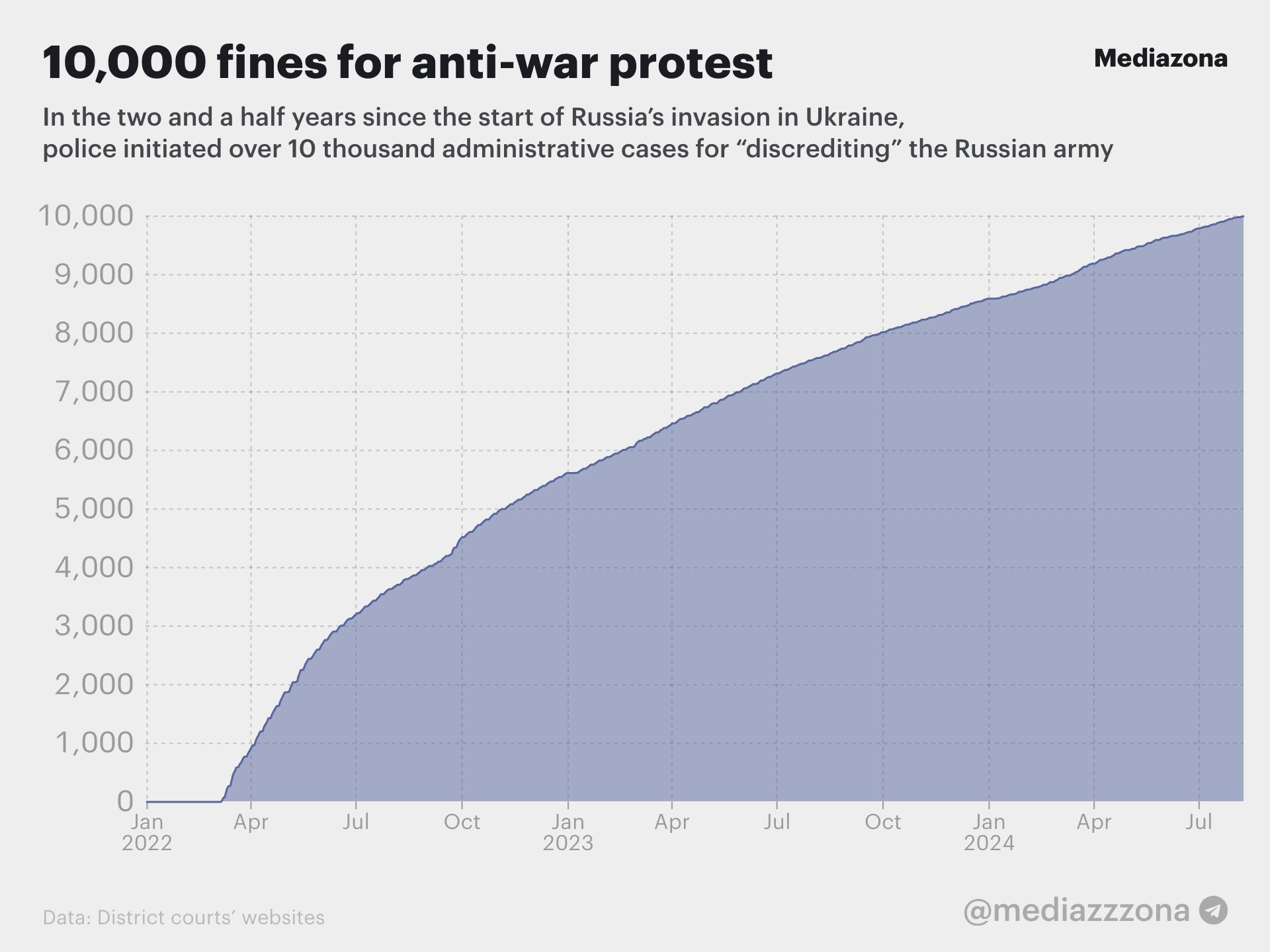
Source: https://twitter.com/mediazona_en/status/1823670620065808557
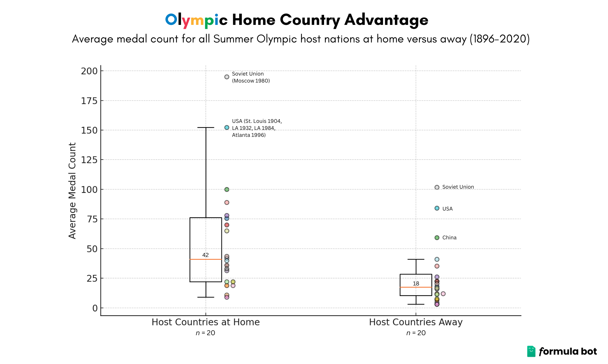
Los Angeles was able to have a surplus as most of the infrastructure was already built before the Games.

Small promo for !football@lemmy.world
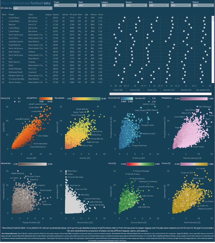
https://public.tableau.com/app/profile/bb.throwaway/viz/Normalizedfootballdata/Instrumentpanel1
Normalized Football Data: "Normalized Football Data" is my platform for delivering advanced player rankings through a detailed analysis of performance metrics from the top seven European leagues over the past seven seasons (6 for Eredivisie and Primeira Liga/Portugal). My aim is to provide a fair and comprehensive comparison of players, regardless of league, team, or season.
How It (basically) Works:
Data Collection: I gather data from fbref.com, focusing on players who have played at least 33% of available minutes each season. This ensures the analysis reflects consistent and impactful contributions. Calculations were made in Excel and visual animations were made in Tableau Public. Normalization Process: Minutes Played: Statistics are adjusted on a per-minute basis for a more accurate comparison. My experience is that the accuracy of the scoring system increases when metrics are normalized around players with more minutes played. You can currently choose between three different minute-requirements (1/3, 1/2 or 2/3). League Elo Rating: I use a custom Elo rating to factor in the strength of each league. Essentially it means that if a player in the PL scores 1.0 goals per 90, a player from Eredivisie has to score 1.3 goals per 90 to achieve the same score. Success Rate Adjustment: Metrics like dribbles and tackles are adjusted for their success rates to better represent player effectiveness. On-Field Expected Goals Against (xGA): For defensive metrics, I normalize based on goals conceded and expected goals against (xGA) while the player is on the field, giving a clearer picture of defensive impact. This means that a player with 10 interceptions and 5 onga+onxga scores higher than a player with 40 inceptions and 30 onga+onxga. Metric Weighting: I assign different weights to each performance metric based on its importance: Non-Penalty Goals: Heavily weighted, up to 30 points.
Expected Goals (xG): Also highly valued, up to 20 points.
Assists, Key Passes, Progressive Carries, Defensive Actions etc.: These metrics are weighted at either 10 or 15 maximum points. Some minor ”discipline” metrics such as fouls commited (where low amounts of fouls give high score) are only ranked up to 5.0).
These points are arbitrarily chosen by me due to how I think they should be valued and from my experience with balancing the scoring system. I’m open to suggestions of you think any metric is wrongly valued.
Feature Scaling: I use the statistical method of feature scaling to standardize various metrics, allowing for a unified scoring system. Application Features: Filtering: You can dive deep into the data by filtering based on seasons, age, team, minutes played, nationality, league, role, and player names. This flexibility helps you focus on the specifics you’re interested in. Comparisons: Compare multiple players side-by-side and see how they measure up against each other. The platform makes it easy to visualize their stats and understand their relative strengths.
Current Scope and Future Plans:
Right now, the data includes only league play, but I want to expand this to cover cup competitions, more leagues, and detailed goalkeeper statistics in the future.
With "Normalized Football Data," I hope to help you uncover not just who the standout players are, but also what makes them excel.
Tools:
Sources (viewed online July 2024):
Artworks, lists and scripts available here: paulgalea.com/Infographics/Colors_across_Great_Artworks-Infographic_Information.txt
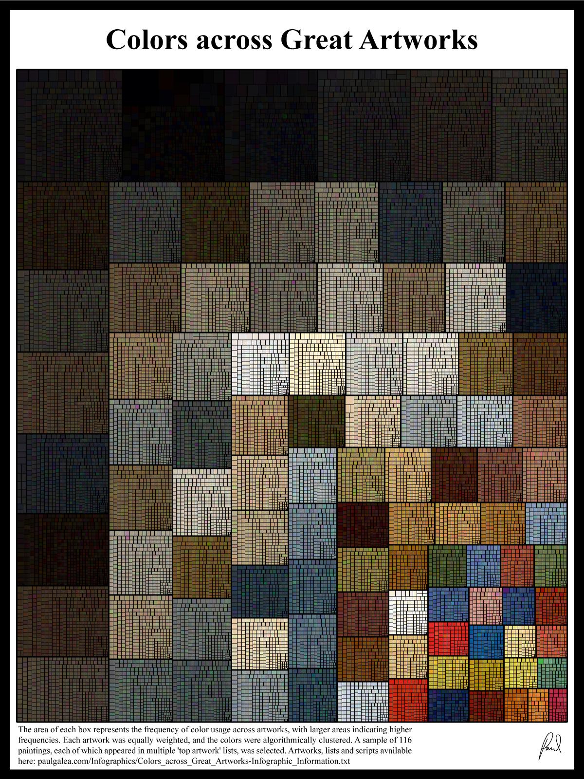
From the creator (not me)
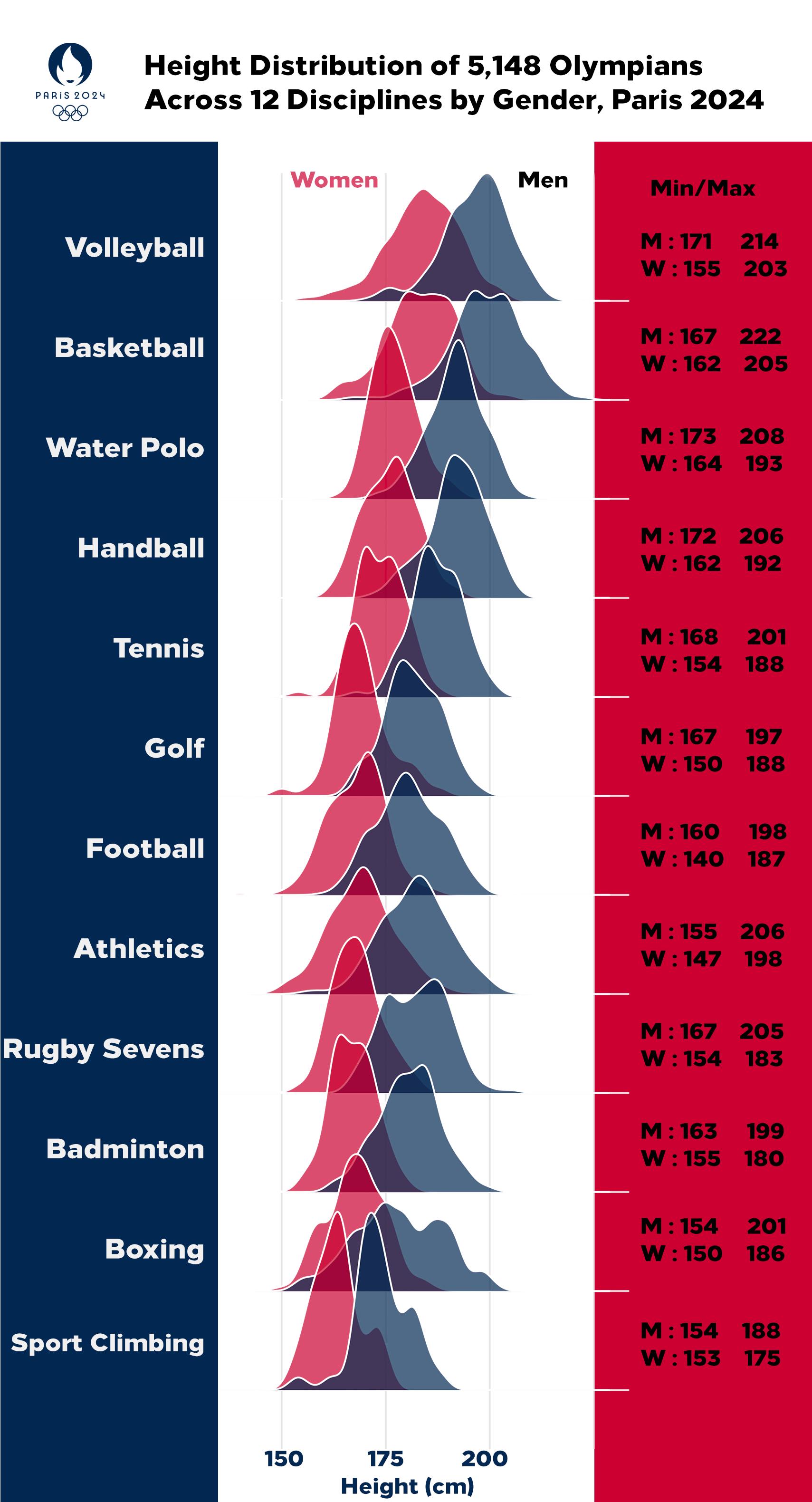
!! ATTENTION !! Not all disciplines are shown, as only 5,148 out of 11,000+ athletes have their height information available on the official Olympics website. Hopefully, they will update the info eventually, as height plays a major role in disciplines such as rowing, weightlifting, and gymnastics. Data is from Kaggle, which seems webscraped from the official olympics website. Done in R, code can be found on my github. The y axis has been sorted by MEDIAN height, men and women combined.

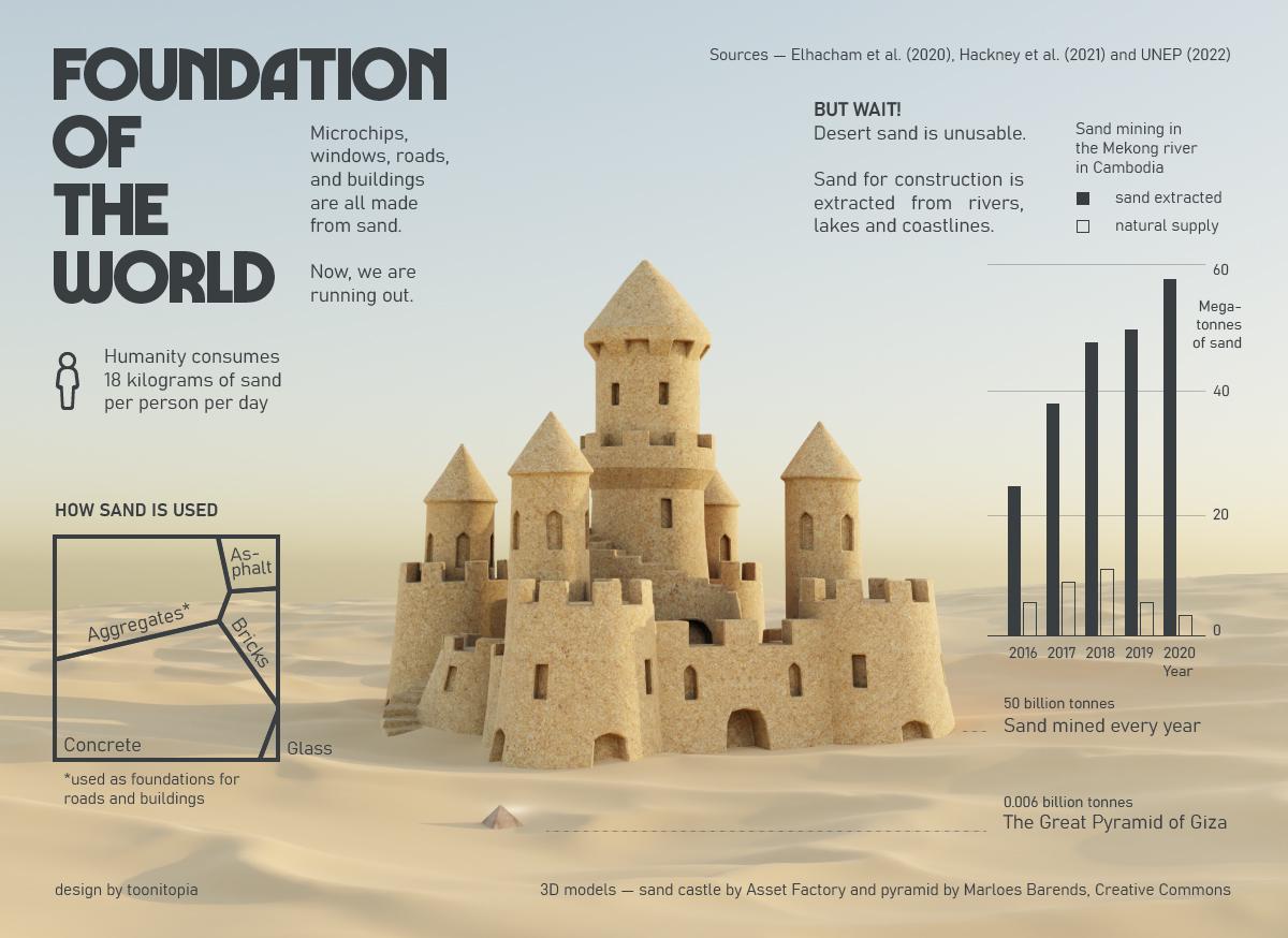
Sources: Elhacham et al. (2020), Hackney et al. (2021), UNEP (2022)