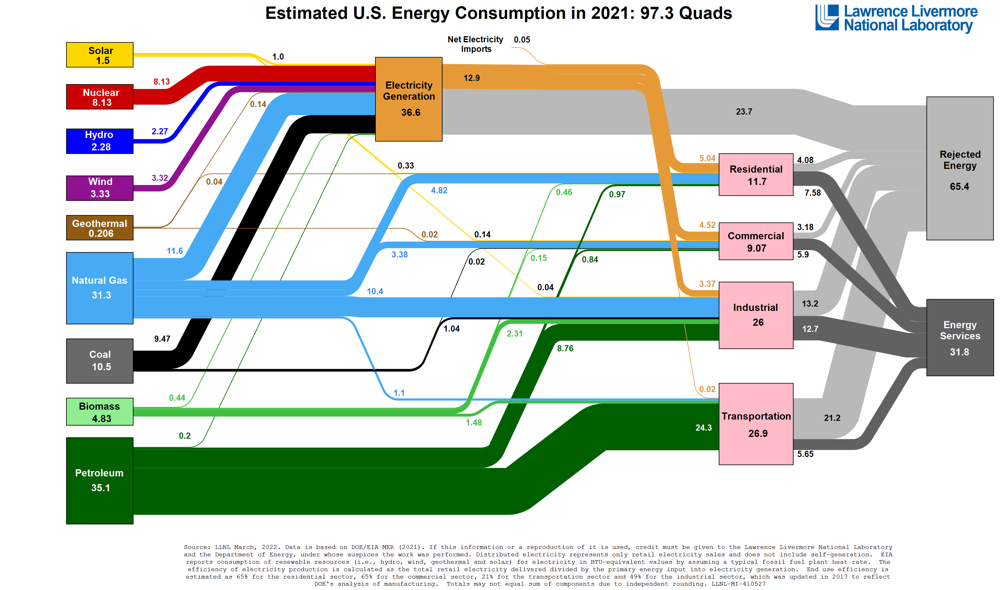
TIL about rejected energy
Data Is Beautiful
A place to share and discuss data visualizations. #dataviz
(under new moderation as of 2024-01, please let me know if there are any changes you want to see!)
Oooo, I really like the Rejected Energy category on the infographic to account for inefficiencies.
Reminds me of a joke from engineering school rephrasing the three laws of thermodynamics:
-
- The best you can ever do is break even.
-
- You can't break even.
-
- You can't even come close.
Why do residential, commercial, and industrial sectors seem to have such better energy efficiency than electrical producers do? Is that just because of the inherent loss in distributing that energy?
I also never realized how bad transportation is with energy efficiency, why is it so much worse than stationary users are?
The graph is misleading. That's why there is such a difference. As if all the energy only goes into electricity and the rest is wasted and is not used for steam or heating.
Not to mention... How can residential even be efficient? Essentially all the energy that goes in is lost as heat soon after.
