this post was submitted on 17 Jun 2023
27 points (96.6% liked)

Memmy - An iOS client for Lemmy

5074 readers
1 users here now

Download on the App Store

View on GitHub

Join the Discord

Code of Conduct

founded 1 year ago
MODERATORS
 

Thanks everyone for all of the feedback we are getting! It's hard to rapidly develop and push new updates while maintaining 100% usability, so your feedback is crucial to making sure things work the way they are supposed to!

If you are interested in getting the latest updates or chatting about issues and ideas, you can join the Discord server.

Please make sure that you are running the latest version of memmy as well. Changes are happening quickly and there are new features getting pushed daily. I suggest enabling automatic updates in TestFlight.

Happy scrolling!

top 50 comments
sorted by: hot top controversial new old
[–] Yoreo@lemmy.ml 3 points 1 year ago (1 children)

The app is coming together and improving pretty rapidly so far. I can see that Apollo has been a big inspiration in regards to gestures which makes me feel "at home" while browsing the lemmyverse. I'm definitely loving it.

My only suggestions would be having the ability to change the font size. I'm unfortunately at a stage in my life where it's becoming more difficult to read smaller fonts, and I'm having to squint to read the comments.

I also made a request to the mlem dev to have the ability to toggle a setting that hides the top and bottom bars while scrolling through threads/comments like you can within Apollo. It'd be nice if a similar setting could be added.

[–] goji@lemmy.ca 1 points 1 year ago

Memmy does support dynamic type, but yeah it’s a feature from apollo that I miss too.

IOS Settings » Accessibility » Display & Text Size » Larger Text

You can bump global text size up with the slider at the bottom of that screen without enabling the Larger Text toggle

I like my system font size to be on the smaller side though, so being able to customize by app is a big QOL upgrade

[–] Nugget_in_biscuit@lemmy.ml 3 points 1 year ago* (last edited 1 year ago) (4 children)

Some feedback: 1: I’m sure you are working on this, but adding the ability to search for communities should be a priority. IMHO, I would copy how Apollo has a dedicated tab on the bottom menu for search. Alternatively, see (7)

2: A couple of features aren’t properly scaling when using the app in the “slide over” configuration on an iPad. The ones I’ve found so far are: it’s impossible to downvote a comment, the top UI elements smoosh into each other, and images don’t display without clicking on them

3: Consider getting a bit more active about promoting the app. This is way more impressive than Mlem

4: Consider adding a dedicated downvote button to comments. Currently people browsing with gestures disabled would not be able to downvote comments at all

5: Consider copying how Apollo will report how many comments are in a collapsed thread / comment chain. This is required to implement (6)

6: Consider automatically collapsing comment chains that are more than 5 replies deep.

7: Consider creating a dedicated interface for selecting communities / all. Perhaps the dialog could be triggered by tapping the top bar, and would contain radio buttons for sorting by all / subscribed / local, as well as a list of subscribed communities. You could also include a redundant shortcut to search (or even put the entire search dialog) here (see (1))

8: The menu when inside a community is currently missing the sidebar

Overall, this app is amazing! ---

load more comments (4 replies)
[–] RustedSwitch@lemmy.world 2 points 1 year ago

Discord link has expired

[–] phario@lemmy.ca 2 points 1 year ago

Hi!

Two quick items of feedback.

  1. When browsing a community, it would be useful to be able to tap the community name at the top centre to go to a drop-down menu of other communities you’ve subscribed. This was default on Apollo. Obviously we have the traverse button now and that’s useful.

  2. When searching communities it would be really useful to see number of users. This is especially important as there can be many communities named after a similar topic, say, “photography”.

[–] moosh@lemmy.world 2 points 1 year ago (1 children)

Did I hallucinate that swipe to save is a feature? Or was it and did it miraculously disappear?

[–] gkd@lemmy.ml 2 points 1 year ago (1 children)

Haha no it wasn’t there. But it will be sooner than later.

[–] moosh@lemmy.world 2 points 1 year ago
[–] NewNewAccount@lemmy.world 2 points 1 year ago

Can images me made easier to swipe away? I feel like much of the time I try to swipe up or down and it just moved the image instead of dismissing like I’m attempting.

[–] Javish@lemmy.world 2 points 1 year ago (1 children)

Does anyone else have the problem on iPad where when you click on a photo in a post, the right 1/3 gets cropped off?

[–] Javish@lemmy.world 1 points 1 year ago

Guess it's just me. 🤙🏽

[–] DreadTowel@lemmy.world 1 points 1 year ago (1 children)

Does Memmy support 2FA? I can't log in, for some reason. Maybe because I have 2FA enabled.

[–] gkd@lemmy.ml 2 points 1 year ago

It does support it. If you want to add me on discord we can try and troubleshoot, g_k_d

I’d also suggest trying to sign in with your name using the correct capitalization (i.e. DreadTowel instead of dreadtowel). There’s an issue (I think fixed but might not be in latest RC yet) where Lemmy won’t recognize both as being the same.

[–] pulehu@lemmy.world 1 points 1 year ago* (last edited 1 year ago)

Hi, pro lurker here. Could you make a disable the swipe vote/save post function? Swiping back is a pain with it and I prefer to manually do it. Thank you for your hard work and making my end of work day a little less stressful with this app.

[–] handhookcardoor@lemmy.world 1 points 1 year ago

Any fixes for compact mode images coming? I keep having to zoom out on pictures to be able to swipe off them, and theres no options to save or share images? I don’t run into these issues on default view, only notice them on compact.

[–] Dr_Decoy@lemmy.world 1 points 1 year ago

I feel like this is such a dumb question, but how do you log out of Memmy? After the hack I think I need to log out of Memmy and log back in. I’ve logged out and back in at Lemmy.World but the Memmy app doesn’t allow me to post or comment or up/down vote. My assumption is that this would be fixed by logging out and logging back in but I can not figure out where to log out for the life of me.

[–] gc_momof3@lemmy.world 1 points 1 year ago

Hi! I am a blind user, just installed memmy and am using it with Voiceover, the screen reader for IOS since that's how I access all my apps. In genral, thanks for labeling the tabs and most of the buttons. It's generally usable by blind individuals. But a few buttons remain unlabeled like the upvote and downvote buttons, as well as the buttons on the top of the screen to change the sort order. I know you are super swamped with a new app but wanted to put a plug in for making this just a bit more accessible to blind users and others with disabilities. Thanks for considering!

[–] messem10@lemmy.world 1 points 1 year ago (1 children)

Is there a way to unblock a community or user from the app?

[–] gkd@lemmy.ml 3 points 1 year ago

Already coming in the next update 👍👍

[–] d4rknusw1ld@lemmy.world 1 points 1 year ago (2 children)

JSON errors. Comments don’t post. Constantly.

load more comments (2 replies)
[–] R05@lemmy.world 1 points 1 year ago

Nice update, feels a bit more stable and I like the functions you have implemented. Especially blocking communities!

[–] Laxaria@lemmy.world 1 points 1 year ago (1 children)

I would love a version of "compact" that hides all thumbnails. It makes for an even more compact list of text rather than dedicating space for a square thumbnail, many of which are just empty because they are text posts and/or just outward going links, and I do enjoy the visual cleanliness that comes from not having a variety of different squares of colors against a black background lining the right side of the text.

[–] Laxaria@lemmy.world 1 points 1 year ago

Included in a recent build. Thanks!

[–] Albinoss@lemmy.world 1 points 1 year ago

Idk if this is possible, but the biggest thing about Apollo, for me, was being able to tune it to my eyesight.

When I use system font, it doesn’t actually boost up the font size to what’s on my phone. When I use the manual slider, it is SO much better, but words in titles and descriptions can get jumbled into themselves and become unreadable. For example, when I search communities, the number of members, community title, and instance they are on all run into each other. It’s made it so I have to use Wefwef when searching for communities, then I can view them on Memmy. If there’s any way to fix this, I would really appreciate it. Regardless, thank you for your efforts!

[–] orangeNgreen@lemmy.world 1 points 1 year ago

Just want to say I’m really enjoying Memmy. Every few days I hop onto Mlem or wefwef just to give them a try, and those are great in their own ways, but I always come back to Memmy.

Thanks for making the transition from Reddit to Lemmy so easy!

[–] ProvokedGamer@lemmy.ca 1 points 1 year ago* (last edited 1 year ago)

Awww. The invite link expired! Can you give me a new one please? I really like your app!

Edit: The one on the about tab works. Thanks!

[–] highestincharge@lemmy.world 1 points 1 year ago (1 children)

i’m unable to load the subscribed feed using my lemmynsfw account, is this a bug?

[–] gkd@lemmy.ml 1 points 1 year ago (1 children)

Do you have Hide NSFW enabled? I'd bet that's the issue.

[–] highestincharge@lemmy.world 1 points 1 year ago

no i dont, i've verified theyre both disabled

[–] iTipTurtles@lemmy.world 1 points 1 year ago (1 children)

Having an issue where the comment reply notification won’t go away.
Someone has replied to a comment I have left, I have them upvoted their reply and even clicked into it. But the notification won’t go away

[–] gkd@lemmy.ml 2 points 1 year ago (2 children)

Noted, will be fixed in the next update.

load more comments (2 replies)
[–] dreikelvin@lemmy.world 1 points 1 year ago

It says "Invite Invalid" ? Is the Discord link broken?

[–] Richard@lemmy.world 1 points 1 year ago

Discord links not working for me right now, so might add the feedback here for now.

Just tried the Bean Lemmy client and was immediately struck by the bottom and top bars having a slight level of transparency of them which causes feed content to appear behind the bars very subtly. It’s a design trait that Apple uses throughout iOS/MacOS and Id like to see it in Memmy given Apple native apps do it.

I do acknowledge transparency is something many people find tacky, so suggesting maybe it could be a toggle under the theme settings to have the bottom and top navigation bars have a slight transparency, along with other relevant controls. That way people can enable or disable it based on what they like and how they’re theming the app.

[–] EatBorekYouWreck@lemmy.world 1 points 1 year ago

I cant find where to switch between accounts on different servers. I’m connecter to 3 accounts but don’t see where I can switch between them

[–] pulehu@lemmy.world 1 points 1 year ago

Not sure if this will get to you, but please put an option to disable the swipe to vote/chat option. Man it’s a pain. Thank you for your hard work!

[–] danc4498@lemmy.world 1 points 1 year ago (1 children)

Looks like none of the stories I open are showing as read. Makes it very difficult to keep track of unread posts

[–] gkd@lemmy.ml 1 points 1 year ago (1 children)

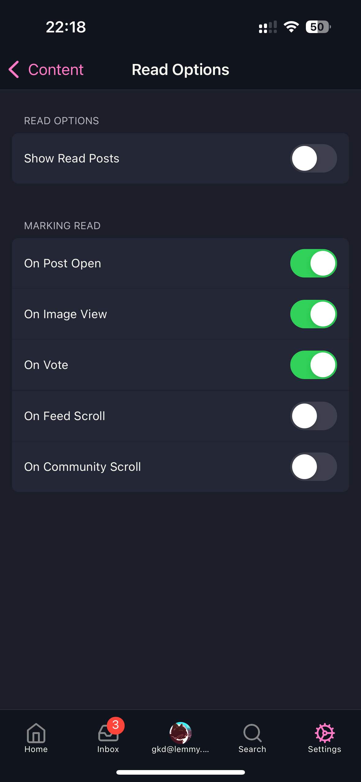
It seems to be working for me right now. Have you disabled “Show Read Posts”?

https://lemmy.ml/pictrs/image/e895f206-3d27-48a5-bcb1-c94a8383feed.png

This setting is reflective of your Lemmy setting, so look on Lemmy and see if it’s disabled.

Unless you are just referring to being able to see it as being read, which could possibly be that the indication needs to be a bit more obvious. Right now the title color is changing. There used to be a read icon which we can add back if that’s useful.

Let me know.

[–] danc4498@lemmy.world 1 points 1 year ago (1 children)

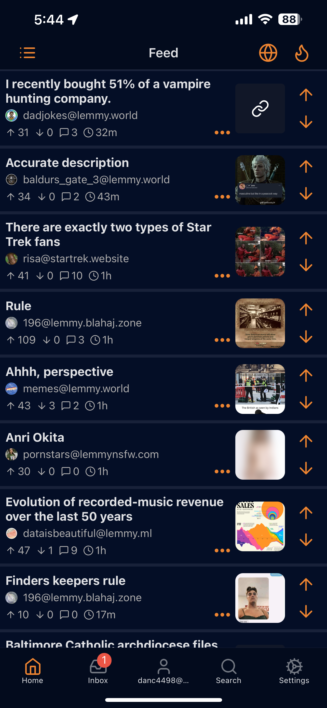
https://lemmy.world/pictrs/image/17fa4317-2347-41a5-93fb-9447ad3f2570.png

This is what the app looks like. I’ve clicked the top post, so it should look different than the other posts.

[–] gkd@lemmy.ml 2 points 1 year ago (1 children)

Oh shoot. Looks like you’re right with compact. Will address it now. Thanks!

[–] danc4498@lemmy.world 2 points 1 year ago

Your going god’s work!

[–] cerberus@lemmy.world 1 points 1 year ago

Thank you for this app! I definitely appreciate it.

[–] PloKoop@lemmy.world 1 points 1 year ago

Going to be moderator options on a future update

load more comments
view more: next ›