87
Purely based on aesthetics, what's your favorite Hammer and Sickle variant?
(shared.prolewiki.org)
Talk about whatever, respecting the rules established by Lemmygrad. Failing to comply with the rules will grant you a few warnings, insisting on breaking them will grant you a beautiful shiny banwall.
A community for comrades to chat and talk about whatever doesn't fit other communities
Why in the ever living fuck is strasserism and other nazbol stuff on here
Yeah who made this list???
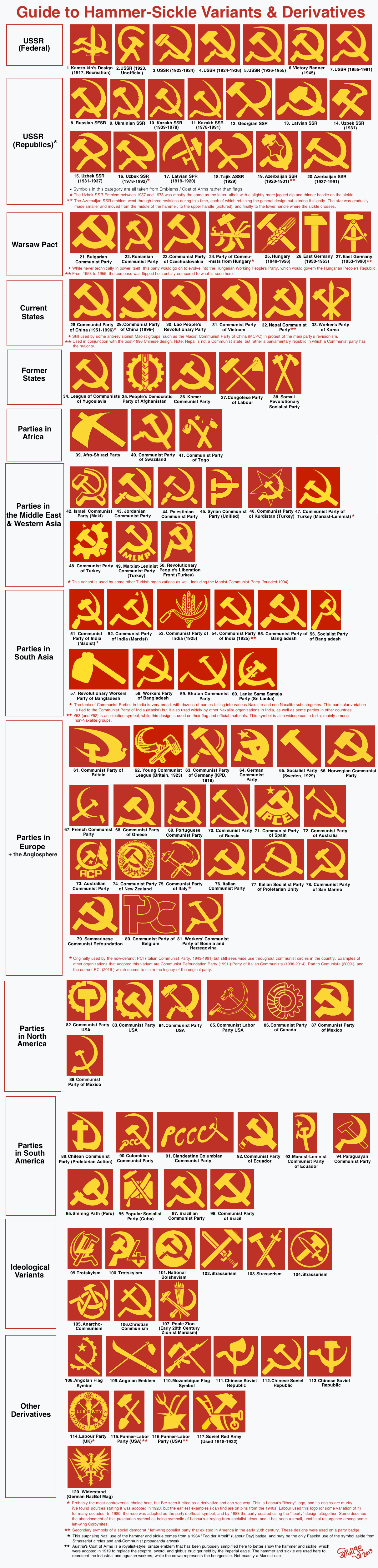
Didn't even put the CPA (1936 = 1965)
or the workers' parties of Tunisia/Algeria (Trotskyists)
i would guess not an ml since they call post Mao china revisionist
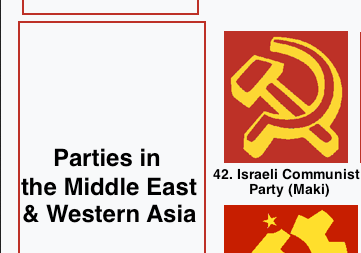
Maki is anti-Zionist at least 
i didnt know those existed so might be just to show literally all the variations? But yeah i did cringe at the "post-revisionist" comments at some point like come on bruh.
Not a party symbol but Bambu is extremely based and this album art is very cool.
I just love DDR's #27 symbol to death. I call it the "communist nerd symbol." I also really like the Angola flag one as it is closer to the tools that would be used on the other side of the Atlantic in Brazil, rather than a sickle. We could easily appropriate it.
I really like the gear/sprocket variants. Also, replacing the sickle with wheat makes more sense - sickles are artisanal these days.
I prefer gear/sprocket tbh as they are simpler , which makes them good on flags . Though I dont like what the Communist Party of Canada has going for it , to much detail imho
🇦🇴’s symbol on their flag is the coolest
Angola and Mozambique are probably my favorites. Can't think of better symbolism, for the struggle it must have taken them to drive the Portuguese out of their countries.
You know it's gotta be Angola
this one
Where's that one from?
party wise, none, it is an ideia that goes around on how the flag of future Democratic Republic of Brazil should be
Mozambique
This will be a perfect album cover for my upcoming anti-Imperialist rap album: Guns and Hoes.
i didnt like it at first but the CPB's new logo's been growing on me
It looks like the Disney 'D' though
USSR from 1955, DDR and Latvian
I think 35, 45, and 53 are pretty baller. The Afghanistan one is just so clean, the Syrian one is like the classic but easier to draw, and I think the India one having crops is a neat touch.
Totally agree, also the quill in the Syrian one makes it almost perfect for me. It's a classic with a twist.
I like how the nazbol symbol combines a symbol from Germany's past with new ideas. It would be even better if the eagle held the hammer in the left hand instead of a sword. From a purely aesthetic standpoint I like this combination of old and new.
Also, Mozambique having an AK in their emblem goes hard.
I like all the ones with gears, something like that would work as a "modernized" symbol.
I love the CPUSA's the best, especially the one that's canted at 45 degrees. Love me some gears.
Workers Party is Korea #33
I like that it includes a brush. It is meant to include not just laborers and farmers but also artists and writers and such. I think that pretty cool of them.
0/10, no Venezuelan Communist Rooster
Afgan, kurdish and Canadian.
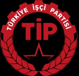
here's workers party of turkey.
5 or 66, good balance on both.
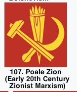
45, hammer, sickle, quill.
Honestly I really like the minimalism of 21. The Bulgarian Communist Party , but I also like the symmetric ones like 27. East Germany , 33. Workers Party of Korea and 35. People's Democratic Party of Afghanistan. I also like that 27. East Germany replaces the sickle with another tool , which I assume had more relevance in the society in East Germany at the time . While a lot of the examples given add other tools or add weapons , I think 27. East Germany is the only one to replace the sickle , with something with a very different shape , which I think is a good nod to progress as , usage of the sickle in farming has decreased a lot , I think .
Edit: 25. Hungary replaces the sickle with a strain of grain (idk how to call it in English), which also looks nice
96 and 114. I like the book and I like the quill.
Best: #5 Worst: #61 Honorable Mention: #74
117, Soviet Red Army, does anyone else see what I see?
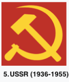
The 1936 - 1955 USSR one is my favorite
Definitely CPC
Always loved the Mozambique flag. It's interesting that the Kazakh version has a serrated sickle.
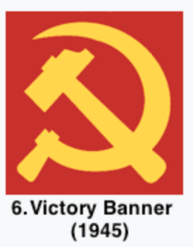
As far as the classic version I prefer 6 (Victory Banner) and 28 (oldschool CPC). But i am also partial to the WPK emblem (33) for its symmetry. And of course you have to appreciate the innovativeness of the DDR's version (27).
28, but 32 is also good