this post was submitted on 17 Oct 2024
177 points (87.7% liked)
movies
1769 readers
344 users here now
Warning: If the community is empty, make sure you have "English" selected in your languages in your account settings.
A community focused on discussions on movies. Besides usual movie news, the following threads are welcome
- Discussion threads to discuss about a specific movie or show
- Weekly threads: what have you been watching lately?
- Trailers
- Posters
- Retrospectives
- Should I watch?
Related communities:
Show communities:
Discussion communities:
RULES
Spoilers are strictly forbidden in post titles.
Posts soliciting spoilers (endings, plot elements, twists, etc.) should contain [spoilers] in their title. Comments in these posts do not need to be hidden in spoiler MarkDown if they pertain to the title’s subject matter.
Otherwise, spoilers but must be contained in MarkDown.
2024 discussion threads
founded 1 year ago
MODERATORS
you are viewing a single comment's thread
view the rest of the comments
view the rest of the comments


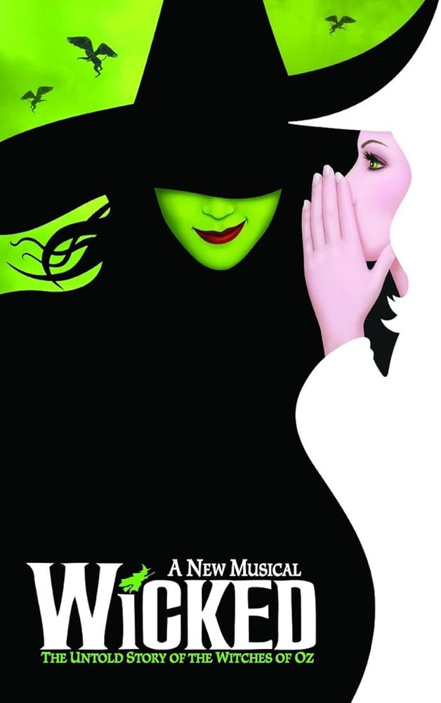
The small smile on her face I assume is a direct homage to the smile from the animated poster.
slight uptick in one corner of the mouth.
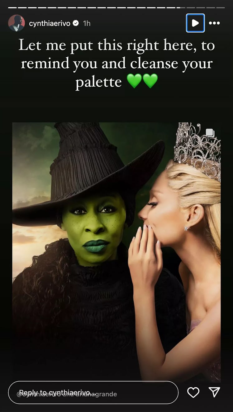
did any of you actually look at the official artwork poster with Cynthia on it?
various statements about her face are divorced from reality.
animated smile, camera right slightly raised corner of the mouth:
cynthia's smile, camera right slightly raised corner of the mouth:
yeah.... that's not a smile.
Tomato potato hombre.
its the same half-smirk in the poster.
so if there was a smile, why did the edited poster have to have one edited in? She is not smiling in that photo. You can zoom in and point to any slight asymmetry you want. Fact of the matter is, if you ask anyone who's not you, they'll say she is dead serious
"so if there was a smile"
there is, as seen above and demonstrated in further detail below.
"why did the edited poster have to have one edited in?"
it appears they wanted a wider, more obvious smile and obviously wanted a different lip color.
maybe she likes big smiles.
and a different sky color for unknowable reasons.
"She is not smiling in that photo."
Yes, she is.
here is cynthia not smiling, a resting face:
and here is Cynthia smirking with one corner of her mouth, a very obvious homage to the tilted animated smirk:
maybe you don't see a lot of smiles regularly?
you seem unfamiliar with their properties.