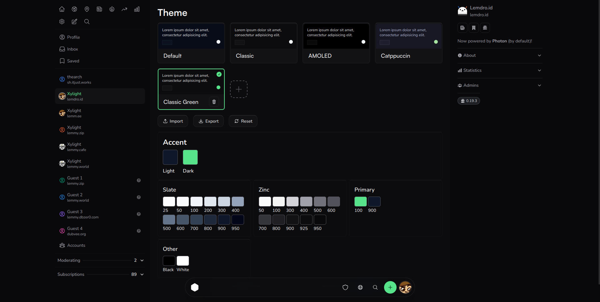
Saw people on slrpnk.net were looking for a photon theme so I decided to make one. I'm not necessarily expecting this to be used at slrpnk.net, but I like the theme so I'll be using it. It has a nice light theme too.
It's pretty similar to a recent post for a "wintergreen" theme, this one is less saturated.
{"slate":{"25":"245 248 247","50":"235 242 241","100":"225 236 235","200":"205 218 222","300":"185 200 209","400":"155 172 186","500":"125 144 163","600":"95 116 140","700":"75 98 122","800":"55 80 104","900":"35 62 86","950":"25 44 68"},"zinc":{"50":"245 248 248","100":"220 235 233","200":"185 214 210","300":"143 185 182","400":"103 154 151","500":"77 127 125","600":"60 101 100","700":"51 82 82","800":"44 66 67","900":"35 51 51","925":"27 41 41","950":"20 31 32"},"primary":{"100":"180 200 199","900":"30 65 64"},"other":{"black":"20 20 30","white":"245 248 247"}}


This comment gets it mostly correct