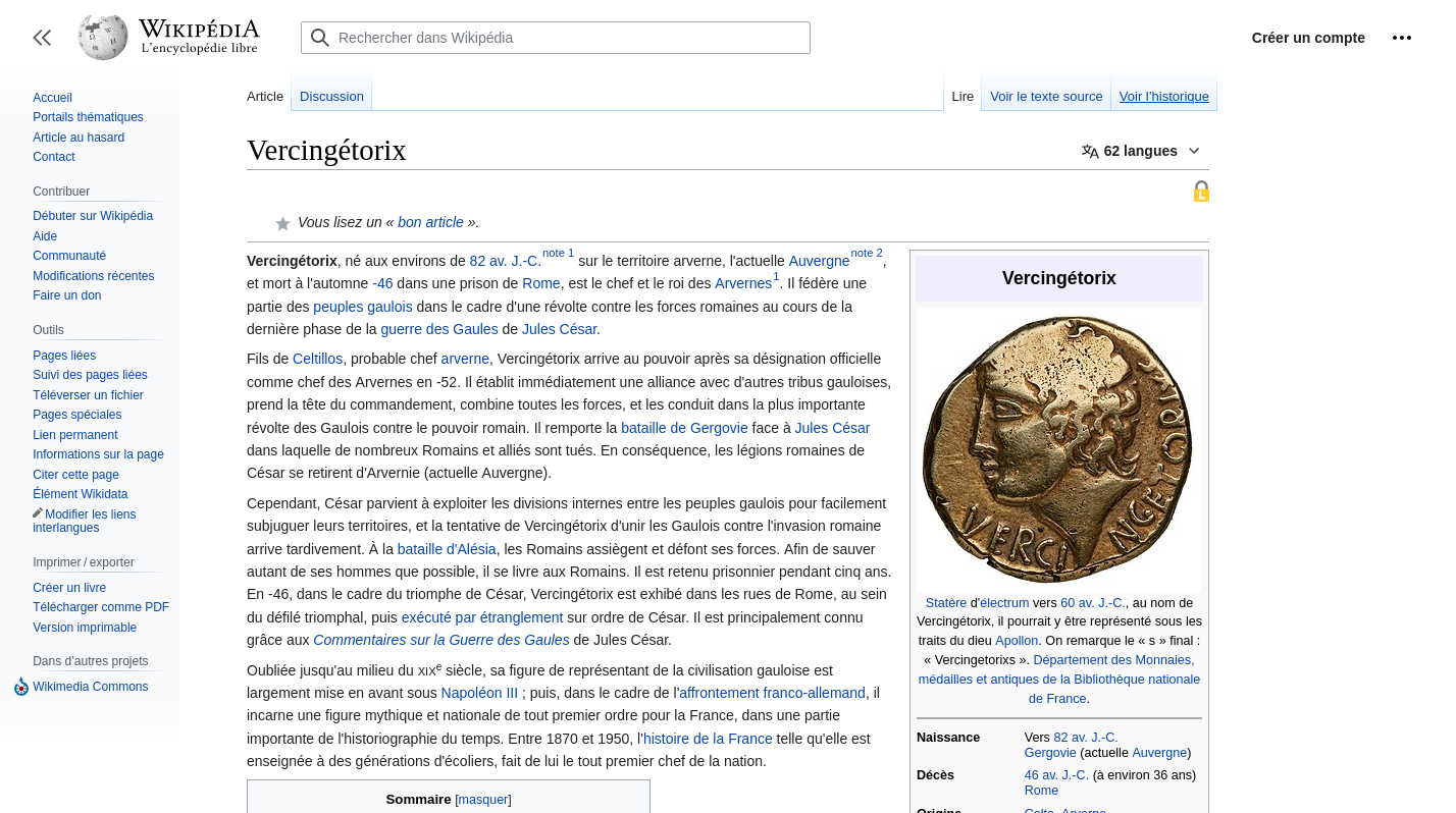
As said in another comment it's testing for improving thr Wikipedia website. I personally find it to be significant improvement. Having shorter lines that are easier to read is really great.
Asklemmy
A loosely moderated place to ask open-ended questions
If your post meets the following criteria, it's welcome here!
- Open-ended question
- Not offensive: at this point, we do not have the bandwidth to moderate overtly political discussions. Assume best intent and be excellent to each other.
- Not regarding using or support for Lemmy: context, see the list of support communities and tools for finding communities below
- Not ad nauseam inducing: please make sure it is a question that would be new to most members
- An actual topic of discussion
Looking for support?
Looking for a community?
- Lemmyverse: community search
- sub.rehab: maps old subreddits to fediverse options, marks official as such
- !lemmy411@lemmy.ca: a community for finding communities
~Icon~ ~by~ ~@Double_A@discuss.tchncs.de~
Yeah, it looks pretty great, I hope they start adopting it more, although I can already see fan wikis being outdated.
Le French Wikipédia opted in becoming one of the early adopter wikis with the aim of modernizing & improving desktop experience:
Because it's using the new version of mediawiki.
Not sure if I'm just too used to the classic design, but the new one looks pretty cramped to me. Also, while I can't read French, it seemed like I got an ad at the top of the page, which hopefully isn't the direction Wikipedia is going.
Ravi d'apprendre que le wiki français est meilleur dans son interface. Cocorico
je ne parle le fran¢ais, ma je suis pipi cucú come Monson
Meilleur je sais pas, ça a foutu en l'air mes userstyles.
