this post was submitted on 18 Jul 2023
578 points (95.9% liked)

Voyager

5477 readers
3 users here now

The official lemmy community for Voyager, an open source, mobile-first client for lemmy.

Download on App Store

Download on Play Store

Use as a Web App

Download on F-Droid

Rules

  1. Be nice.
  2. lemmy.world instance policy

Sponsor development! πŸ‘‡

Number of sponsors badge

πŸ’™

founded 1 year ago
MODERATORS
 

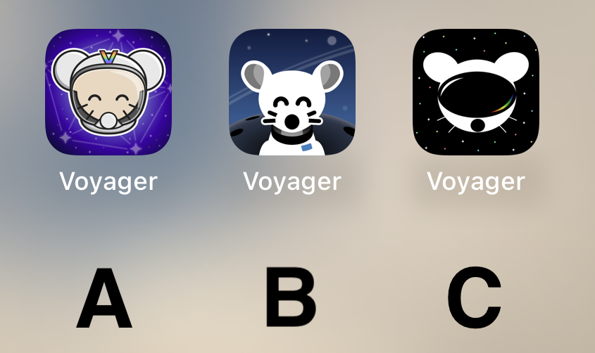
Voting has ended! Congrats to @fer0n@lemm.ee with option B. Thanks everyone for participating! :)


First off, thanks to everyone that participated in our icon contest last week!

I'm excited to show the final three options for you to vote on below!

Overview

Option A

Option B

Option C

πŸ—³οΈ Vote!

⚠️ BEFORE VOTING I encourage you to tap through the links above to see what it's like on your homescreen!

Results of the poll will not be available until it has ended, so no need to make a rushed decision.

~~VOTE HERE: https://strawpoll.com/BDyNEbKeqZR~~

Strawpoll privacy

~~Polling ends in ~24 hours! If there is a tie, I will cast the final vote.~~

(page 3) 50 comments
sorted by: hot top controversial new old
[–] weLookAbove@lemm.ee 7 points 1 year ago (3 children)

I'm slow. I don't understand C. Is the lemming wearing a VR headset?

load more comments (3 replies)
[–] iamthewalrus@lemmy.world 7 points 1 year ago

Current icon

[–] danielphan2003@lemm.ee 7 points 1 year ago
[–] Octagon9561@lemmy.ml 7 points 1 year ago

B. A is also good. Don't like C at all.

[–] greenashura@sh.itjust.works 7 points 1 year ago* (last edited 1 year ago)

B is the best by far

[–] Gwaer@lemmy.world 7 points 1 year ago
[–] Simplesyrup@lemmy.ml 7 points 1 year ago
[–] bugs@lemmy.world 7 points 1 year ago

B 100% !!! It's so cute

[–] thayer@lemmy.ca 7 points 1 year ago* (last edited 1 year ago)

Voted C. It's by far the most robust option. It looks stylish, professional, and could easily accommodate a flat, 1-color design.

I don't like any of them. That said, I voted for C. It's kinda plain, but that's what I like about it. The other ones are too messy.

[–] bdonvr@thelemmy.club 7 points 1 year ago

B and it's not even close

[–] Mojeezy@lemmy.world 7 points 1 year ago
[–] AndreyAsimow@lemmy.world 7 points 1 year ago

C looks like Daft Punk mouse

[–] Ascend910@lemmy.ml 7 points 1 year ago
[–] sixty@sh.itjust.works 7 points 1 year ago
[–] Snapz@lemmy.world 6 points 1 year ago

B, but the planet in the background makes it look like extremely large shoulders.

[–] vox@sopuli.xyz 6 points 1 year ago (1 children)

what about making it optional?
both android and ios provide some sort of api for changing icons.

[–] aeharding@lemmy.world 7 points 1 year ago (2 children)

Mostly because Voyager is a progressive web app with no such API available because Apple and Google are large corporations that profit over their controlled app stores.

load more comments (2 replies)
[–] Kuunha@lemmy.eco.br 6 points 1 year ago (1 children)
load more comments (1 replies)
[–] kratoz29@lemmy.world 6 points 1 year ago

I can't decide between A and C... I am gonna go for C I guess.

BTW can we have different icons like Apollo had?

[–] LazaroFilm@lemmy.world 6 points 1 year ago* (last edited 1 year ago)

I’m just here to say: CHARGE YOUR PHONE!

Also, C A B is my ordered preference.

[–] jonwyattphillips@lemmy.ml 6 points 1 year ago

C mouse with A background please

[–] andrewta@lemmy.world 6 points 1 year ago

I prefer what we already have but if we have to change then go with A

[–] sandayle@iusearchlinux.fyi 6 points 1 year ago (2 children)

We'll be able to use Voyager on Android in the future, right?

load more comments (2 replies)
[–] Bakachu@lemmy.world 6 points 1 year ago (1 children)

Initially I liked the background on A and the lemmy on B....

....but I think C has my vote just for the sheer symbolism it projects - a confident lemmy ready to boldly venture into the future fediverse.

load more comments (1 replies)
[–] SharpMaxwell@lemmy.world 6 points 1 year ago* (last edited 1 year ago)

B, good middle ground of clean design yet still has personality

[–] Kylamon1@lemmy.world 6 points 1 year ago
[–] peddlerartist@lemmy.world 6 points 1 year ago* (last edited 1 year ago)

It’s really cool to have such talent in this community to go along with such an amazing app. The 3 finalists are really good. I don’t usually use dark icons but I love C so much. I hope to see variations of it as the app grows. Congratulations to all who made it to the top 3! That in itself is an accomplishment. I can’t wait to see the results of the final! This community is awesome!

[–] DigitalNirvana@lemm.ee 6 points 1 year ago
[–] llIStormIll@feddit.de 6 points 1 year ago
[–] Squirrel@thelemmy.club 6 points 1 year ago

B for sure.

[–] sethal@lemmy.world 6 points 1 year ago

I like B the best.

[–] FuckSpez@lemmy.one 6 points 1 year ago

Definitely B

i vote for B cuz i think it's the cutest 🐭

[–] Cheese@sh.itjust.works 6 points 1 year ago

A and B has too many details for an app icon that isn’t for a game.

[–] bigfish@reddthat.com 6 points 1 year ago

A looks like something an elementary school aged kid would have on their iPad for help learning to add.

B's got my vote.

[–] ohlaph@lemmy.world 6 points 1 year ago
[–] Gork@lemmy.ml 6 points 1 year ago

πŸ…±οΈ

[–] 8eyedcorsair@lemm.ee 6 points 1 year ago

B Please! Looks so very clean.

[–] Quill7513@slrpnk.net 5 points 1 year ago
[–] Achsonaja@sh.itjust.works 5 points 1 year ago (2 children)

Can we have them all and a setting to choose? Other apps do that. Is it a limitation of the PWA?

load more comments (2 replies)
[–] tomkatt@lemmy.world 5 points 1 year ago
load more comments
view more: β€Ή prev next β€Ί