this post was submitted on 29 Oct 2024
278 points (93.4% liked)

Technology

59092 readers
6622 users here now

This is a most excellent place for technology news and articles.


Our Rules


  1. Follow the lemmy.world rules.
  2. Only tech related content.
  3. Be excellent to each another!
  4. Mod approved content bots can post up to 10 articles per day.
  5. Threads asking for personal tech support may be deleted.
  6. Politics threads may be removed.
  7. No memes allowed as posts, OK to post as comments.
  8. Only approved bots from the list below, to ask if your bot can be added please contact us.
  9. Check for duplicates before posting, duplicates may be removed

Approved Bots


founded 1 year ago
MODERATORS
top 50 comments
sorted by: hot top controversial new old
[–] Evil_Shrubbery@lemm.ee 46 points 6 days ago* (last edited 6 days ago) (3 children)

Well, it would be

  • more confusing if they shaped it like an iPhone,
  • more unstable if they shaped it like the magic mouse with the power port at the bottom,
  • super cute if they kept the exact mac pro tower design but super smol,
  • actually useful as a vase of they used that cylinder mac pro design from 10 years ago
[–] ilega_dh@feddit.nl 25 points 6 days ago

That cilinder Mac Pro was a fever dream but I still love the design

[–] Janovich@lemmy.world 20 points 6 days ago (1 children)

Smol Mac Pro would have been the best possible reality here.

load more comments (1 replies)
[–] lando55@lemmy.world 8 points 6 days ago (1 children)

more unstable if they shaped it like the magic mouse with the power port at the bottom

Sounds like someone didn't wear their Brave pants today

[–] Evil_Shrubbery@lemm.ee 6 points 6 days ago* (last edited 6 days ago)
  • way sexier if they shaped it so it could wear tight little brave pants
    (and the 'turn on' button would have been covered by pants in this case as well, which sounds proper)
[–] Imgonnatrythis@sh.itjust.works -2 points 6 days ago

Meanwhile... Apple TV stuck in stone age and still can't do bitstream.

[–] Yes_Man@lemmy.world 132 points 6 days ago (33 children)

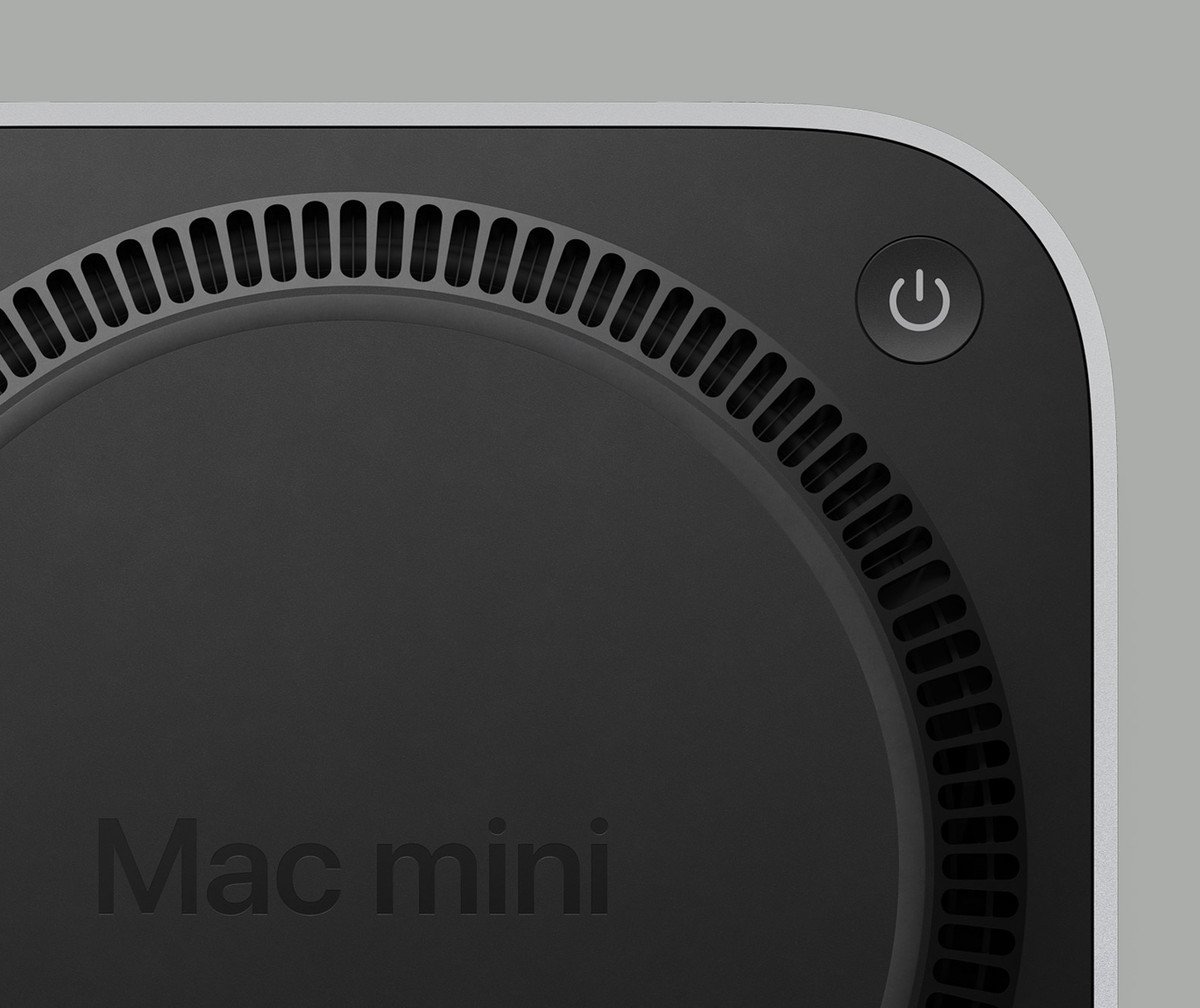
Mac Mini's are cool, and I appreciate that Apple has some of the most experienced and talented designers in the world... But they put the power switch on the bottom. You have to lift it up and turn it over to turn it on and off.

A Mac Mini underside, showing the power button placement.

[–] GhostlyPixel@lemmy.world 97 points 6 days ago* (last edited 6 days ago) (6 children)

Remember these are the same engineers who put the Magic Mouse charging port on the bottom, making the mouse unusable while you charge it

[–] ThePantser@lemmy.world 5 points 6 days ago* (last edited 6 days ago)

Yeah and I hear they might bring that back lol. Why haven't there been any wireless mice that use wireless charging? They could include a super thin coil that you could place under any mouse pad. It doesn't even need to charge fast so heat shouldn't be an issue. Just trickle charge when it's not being used.

Edit: guess I should have searched first. Of course it was Logitech

[–] VindictiveJudge@lemmy.world 23 points 6 days ago (7 children)

Honestly, the mouse charger screams marketing or management. Apple's brand is partially form over function.

load more comments (7 replies)
[–] million@lemmy.world 19 points 6 days ago (13 children)

People treat it like a mistake but not be able to use the mouse while it’s plugged in is the entire point of the design. Right or wrong the Apple designers thought a cord drag was a bad experience and designed to prevent it.

They probably looked at their target audience and realized there was a certain percentage of folks that would just leave the mouse on the cord 24/7 and wanted to prevent that.

[–] LANIK2000@lemmy.world 4 points 5 days ago* (last edited 5 days ago) (7 children)

I don't understand what was wrong with the original version that just took 2 AA batteries. Reaching for the AA charger and swapping cells not awkward enough or something?

Smart and elegant design would be hiding a battery charger in the iMac it self (maybe even use something smaller than AA), not expect you to flip and plug in your mouse every time ya leave it. The Nintendo Switch, while a completely different form factor, is a great example of an elegant (you could even say "wireless") charging solution.

I'm getting really sick of the Apple esthetic of sticking out wires, be it the mouse or the dozen dongles for every portable device they now make. Uh! Can't forget the world's only pen that needs charging, for seemingly no reason.

load more comments (7 replies)
[–] RecluseRamble@lemmy.dbzer0.com 21 points 6 days ago

They also know their target audience has plenty of people who gobble up every bad design decision and even defend it online years later.

[–] Flocklesscrow@lemm.ee 10 points 6 days ago

People treat it like a mistake, but the Emperor has no clothes and people are catching on.

load more comments (10 replies)
load more comments (3 replies)
[–] xxd@discuss.tchncs.de 13 points 6 days ago* (last edited 6 days ago)

The new design seems more lifted, I think it should be fine to fit your finger below there without having to lift it up yourself. At least for most people.

[–] MentalEdge@sopuli.xyz 33 points 6 days ago

What.

The fuck.

[–] falkerie71@sh.itjust.works 18 points 6 days ago (3 children)

In case it wasn't a joke, I imagine it would be high enough for your finger to just poke under it to push the button, like you would a monitor with buttons on the bottom of the screen.

load more comments (3 replies)
[–] winkly@lemmy.world 11 points 5 days ago

Power Bottom

[–] flop_leash_973@lemmy.world 9 points 6 days ago (5 children)

But once its on why would you ever turn it off? /s

[–] ilega_dh@feddit.nl 9 points 6 days ago

This but non-sarcastically. I have a Mac mini and I don’t think I’ve ever touched the power button (except after plugging in of course, but then you’re already fiddling)

load more comments (4 replies)
[–] hector@sh.itjust.works 8 points 5 days ago
load more comments (26 replies)
[–] ElPussyKangaroo@lemmy.world 50 points 6 days ago

Most, if not all, Apple devices look almost exactly the same as their sibling devices.

[–] grue@lemmy.world 42 points 6 days ago (1 children)

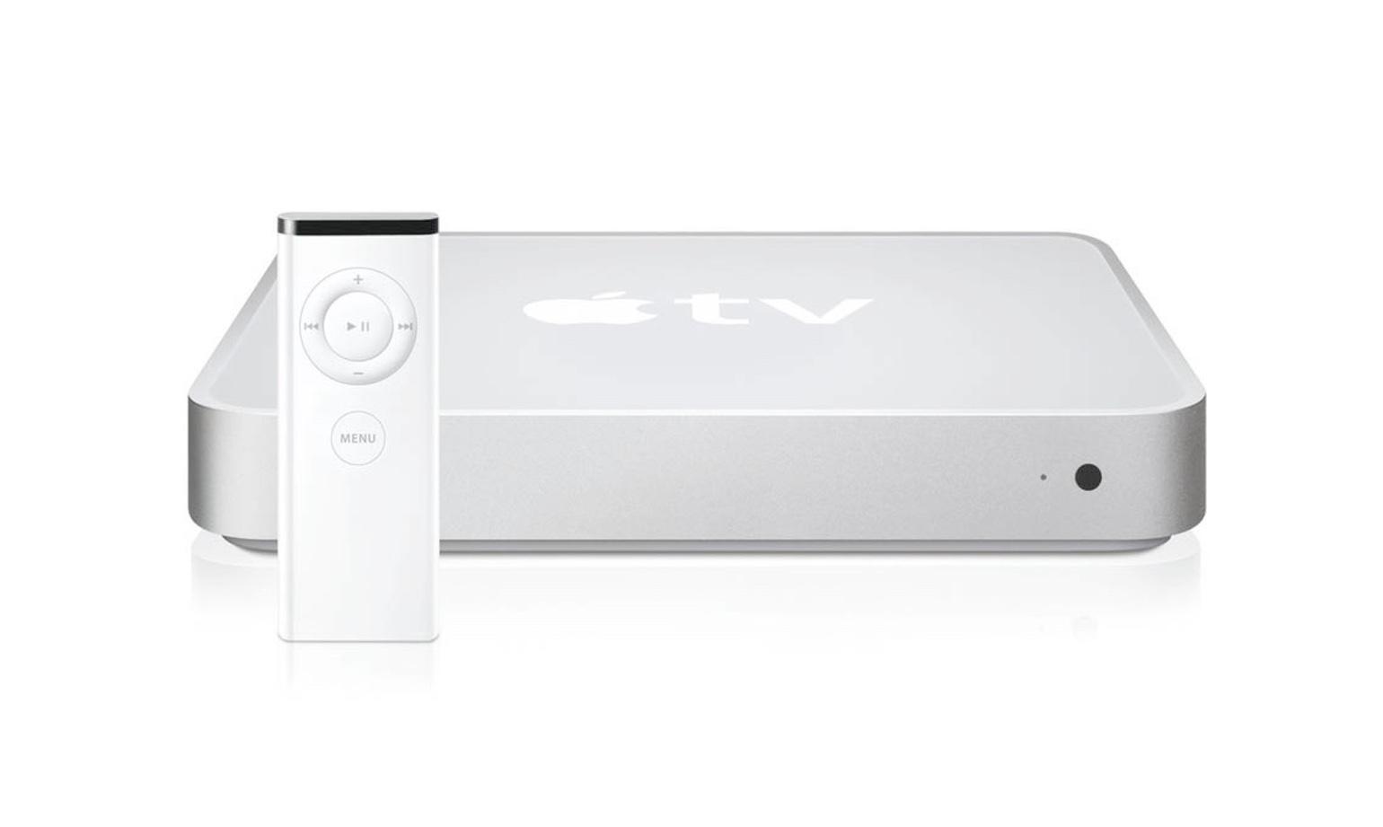
Implying Mac Minis haven't looked like Apple TVs from the beginning?

Mac Mini (2005-2009):

Apple TV (1^st^ gen, 2007):

Mac Mini (2010, first redesign after Apple TV came out):

load more comments (1 replies)
[–] falkerie71@sh.itjust.works 37 points 6 days ago (5 children)

The price of the storage upgrades. Jesus.

load more comments (5 replies)
[–] HEXN3T@lemmy.blahaj.zone 21 points 6 days ago

It's kinda cute

[–] ABCDE@lemmy.world 9 points 6 days ago

I mean.. It looks like the other Mac minis so... Okay.

load more comments
view more: next ›