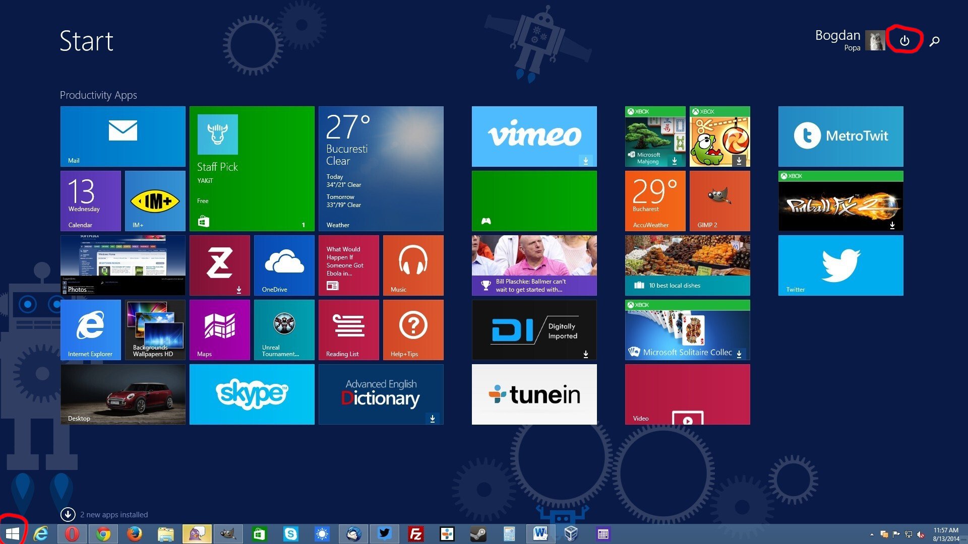
Ugh, fine Microsoft. I'll finish my migration to Linux this weekend.
Technology
This is a most excellent place for technology news and articles.
Our Rules
- Follow the lemmy.world rules.
- Only tech related content.
- Be excellent to each another!
- Mod approved content bots can post up to 10 articles per day.
- Threads asking for personal tech support may be deleted.
- Politics threads may be removed.
- No memes allowed as posts, OK to post as comments.
- Only approved bots from the list below, to ask if your bot can be added please contact us.
- Check for duplicates before posting, duplicates may be removed
Approved Bots
With more room for ads, I hope?!
i assume that's what the sidebar is for
The sidebar looks like it's dedicated to phone access?
"Why are you using Firefox? Didn't you know edge is better?
Are you sure you don't want to try edge?
I'll fuckin murder you if you don't launch edge right now. "
-windows these days.
ha, oh look another revision no one asked for.
i had to use this recently, and its all kinds of useless now. the 'search' didnt find my installed app, the 'all apps' list is a click or two in, and then absurdly inefficiently styled.. the win98 start menu was easier for me to navigate.
Every update with these new UI changes seems to increase empty wasted space each time
I love how modern UI = eating up as much space as possible, while displaying as little information as possible. Glad I can watch this shitshow from afar.
It's hard to even take Windows seriously as a business OS when they're shoving this overly padded UI down everyone's throats. Windows 10 supported small task bars, among many other things that Windows 11 doesn't. There seems to be a lot of really tone deaf people at Microsoft working in silos, not really aware of the features people care about in their own product.
Oh cool, good to see the power button is still on the other side of the fucking menu. You know, the thing that I'm clicking on 90% of the time I'm opening the Start Menu? Why have that easily reachable like in past versions of Windows? Silly me I guess.
This isn't the first time Microsoft has done this, I remember this being a huge gripe for me with Windows 8/8.1

Hey that was when they thought it was also a smart idea to force that shit tablet view on users...
And they did it on Windows Server too, which made even less sense.
Don't your servers run on phones?
Strangly this UI always reminds me of the hospital scene from Idiocracy... Click the icon for where it hurts
With Windows 8, they all hurt.
Then you wouldn't notice all the fun and exciting recommendations they have for you! /s
I love how, as a Linux user, Windows never adds anything that makes me regret leaving.
Looks like someone at Microsoft saw someone's iPad and went "That's what we need! Icons in boxes that need an extra click to be used!" and their MBA boss figures they'll get a bonus for "increasing user engagement" by making everything take two actions instead of one now.
Sigh.
From the linked article:
One interesting thing about it is that clicking on an icon instantly launches the app, without opening the folder.
Oh for fucks sake, auto categorization is one of the thing I dreaded the most on iOS because it's almost always incorrect and it doesn't fit my usage at all. Hopefully it will be possible to disable this crap.
They want to be as sleek as apple but it comes off as an old man trying to be hip
And maybe I'm using it wrong, but it just...doesn't work. I use spotlight search on my MacBook to find programs and things and it just finds them. It's fast enough to be faster than me opening things off the dock.
I try to use the search on my wife's Win11 computer and half the time it sends me to a website for a program she already has installed.
Like if you want to imitate, even badly, the imitation should at least be functional.
Interesting design but I've literally never used the start menu for the past 5 years I think. I only ever press the windows key and then type the name of the app I need.
What the fuck is the point of the start button in the middle? Like, did they forget why the space to the right of it even exists.
i keep forgetting it's in the middle by default. first thing i did was change the setting to put it back on the left corner.
well they essentially copied the Mac dock for no reason. The icons will still go to the right of start but overall the elements will be centered.
Yeah, I moved that back the minute I upgraded to 11. It's much better in the bottom left.
That change was absolutely idiotic. It reminds me of that time Apple changed the scroll direction. Who ever asked for any of this?
Another 500k lines of new code? Yay more bloat!
Win 11 still looks ugly.
My main desktop OS in Linux. But on my Windows 11 VM I'm using StartAllBack app. It makes start menu, task panel to be normal again, like it was in Windows 7 and XP.
I'm using StartAllBack app.
God, I hope MS doesn't find out this exists. I'm sure they'd find some way to break it on an update.
Clearly they learned nothing from windows 8...
Uggggh fucking whhhhhy.
I don’t even use Windows and I have to put up with this shit. My parents are going to call and ask how and why they have to use this new thing.
What was gained from this exercise in self-lobotomization? Pick a design language and stick to it.
Stirring the pot like this is driving away even enterprise users. My last org only approved Macs and Chromebooks because we didn’t want to deal with the headaches that windows brought. Imagine saying that statement 10 years ago!
Oh it's good they have the "Messages" and "Calls" buttons right there for easy access since so many people message or call my desktop PC.
Uhhh! Ahhh! How about the mouse pointer? Make it AI! Nobody likes the little ⬆️ arrow following all the stupid motions. Plus when you loose it and you had wanted to click somewhere, where the fuck is it? Make it jiggle around! That's it! A jiggling mouse pointer that is composed of the two letters AI and jiggles around randomly is surely something everyone could use!
Amazing! Reading this headline made my bazzite partition grow by 2 whole disk drives!

