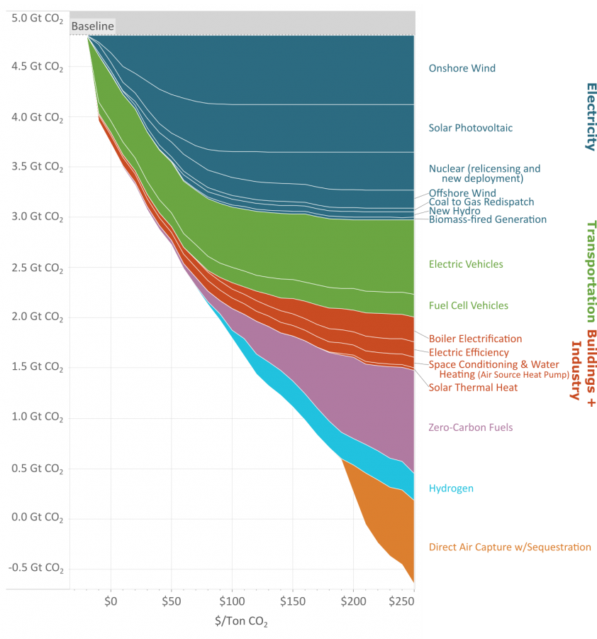
If you need a video to explain your graph, is it really that good of a visualization?
Data Is Beautiful
A place to share and discuss data visualizations. #dataviz
(under new moderation as of 2024-01, please let me know if there are any changes you want to see!)
"carbon capture doesn't make sense" lol
If across the world enough trees were planted to equal the size of Amazon rain forest, that would be 300 billion trees and 7.5Gtonnes CO2
So more than entire graph.
But you need to plant that every year in perpetuity, while still burying the logs so decomposition doesn't release the co2 again.
Why would the logs be emitting CO2 (rotting?) if they are alive and growing?
Because they're only alive and growing till they die and rot. Sometimes trees do both at the same time, rot from the inside out. You can't just plant trees for carbon capture, you also need to deal with how to permanently sequester the carbon.
Let's say that for millions of years a healthy biosphere grew around forests and the balance worked. Now you come to tell us it doesn't. Wouldn't you think it's a bit unconvincing?
We've only been pumping out co2 for a hundred or two years. We can't keep doing that and expect the old balance to hold up.
