this post was submitted on 27 Apr 2024
4 points (100.0% liked)

Data Is Beautiful

6878 readers
1 users here now

A place to share and discuss data visualizations. #dataviz


(under new moderation as of 2024-01, please let me know if there are any changes you want to see!)

founded 3 years ago
MODERATORS
 
top 17 comments
sorted by: hot top controversial new old
[–] Hux@lemmy.ml 2 points 6 months ago (1 children)

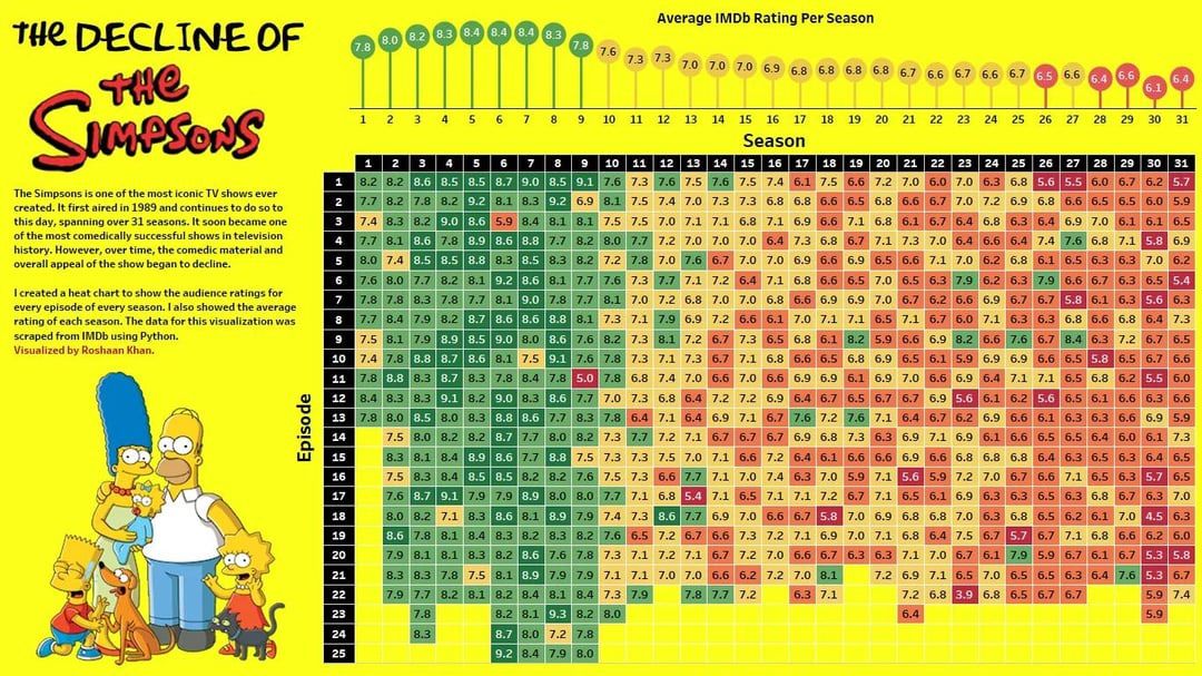
I agree with the graphic.

However, I recently completed a straight watch-thru of every Simpsons episode, and while watching the lackluster episodes from seasons ~20-~30, I have to acknowledge one thing:

Quality of the show and its writing have noticeably improved since around Season 32.

The most recent episodes feel more centered on the family and much less on bizarre cameos and really outrageous situations. It actually feels like a show about the Simpson family and treats the characters more age-appropriately.

I don’t like that they lost/recast established voices of minority characters (Apu, Carl, Dr. Hibbert, etc), I do think the quality and the focus of the show is much better than it has been in almost 2-decades.
[–] protist@mander.xyz 1 points 6 months ago

Dude, that's over 700 episodes, most of which suck ass. Why would you do that to yourself?

[–] TheNanaimoBarScene@lemmy.ca 1 points 6 months ago
[–] Blaze@lemmy.blahaj.zone 1 points 6 months ago

Nice graph!

By the way, any reason to share this here rather than !dataisbeautiful@lemmy.world, as you did for the Boeing one? Genuinely curious

[–] RarePossum@programming.dev 0 points 6 months ago (1 children)

I'm just nitpicking but why are 7.7 and 6.6 arbitrary the thresholds for the colour change? Also, why is one 6.6 red while another two are yellow?

[–] bstix@feddit.dk 0 points 6 months ago* (last edited 6 months ago) (1 children)

It appears that the colours are not on a fixed scale. The season averages and individual episodes are coloured using different ranges.

It ranges from lowest to highest regardless of the value. Like conditional formatting in Excel does if you don't specify the scale.

The seasons average ratings range from 6.1-8.4, so it goes red to green in the span of 2.3 points.

The episodes range from 3.9 to 9.3, so it goes red to green in the span of 5.4 points.

The full IMDb ratings range from 1-10. This should have been used as a basis for the colouring instead. The overall average on IMDb is somewhere around 7, so it would be fine to skew the colours so the middle/yellow was at 7, but it should be able to represent any possible ratings.

[–] deweydecibel@lemmy.world 0 points 6 months ago (1 children)

Should probably also be acknowledged that the sample size is not going to be the same.

You're going to get a bunch of people piling in to highly rate the early episodes that they remember watching when they were kids, but a significantly lower number are going to be voting on the episodes that came later.

Really the whole premise of trying to compare and contrast the seasons for such a long running show that existed before IMDb even started is flawed on many levels.

[–] brbposting@sh.itjust.works 0 points 6 months ago (1 children)

If the music labels are botting up Spotify playcounts, are media producers botting up IMDb ratings?

[–] bstix@feddit.dk 1 points 6 months ago

Yes, it has been observed that IMDb sometimes get a lot of new "single post users" putting in 10/10 ratings on Disney movies that otherwise scored badly.

[–] Setiyeti93@lemmy.ca 0 points 6 months ago (1 children)

A very nice wave seeing the series decline... The only problem with it is it seems a little skewed to have 5.5 in strong red...

[–] ForgotAboutDre@lemmy.world 0 points 6 months ago (1 children)

How people rate things is skewed. 5 really means there isn't anything redeemable about it.

For someone to mark below the midway point it tends to be because they are offended or upset about it. At that point a quality rating isn't appropriate, it should be 0.

[–] deweydecibel@lemmy.world 0 points 6 months ago (1 children)

Why are you assuming that there's some uniform rating standard that every person is committing to?

[–] ForgotAboutDre@lemmy.world 0 points 6 months ago

That's just how humans are. The average rating is 7. If it was perfectly even it would be 5. But it isn't. We are objective or rational when we're asked to put a number to our personal opinion.

[–] Burghler@sh.itjust.works 0 points 6 months ago (1 children)

Why was 9/11 such a poorly rated episode in an otherwise solid season. Hmmm πŸ€”

[–] CoggyMcFee@lemmy.world 1 points 6 months ago

Laughter can’t melt steel beams!

[–] RunawayFixer@lemmy.world 0 points 6 months ago (1 children)

Episode 3 of season 6 is such an outlier. Too much romance for the Simpsons audience apparently.

[–] fishos@lemmy.world -1 points 6 months ago

It's a clip show. Both low rating episodes from the first seasons are clip shows. That's why. Clip shows are typically unpopular, even tho for The Simpsons, each clip is original and not a reair of a previous one. They're "filler" episodes.