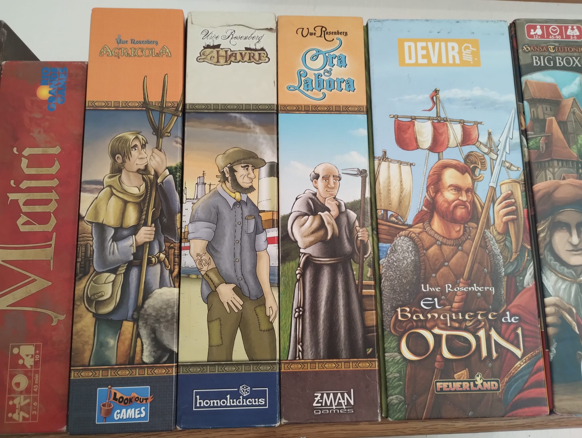
I have four Uwe Rosenberg games. Three of those follow a similar format: game title on top, then a line, then some dude, another line, publisher logo. But Feast For Odin had to go and be all creative and unique.
Everything boardgames
Please stick to English for posts and comments
I have four Uwe Rosenberg games. Three of those follow a similar format: game title on top, then a line, then some dude, another line, publisher logo. But Feast For Odin had to go and be all creative and unique.
Take a cup of tea, it's OK.
The first 3 are designed by Clemens Franz, A Feast for Odin was designed by Dennis Lohhausen. Dunno if that applies to the box design though, but clearly a different visual style.
and all the dudes are facing in the same direction, what are they looking at? Or are they waiting in a queue?