this post was submitted on 01 Nov 2023
213 points (98.2% liked)

Data Is Beautiful

6700 readers
2 users here now

A place to share and discuss data visualizations. #dataviz


(under new moderation as of 2024-01, please let me know if there are any changes you want to see!)

founded 3 years ago
MODERATORS
 

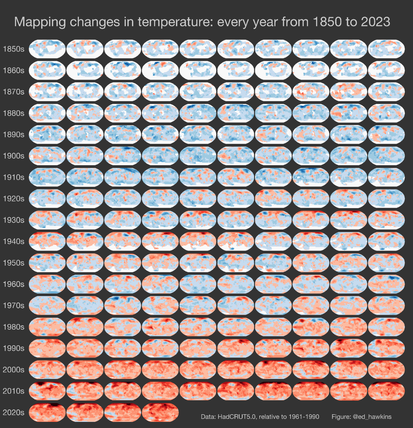
Red indicates a higher average temperature than the previous year; blue the opposite.

source

top 12 comments
sorted by: hot top controversial new old
[–] Fixbeat@lemmy.ml 12 points 10 months ago (1 children)
[–] flint5436@lemmy.world -1 points 10 months ago

This is fine.

[–] Infynis@midwest.social 10 points 10 months ago

dataisterrifying

[–] eager_eagle@lemmy.world 7 points 10 months ago (2 children)
[–] jabathekek@sopuli.xyz 2 points 10 months ago

stress_migraine_meme.jpg

[–] elouboub@kbin.social 1 points 10 months ago

votes for right wing party that doesn't give a fuck about climate change

[–] Nonameuser678@aussie.zone 6 points 10 months ago

Terrifying to think what the next set of images are going to look like.

Glad I decided not to have kids.

[–] Aatube@kbin.social 5 points 10 months ago (1 children)

I really want a full-res view of one of these little pictures so I can know where’s where

[–] otter@lemmy.ca 1 points 10 months ago* (last edited 10 months ago) (1 children)

What little pictures, it's just a photo of a sunrise /s

!misleadingThumbnails@lemmy.ca

[–] Aatube@kbin.social 1 points 10 months ago* (last edited 10 months ago) (1 children)

The time scale on the left is literally in decades, how is this a sunrise

(judging by how you posted it there you don't seem to be joking)

Edit: Huh, so that sub is about illusions in the thumbnail, but I don't really think it looks like that

[–] otter@lemmy.ca 2 points 10 months ago

I should have included the /s, that's my bad 😄

[–] qwertyqwertyqwerty@lemmy.one 4 points 10 months ago

The 2030's will be brown, like burnt toast.