this post was submitted on 27 Nov 2024
703 points (98.2% liked)
Microblog Memes
6086 readers
3819 users here now
A place to share screenshots of Microblog posts, whether from Mastodon, tumblr, ~~Twitter~~ X, KBin, Threads or elsewhere.
Created as an evolution of White People Twitter and other tweet-capture subreddits.
Rules:
- Please put at least one word relevant to the post in the post title.
- Be nice.
- No advertising, brand promotion or guerilla marketing.
- Posters are encouraged to link to the toot or tweet etc in the description of posts.
Related communities:
founded 2 years ago
MODERATORS
you are viewing a single comment's thread
view the rest of the comments
view the rest of the comments

You are both correct. A decade is a perfectly acceptable time frame by which to judge forex, however the two decade window fills in additional context.
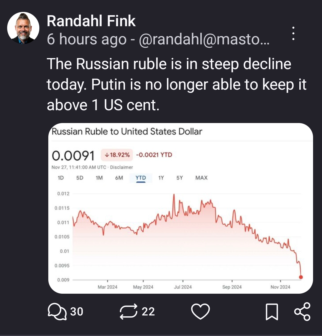
True, but the way I see it, a graph shouldn't be cropped and left without a labeled y axis, especially when making a point about long term-ness.
One narrative is about effectiveness of sanctions, specifically the ones levied at the start of 2022. Zooming out beyond 2015 doesn't really change that narrative (no appreciable effect tied with a change that happened in 2022).
The other narrative relates to Russia's big picture strategy. Undoubtedly by this measure, Russia is underperforming. We might conclude that the sanctions was effective only once, in 2014. Or just a bad economy for another reason that spurred war.
This guy graphs
The issue is the crop has obliterated the starting value