this post was submitted on 18 Oct 2023
307 points (100.0% liked)
196
16224 readers
3321 users here now
Be sure to follow the rule before you head out.
Rule: You must post before you leave.
founded 1 year ago
MODERATORS
you are viewing a single comment's thread
view the rest of the comments
view the rest of the comments
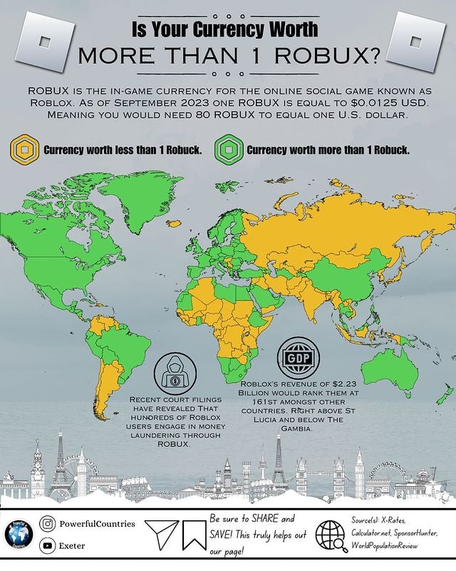
The point of the comment is to point out the common misconception that the value of one [token of a currency] has anything to do with the strength of a currency. As described in the comment, the value of a singular token of a currency can be chosen arbitrarily.
This, of course, doesn't mean the map is factually incorrect.
But the value of a unit of currency being unrelated to the currency's strength had nothing to do with whether that currency has cents or not. That comment just used the wrong explanation to make a correct point.
Also the map isn't entirely useless, because what it does illustrate is currencies which likely suffered from high or hyper-inflation in the past (or are very old). Obviously, no government first issues a currency and says "... and so one loaf of bread is 10000 schmeckles". That's just impractical.
Of course this doesn't mean that then Japanese Yen is a bad currency, but it does make for an interesting historical point.
This, I don't think the map is incorrect, for me it would be more interesting to compare people's wealth than the arbitrary value of a token