this post was submitted on 07 Oct 2023
12 points (73.1% liked)
Data Is Beautiful
6846 readers
2 users here now
A place to share and discuss data visualizations. #dataviz
(under new moderation as of 2024-01, please let me know if there are any changes you want to see!)
founded 3 years ago
MODERATORS
you are viewing a single comment's thread
view the rest of the comments
view the rest of the comments

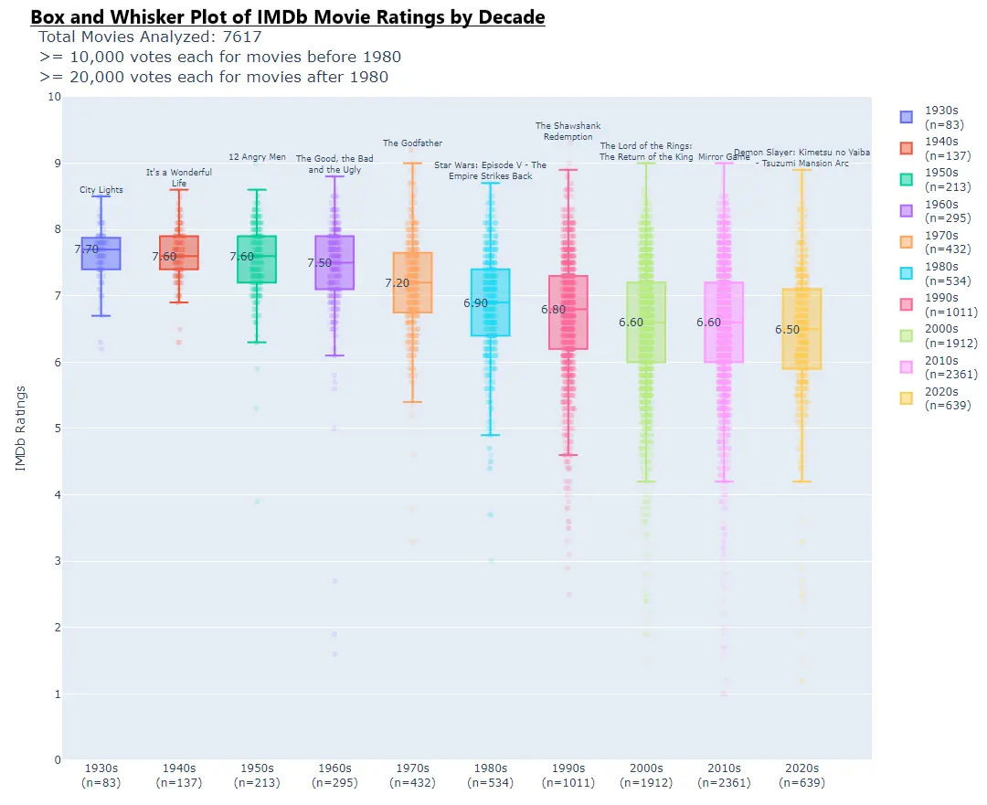
I don't like the horizontal bar graphs (or I guess rather plot points) running along the box and whiskers. They don't have units and don't really help convey much of anything that the box and whiskers didn't already convey. Yes, they are more granular, but that granularity isn't all that useful.