this post was submitted on 17 Aug 2023
32 points (86.4% liked)
Data Is Beautiful
6846 readers
2 users here now
A place to share and discuss data visualizations. #dataviz
(under new moderation as of 2024-01, please let me know if there are any changes you want to see!)
founded 3 years ago
MODERATORS
you are viewing a single comment's thread
view the rest of the comments
view the rest of the comments


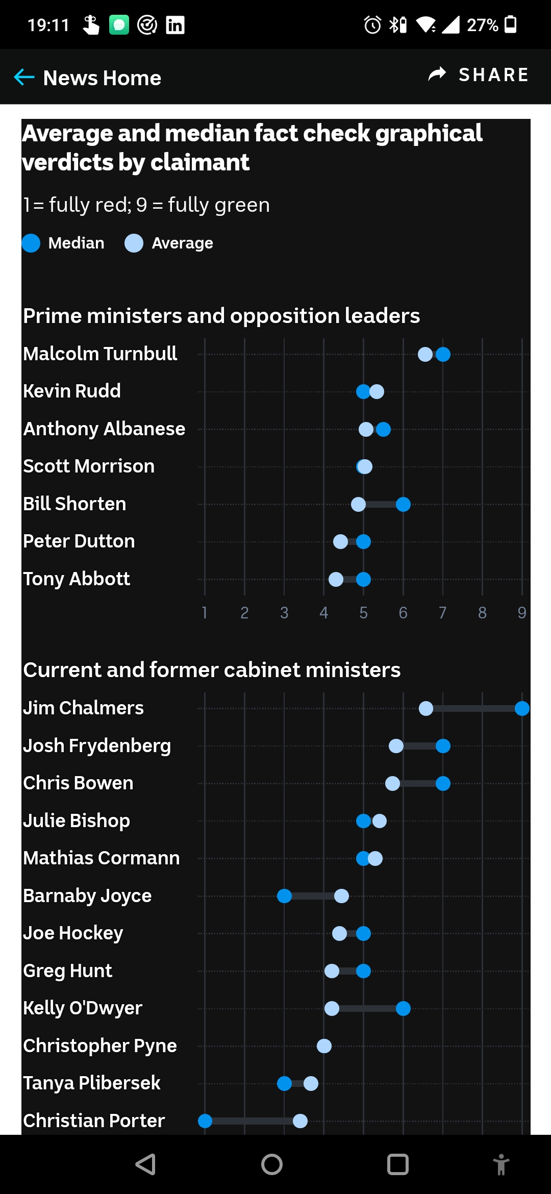
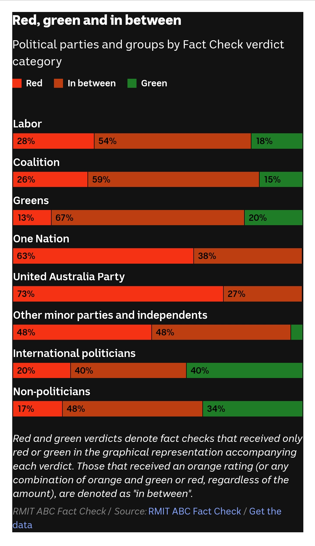
The most useless comparison. If you compare graphs like this created by fact checkers ideologically aligned with any of these parties you get completely different results.
And just by selectively choosing which claims you fact check, you can get whatever results you want for this graph. Just never publish any positive fact checks about one party and you can make them look as bad as you want.
“do not believe any statistic that you haven't forged yourself"
There is no such thing as an objective fact checker, so their very existance is absurd.
There is no arbiter of absolute truth. However, sometimes there are clear cases of falsehood.
This data is from the national broadcaster in Australia which aligns pretty moderate from all studies. The fact that the two major parties show about the same would defeat your hypothesis on its own.
I agree that the data can skew based on choosing what to fact check, but to say this was a long con over 20 years to produce this graph is ludicrous.
Fact checkers are not ideal but the lack of fact checking allows more falsehoods to propagate.