this post was submitted on 23 Jul 2023
682 points (92.0% liked)
Data Is Beautiful
6989 readers
1 users here now
A place to share and discuss data visualizations. #dataviz
(under new moderation as of 2024-01, please let me know if there are any changes you want to see!)
founded 4 years ago
MODERATORS
you are viewing a single comment's thread
view the rest of the comments
view the rest of the comments

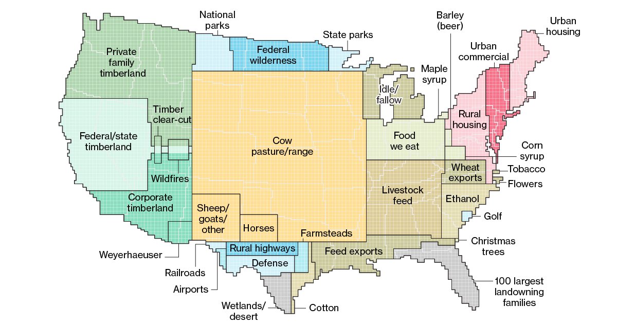
It seems you're misunderstanding the map. It's how much space each of those categories is taking up as a fraction of the total area of the contiguous US, not where that land use primarily occurs.