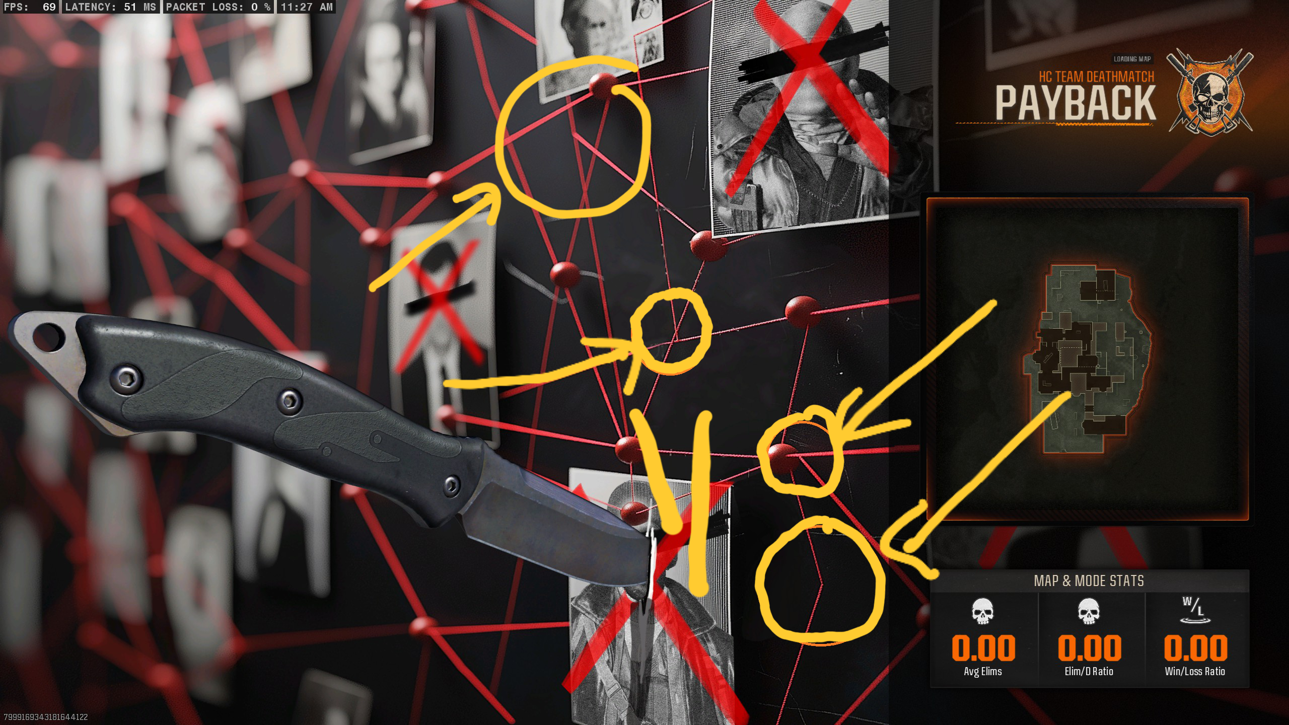
The loading screen with the red string connecting tacks on a board has a bunch of random lines connecting nothing. Alll that stuff looks like AI slop, although the Santa stuff looks even worse than the defaults.

Video game news oriented community. No NanoUFO is not a bot :)
Posts.
Comments.
My goal is just to have a community where people can go and see what new game news is out for the day and comment on it.
Other communities:
The loading screen with the red string connecting tacks on a board has a bunch of random lines connecting nothing. Alll that stuff looks like AI slop, although the Santa stuff looks even worse than the defaults.

I was wondering why the art direction seemed terrible for the event. Everything feels all over the place and generic - apparently cause it is.
I have an unpopular opinion on this photo.
I think it looks really good, I don't care if it has more fingers than normal, it's a known zombie trait to be mutated, it looks natural given the creature.
if it was a human drawing it nobody would be complaining. It would be concidered creative to the world.