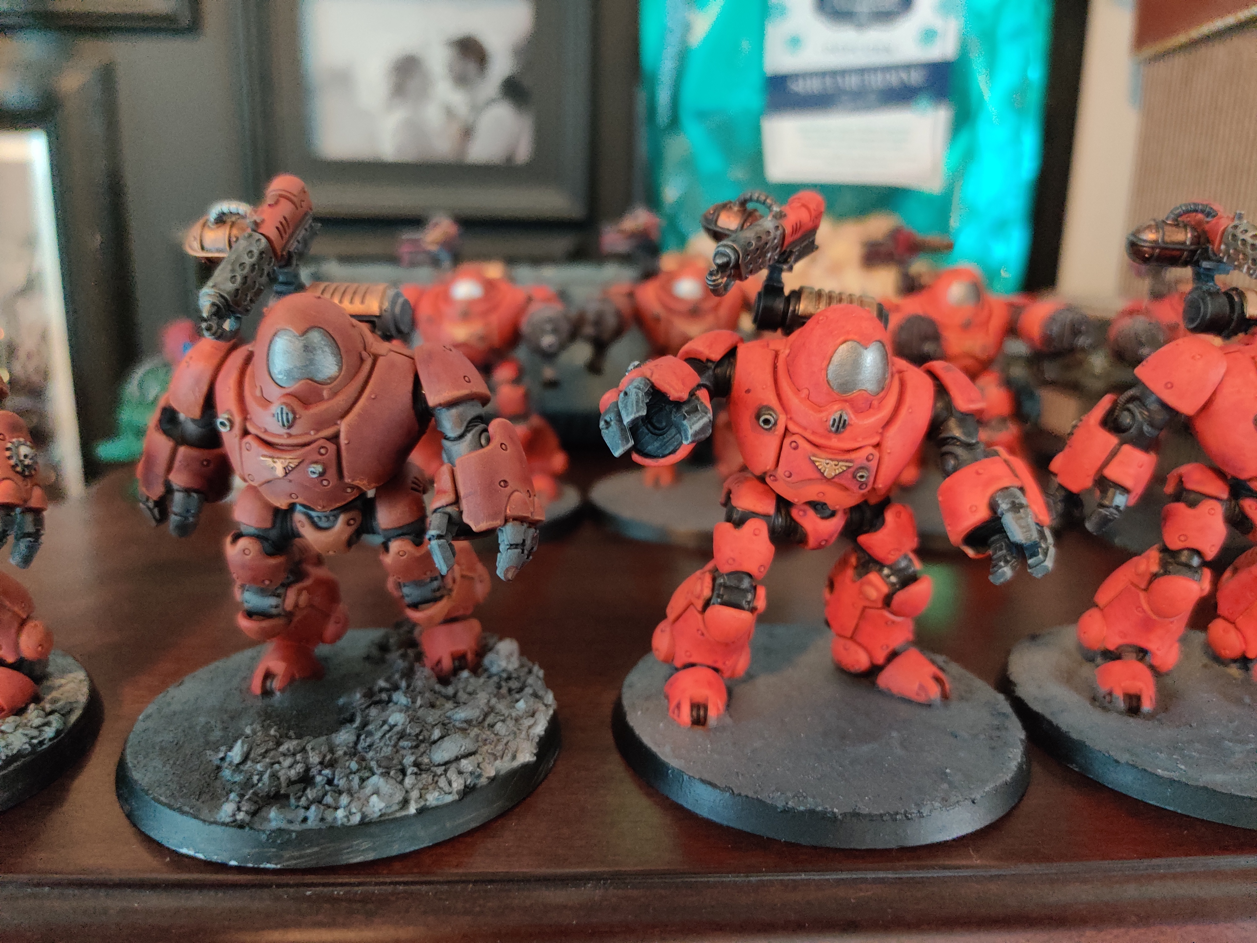
It depends on what you like. I like both for different reasons. I like having pretty high contrast on my minis, so the darks are dark and the colors are vibrant. But some people like the dull look too.
Warhammer 40k
A community dedicated to the universe of Warhammer 40k, a tabletop setting in the far, distant future.
This is a general community for 40k miniatures, art, lore discussion, and gameplay discussion.
Rules
- Keep it civil.
- No memeposts/shitposts. Memes are great but direct them to grimdank.
- Please mark any posts containing realistic nudity or realistic excessive gore/violence as NSFW; this rule mainly applies to cosplay and realistic drawings rather than miniatures. Being that 40k is inherently violent, this is a judgement call, and mods may occasionally request posters add tags.
- No political or social cause agenda pushing.
Helpful Links
- 10th Edition Rules
- iOS Warhammer 40k App
- Android Warhammer 40k App
- 3rd party site for running Kill Team games
Related 40K Communities:
!imaginarywarhammer@lemmy.world
Other tabletop hobby communities:
Dull guy feels much more like he's been around the block a few times. I'd go with that route and lean even more into it.
With respect, I feel that both are halves of very similar end goals. For example, the model on the left (A) has edge highlighting, but lacks much contrast. Whereas, it's counterpart (B) has an abundance of contrast, the larger pieces seem to lack the definition that edge highlighting can produce. While it might be a bit of work to get A & B to each resemble the same C, there are a number of things they don't have in common that their neighbor could benefit from. 🤙🏼
The one on the right needs a goblin green base.
Yeah too third edition 'eavy metal, I see it now
He looks good like that to me
Personally I say go bright.
I'd rather play with or against a garishly bright army than a dark one trying to look grim dark. I'd push some brighter highlights though, right now it looks a little flat and just mixing in a touch of yellow and light glaze should give them more depth.
