this post was submitted on 18 Jul 2023
578 points (95.9% liked)

Voyager

5463 readers
9 users here now

The official lemmy community for Voyager, an open source, mobile-first client for lemmy.

Download on App Store

Download on Play Store

Use as a Web App

Download on F-Droid

Rules

  1. Be nice.
  2. lemmy.world instance policy

Sponsor development! πŸ‘‡

Number of sponsors badge

πŸ’™

founded 1 year ago
MODERATORS
 

Voting has ended! Congrats to @fer0n@lemm.ee with option B. Thanks everyone for participating! :)


First off, thanks to everyone that participated in our icon contest last week!

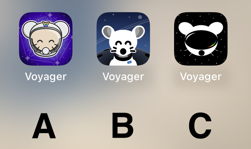
I'm excited to show the final three options for you to vote on below!

Overview

Option A

Option B

Option C

πŸ—³οΈ Vote!

⚠️ BEFORE VOTING I encourage you to tap through the links above to see what it's like on your homescreen!

Results of the poll will not be available until it has ended, so no need to make a rushed decision.

~~VOTE HERE: https://strawpoll.com/BDyNEbKeqZR~~

Strawpoll privacy

~~Polling ends in ~24 hours! If there is a tie, I will cast the final vote.~~

(page 2) 50 comments
sorted by: hot top controversial new old
[–] robocall@lemmy.world 10 points 1 year ago
[–] RIM74@lemmy.world 10 points 1 year ago

I like the C option best for its simplicity

[–] phoneymouse@lemmy.world 10 points 1 year ago
[–] Sandevistan@lemmy.ml 10 points 1 year ago

Option B. I feel like it integrates the Lemmy logo the best.

[–] DekesEnormous@lemmy.world 10 points 1 year ago
[–] Imbaster@lemm.ee 10 points 1 year ago
[–] anon_water@lemmy.ml 9 points 1 year ago
[–] LunchEnjoyer@lemmy.world 9 points 1 year ago

All great! But option B stands out the most and feels like the more natural one. The result of this poll will be good either way :)

[–] STUPIDVIPGUY@lemmy.world 9 points 1 year ago
[–] Venomnik0@lemmy.world 9 points 1 year ago
[–] krnl386@lemmy.ca 9 points 1 year ago

I voted B. In terms of suitability for an icon, I think B is best.

[–] dnick@sh.itjust.works 9 points 1 year ago
[–] scorpiosrevenge@lemmy.ml 9 points 1 year ago
[–] besorgterhase@feddit.de 9 points 1 year ago

I think B is the nicest design wise, but I would’ve loved the more colorful version

[–] Frostwolf@lemmy.world 9 points 1 year ago

Voting for B. A- color and background clashes. C- feels too simple and plain.

[–] alexius@lemmy.world 9 points 1 year ago
[–] Tygr@lemmy.world 9 points 1 year ago

I’ve been using B for a couple weeks now as it is. Obviously I voted B, still love it

[–] Feddit@lemmy.world 9 points 1 year ago (2 children)

Can a PWA have multiple/selectable icons? Like the src in the manifest file gets swapped upon selection or something.

load more comments (2 replies)

I like B the best

[–] a_guy_at_home@lemmy.world 8 points 1 year ago
[–] 5h3r1dan@sh.itjust.works 8 points 1 year ago

Option C please!!!!

[–] tanker405th@lemmy.world 8 points 1 year ago

C is giving off those Daft Punk vibes! I wonder what it would look like with Material You theming? B looks more cohesive. Argh, so tough to choose!

[–] Stiltonfondu@sopuli.xyz 8 points 1 year ago
[–] UhBell@lemmy.world 8 points 1 year ago

Definitely B

[–] Dmian@lemmy.world 8 points 1 year ago* (last edited 1 year ago)

I like the idea of A, but as a Designer, B’s execution is way better and cleaner. Cohesive style, and very fitting for iOS. Sad that A is too cartoony. C is weird, the mouse is flat, and the β€œvisor” (that looks like a huge mouth) is very detailed… don’t like it.

So, B, definitely.

[–] fluffy@lemm.ee 8 points 1 year ago

B by a large margin.

[–] WEAPONX@lemmy.world 8 points 1 year ago
[–] Pietrasagh@lemmy.world 8 points 1 year ago
[–] allforthebest@infosec.pub 8 points 1 year ago
[–] TheLoneBeatle@lemmy.world 8 points 1 year ago

C is my favorite, however, I have grown fond of the original icon, will we be able to choose? Thanks for all you do! Voyager is the BOMB!

[–] vojta637@lemmy.dbzer0.com 8 points 1 year ago

Definitely B

[–] ScOULaris@lemmy.world 8 points 1 year ago

It's B all day. Close the polls because it ain't even close.

[–] srxavi@lemm.ee 8 points 1 year ago
[–] yeather@lemmy.ca 8 points 1 year ago
[–] kbtaco@lemmy.world 8 points 1 year ago

B is my first choice. Most similar to what I used for Apollo. Second choice would be c.

[–] KoofNoof@lemmy.ml 7 points 1 year ago

I like the simplicity of C. The background of B. And the Lemmy of A.

Overall I would pick A

I don't like any of them. That said, I voted for C. It's kinda plain, but that's what I like about it. The other ones are too messy.

load more comments
view more: β€Ή prev next β€Ί