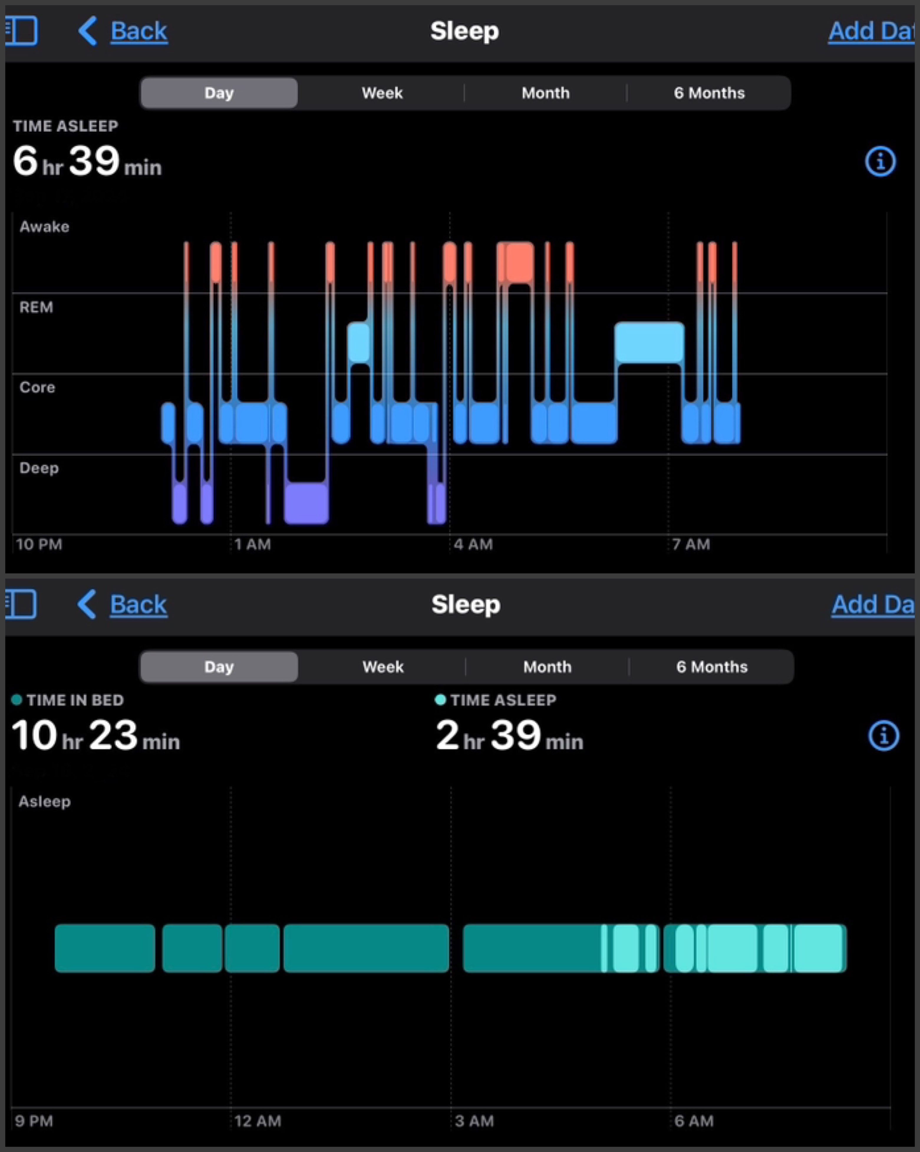
this post was submitted on 18 Sep 2024
3 points (61.5% liked)

Apple

17334 readers
22 users here now

Welcome

to the largest Apple community on Lemmy. This is the place where we talk about everything Apple, from iOS to the exciting upcoming Apple Vision Pro. Feel free to join the discussion!

Rules:
  1. No NSFW Content
  2. No Hate Speech or Personal Attacks
  3. No Ads / Spamming
    Self promotion is only allowed in the pinned monthly thread

Lemmy Code of Conduct

Communities of Interest:

Apple Hardware
Apple TV
Apple Watch
iPad
iPhone
Mac
Vintage Apple

Apple Software
iOS
iPadOS
macOS
tvOS
watchOS
Shortcuts
Xcode

Community banner courtesy of u/Antsomnia.

founded 1 year ago
MODERATORS
 

I did look within the health app, but I do not find the interface hierarchy to be at all intuitive, and it’s very difficult to locate relevant information.

top 8 comments
sorted by: hot top controversial new old
[–] thisisdee@lemmy.world 1 points 2 weeks ago (1 children)

Do you mean this is the same sleep data for the same day and asking why the data itself is different? Or are you asking why they look different regardless of the data represented?

You said it’s very difficult to locate relevant information, is there anything specific you’re looking for?

[–] Reverendender@sh.itjust.works 1 points 2 weeks ago (1 children)

Sorry, this is sleep data for the same person for two different days

[–] thisisdee@lemmy.world 2 points 2 weeks ago* (last edited 2 weeks ago) (1 children)

In my experience, the top more detailed view is available when I’m wearing Apple Watch to sleep. The bottom view is just based on other devices (e.g. when I stop using my iPhone and put it down to charge, combined with my sleep schedule data)

[–] Reverendender@sh.itjust.works 1 points 2 weeks ago

Yeah it seems like some days it just doesn’t have Apple Watch data, which I cannot figure out. Those views in the image are two different days by the way. I collaged two images together.

[–] sp3tr4l@lemmy.zip 1 points 2 weeks ago* (last edited 2 weeks ago) (1 children)

Is this data from the same person?

If yes, probably some kind of error is going on, idk what though.

If no, the upper person has sleep apnea.

EDIT: Ok on second look these are two different graphs, presumably of the same night... with the upper one likely tracking heart rate and movement to guess at sleep stage, and the bottom just... location in bed vs some level of deep sleep?

Yeah I don't know, either its configured wrong, its not sensing correctly, or you have sleep apnea.

[–] Reverendender@sh.itjust.works 1 points 2 weeks ago* (last edited 2 weeks ago) (1 children)

Sleep apnea is yes, I know. These are the same person on two different days though.

Ok, it seems that it’s greenish when it does have data for the other color categories. Why it does not have data I have no idea, but that’s a separate question.

[–] sp3tr4l@lemmy.zip 1 points 2 weeks ago* (last edited 2 weeks ago) (1 children)

Ok, if its the same person with sleep apnea and two different days, then what you're looking at is two different data views or visualizations.

The top graph is more detailed, showing many different sleep states in detail, while the bottom is a more general, summarized view of just 'in bed' vs 'good quality sleep'.

Probably the bottom graph is showing a more dull green for just being in bed vs the brighter green showing either just deep sleep, or core sleep plus deep sleep.

Somehow an option has been changed so that now you're getting the simplified/summarized view.

[–] Reverendender@sh.itjust.works 1 points 2 weeks ago

I agree, except it seems like which view is displayed on a given day is random.