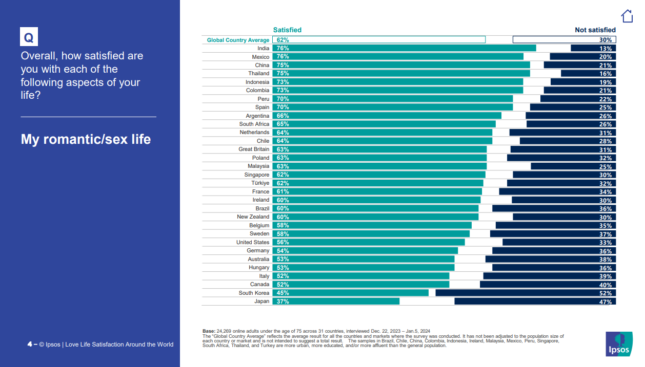
India and Mexico say the same percentage but the bars are different sizes. Either the data or the bars are inaccurate, this data is not beautiful :(
this post was submitted on 15 Feb 2024
-1 points (0.0% liked)
Data Is Beautiful
6878 readers
1 users here now
A place to share and discuss data visualizations. #dataviz
(under new moderation as of 2024-01, please let me know if there are any changes you want to see!)
founded 3 years ago
MODERATORS
