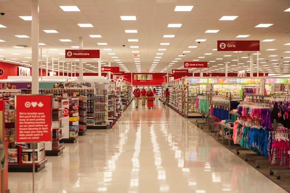
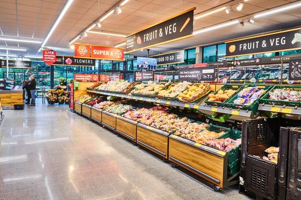
I'm not in the US but what makes you feel this is run down?
Mildly Infuriating
Home to all things "Mildly Infuriating" Not infuriating, not enraging. Mildly Infuriating. All posts should reflect that.
I want my day mildly ruined, not completely ruined. Please remember to refrain from reposting old content. If you post a post from reddit it is good practice to include a link and credit the OP. I'm not about stealing content!
It's just good to get something in this website for casual viewing whilst refreshing original content is added overtime.
Rules:
1. Be Respectful
Refrain from using harmful language pertaining to a protected characteristic: e.g. race, gender, sexuality, disability or religion.
Refrain from being argumentative when responding or commenting to posts/replies. Personal attacks are not welcome here.
...
2. No Illegal Content
Content that violates the law. Any post/comment found to be in breach of common law will be removed and given to the authorities if required.
That means: -No promoting violence/threats against any individuals
-No CSA content or Revenge Porn
-No sharing private/personal information (Doxxing)
...
3. No Spam
Posting the same post, no matter the intent is against the rules.
-If you have posted content, please refrain from re-posting said content within this community.
-Do not spam posts with intent to harass, annoy, bully, advertise, scam or harm this community.
-No posting Scams/Advertisements/Phishing Links/IP Grabbers
-No Bots, Bots will be banned from the community.
...
4. No Porn/Explicit
Content
-Do not post explicit content. Lemmy.World is not the instance for NSFW content.
-Do not post Gore or Shock Content.
...
5. No Enciting Harassment,
Brigading, Doxxing or Witch Hunts
-Do not Brigade other Communities
-No calls to action against other communities/users within Lemmy or outside of Lemmy.
-No Witch Hunts against users/communities.
-No content that harasses members within or outside of the community.
...
6. NSFW should be behind NSFW tags.
-Content that is NSFW should be behind NSFW tags.
-Content that might be distressing should be kept behind NSFW tags.
...
7. Content should match the theme of this community.
-Content should be Mildly infuriating.
-At this time we permit content that is infuriating until an infuriating community is made available.
...
8. Reposting of Reddit content is permitted, try to credit the OC.
-Please consider crediting the OC when reposting content. A name of the user or a link to the original post is sufficient.
...
...
Also check out:
Partnered Communities:
Reach out to LillianVS for inclusion on the sidebar.
All communities included on the sidebar are to be made in compliance with the instance rules.
How is this mildly infuriating
It’s mildly infuriating because op doesn’t like the color scheme, therefore it’s “run down”
If you eat inflammatory foods every day, anything can be mildly infuriating
If this is "run down" I wanna see what you would consider normal.
So in other words "yes" 😁. Honestly the floors look clean, stuff is on shelves, I have no idea what OP is complaining about.
I assume they mean more like... Sterile? Walmart always puts me off by how cold and uninviting it is. Just a white warehouse with metal shelves, fluorescent lights, and linoleum floors. There's no life to them like other smaller stores.
You had me zooming in looking for something. Like others have said, this is the "passing the savings along to you" look.

Target is a little more lively with an actual ceiling and brighter color scheme, but it's really the same thing with a little extra polish.

This is a Giant Supermarket. Same overall feel as the Walmart, but slightly less warehouse like to make things look more appetizing.

Aldi has done a pretty good job of remodeling. It's a value brand store where just about everything is store label, and it used to look rougher than Walmart. Now it's become almost trendy and chic, but prices are still good. Makes the others really look like penny pinchers.
Aldi has really cleaned up it's act in the last decade or so, but so have all the other grocery stores in my area. Customers want to have a luxury feel and passing along the savings really isn't necessary if supermarkets syndicate themselves properly.
Seriously though, what's wrong with them? Have I been living in a dump and not realizing it?
This is how most supermarkets (Walmart/Kroger/Target, etc.) in the U.S. look brand new - they're effectively warehouses that sell product directly to customers. Smaller shops and boutiques have finished ceilings that hide the ductwork and such because they're meant to be more flexible commercial/office space, but large stores like this do not, except for specialized locations like electronics, jewelery, or pharmacy, that can be gated off from the rest of the inside of the building for reduced operation and security.
WDYM run down? Bro that looks really good.
Looks like a normal grocery store to me. If you want run down looking you should see what family dollar stores look like.
Or a K-Mart. Any of them.
LOL, what K-Mart? They're (rightfully) long gone, at least from around here.
Apparently they are still around in Australia. They just had a Hamas related marketing snafu.
It was the first store I thought of but I haven’t seen one in years. The ones here made family dollar look good and Walmart look upscale.
Yeah dollar stores are the worst. They usually only have 1 or 2 employees and everything is everywhere. I don't blame the employees, the store management needs to hire enough people to staff the fucking things.
Ignorant American here: what looks "run down" about it?
Boy oh boy. Go to some of the save-a-lots in Cleveland OH. You’ll see the “run down” feeling. It’s just supposed to be the cheapest store to buy stuff, which makes sense they don’t go all out
The big box store chain esthetic. Ostensibly about passing value onto the customer (we put a roof over the products, what more do you want?) but probably more about maximizing shareholder value.
In fairness from the perspective of someone who has had to pull a lot of network cable in buildings before, drywall ceilings SUCK, drop ceilings are fine but can really be a pain, and open ceilings are chefs kiss soooooo much easier to work with. I promise that's true for your HVAC, fire sprinklers, electrical/lighting, and plumbing guys too. Particularly when you have to work on a scissor lift for those high ceilings, rather than on a 6ft ladder. From a practicality standpoint, open ceilings are way better for maintenance and new installations.
This can’t be a walmart in america, where are the 50 american flags?
It’s not, it’s a Meijer (Midwest chain).
Could probably be me being ignorant, but how does this look "run down" exactly? It looks like a Walmart, and them looking like this is not strictly a US thing. Walmarts look exactly like this in Mexico too, and from what ever little I seen of em, also look the same in Canada.
But to answer your question, no. Not all shops in the US look have the Walmart look.
European here: looks perfectly normal to me.
Ever been to a dollar store?

The reason is that they often need to have just 1-2 employees to cut costs and stay competitive.
Are those stains or shadows?
Yes
Looks like a typical Walmart.
In the US I don't really shop at a lot of these big name department/supermarket stores but I appreciate the deprioritization of superfluous building fashion.
But from what I understand, if you compare our hospitals to those abroad, the values are flipped on their head. We have granite marble waterfront facilities with grand fountains in the lobby and the patients and health care staff are treated like ass, we have poor outcomes that bankrupt us. But at least the place we shouldn't want to be in looks sharp.
Hmm. I wonder if our hospital architecture affects medical staff’s attitude toward patients. Perhaps hospitals should be more down to earth, to elevate the patients, like the Temple of the Human Spirit
You should see Walmart in Canada. Makes US Walmart look like a luxury store.
Pretty much par for the course for a Walmart/any other store like it. Also they look exactly the same in Canada. Cruddy lighting, cheap beige laminate floors... Bleh.
Yeah this is what they look like unfortunately. When it comes to size, decoration tends to suffer
As a retail manager, it looks fine? If the people in front of you are all waiting to check out, they should probably grab people from other departments to cover a few extra registers for a bit, but the store itself looks nice to me.
Nah, usually some of the lights are out and there is mushy spots on the ceiling.
I think it's a size thing. At some point it just doesn't make sense to put in a lowered ceiling, because it costs a lot of money for no purpose and still looks like shit. Large stores in Europe also have visible airducts and supports etc.
Also, some malls have rules for what tenants are allowed to do with it, either for safety reasons (water sprinklers/fire alarms) or just because they don't want to repaint or remove whatever the tenant did with it before they went bankrupt.
When you shop at big box stores, the money leaves the community and goes to the wealthy 0.01%ers.
But the evil of their methods is that typically once they move in there's literally no other options left. Everything else either goes out of business or your wages drop so low you can't afford anything else.
These are a blight on American society.
These types of stores didn't used to be possible for various reasons. But removal of anti-trust regulations and a focus on car-centrism have enabled this hellish combo of monopolistic box stores that can pop up, kill the competition and leave a wasteland behind in which it is both financially and legally impossible for the local population to bring back local stores.
Local stores tend to be in the older town areas where dense-buildings were once legal, and are grandfathered in. These get bought up and flattened and replaced with a mcdonalds or a gas station while the walmartification is in full swing. Then once walmart implodes there because no one can afford it anymore, walmart closes and the other chains close as well. No one can afford to replace walmart or the gas stations at scale for the obnoxious amount of land they use, but they also can't replace them with more dense buildings because its literally illegal.
That is from the dystopian hellscape that is known as Walmart lol, not all shops look this way but it is an extra depressing take on big box stores.
This is what every Meijer I've been to looks like. Yes, this is a Meijer, not Walmart.
Actually looks pretty clean to me. The ceiling having nothing but beams is pretty standard issue.
As a Texan, I'd be remiss if I didn't post about HEB:
Practically every store is different, they tailor them to the neighborhoods they're built in.
https://thcshoanghoatham-badinh.edu.vn/descubrir-70-imagen-heb-interior/
What's wrong with it?
