this post was submitted on 11 Jul 2023
5 points (57.6% liked)
United States | News & Politics
7211 readers
659 users here now
founded 4 years ago
MODERATORS
you are viewing a single comment's thread
view the rest of the comments
view the rest of the comments

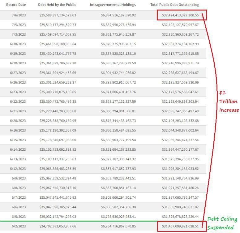
To be fair the web site does a terrible job at presenting the information since it only gives you a couple of of datasets at a time, so the screenshot makes it easier to see the difference. Although I agree that having the link in the URL field and the image on the body would have been better, I guess.
What would have been better is ... anything honestly. Any kind of interpretation or findings. Or, if that's asking too much, even a vague thesis statement.
This is definitional low quality and the OP should be embarrassed by it.