this post was submitted on 21 Oct 2024
854 points (98.9% liked)
RetroGaming
19471 readers
213 users here now
Vintage gaming community.
Rules:
- Be kind.
- No spam or soliciting for money.
- No racism or other bigotry allowed.
- Obviously nothing illegal.
If you see these please report them.
founded 1 year ago
MODERATORS
you are viewing a single comment's thread
view the rest of the comments
view the rest of the comments

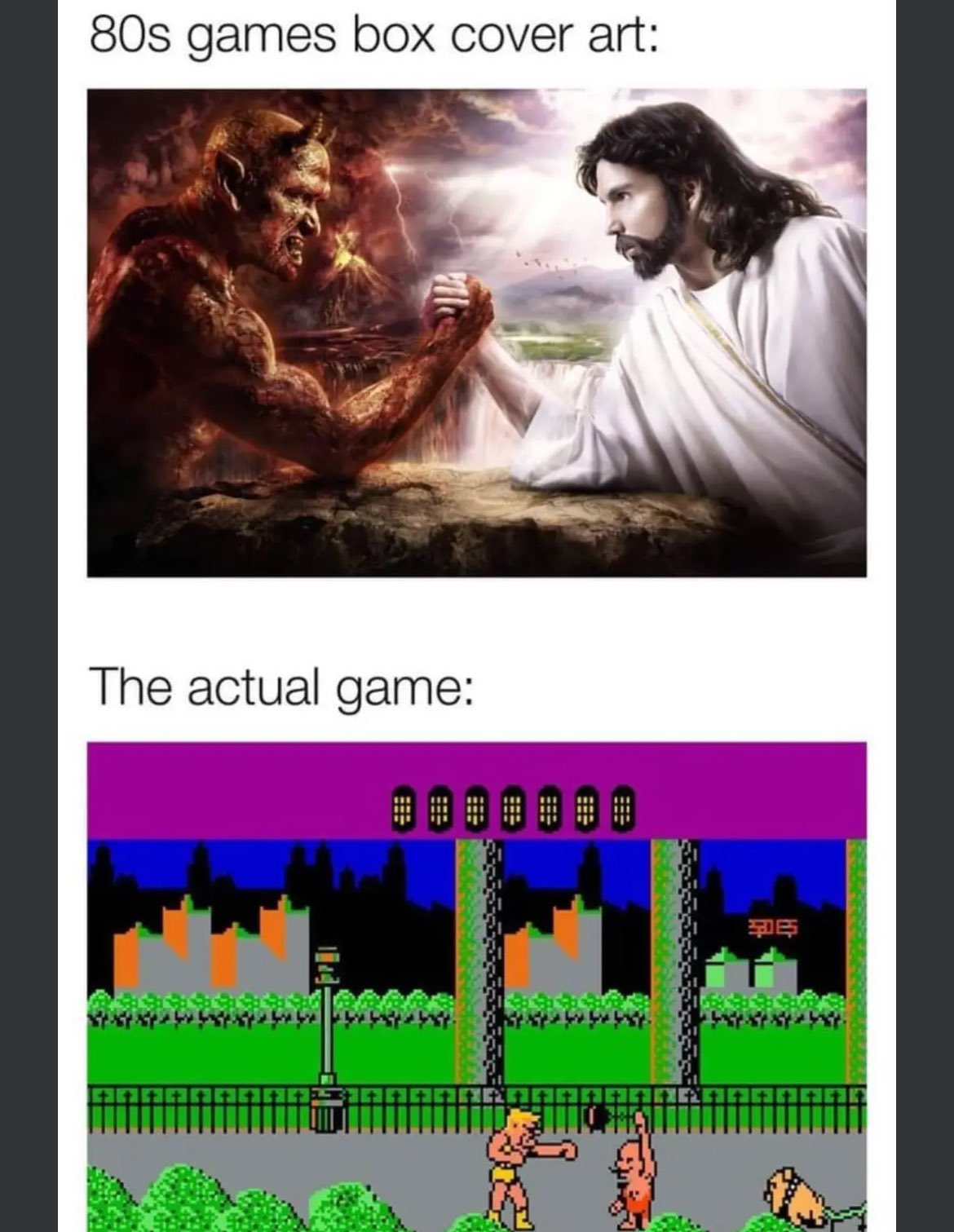
Back in the day, deep down you knew what you were really getting. I'm a little annoyed these days when indie games use marketing visuals that look like they could be in-game for a modern title and then it's all pixel art style. I get that you don't make a pixel art poster, but in that case, go all-in on an art cover don't let it be mistaken for game graphics.
The first game that always comes to my mind in that regard is Super Time Force Ultra. It kept showing on my steam page for weeks on end years ago, with a cartoony-looking cover and "minimalistic pixel" style for actual gameplay