this post was submitted on 03 Jun 2024
121 points (94.8% liked)
KDE
5284 readers
162 users here now
KDE is an international technology team creating user-friendly free and open source software for desktop and portable computing. KDE’s software runs on GNU/Linux, BSD and other operating systems, including Windows.
Plasma 6 Bugs
If you encounter a bug, proceed to https://bugs.kde.org, check whether it has been reported.
If it hasn't, report it yourself.
PLEASE THINK CAREFULLY BEFORE POSTING HERE.
Developers do not look for reports on social media, so they will not see it and all it does is clutter up the feed.
founded 1 year ago
MODERATORS
you are viewing a single comment's thread
view the rest of the comments
view the rest of the comments

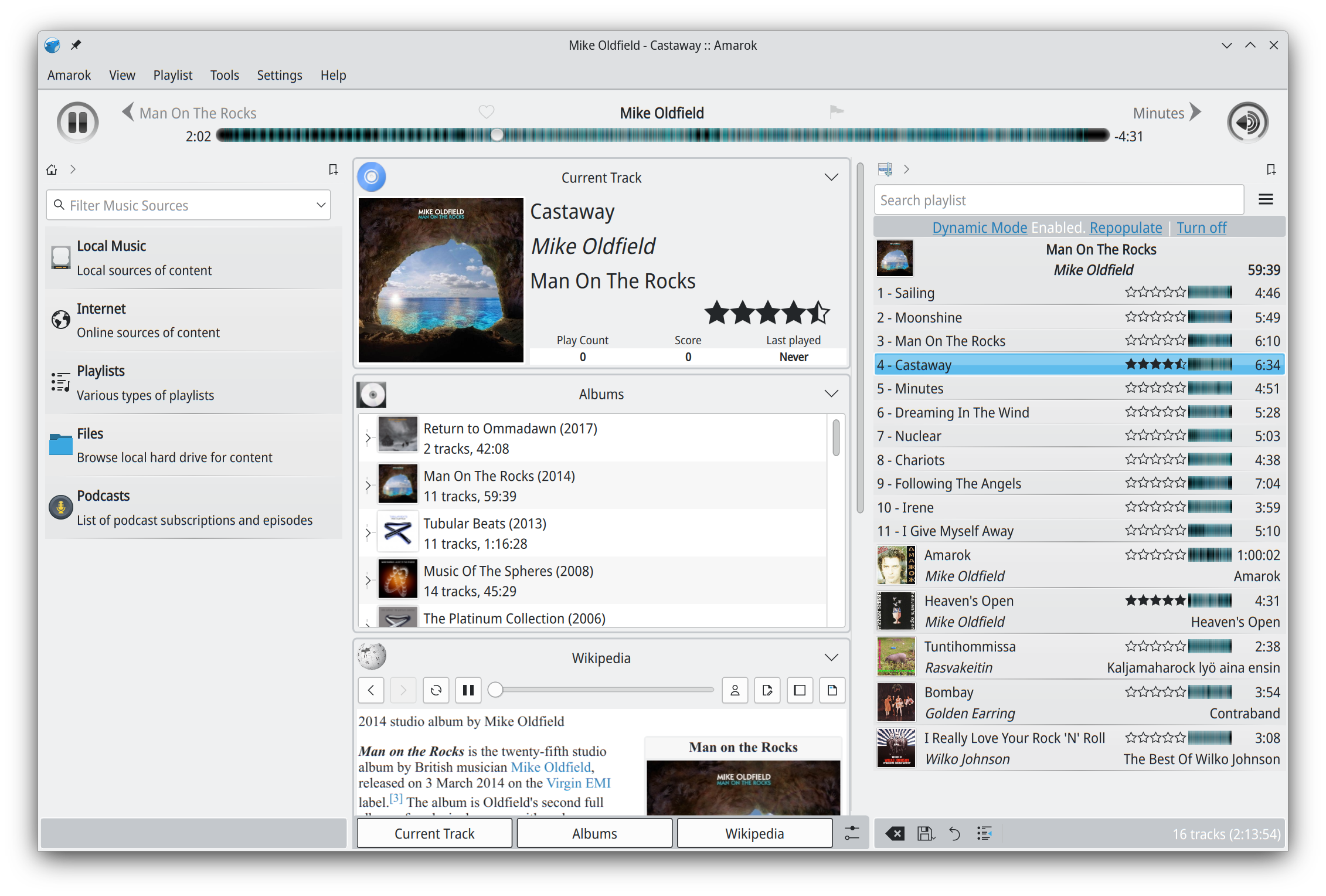
What, the grey bars? Crappy is a rude way of putting it, but yes they look pretty bad. I think that's probably an artifact from the Qt4 days. It looked fine with Oxygen. Rest looks fine to me. If you think it looks busy, well the screenshot has a lot of panels enabled, just to showcase the features. IIRC many of them are not shown by default and a user would only keep the ones they need, since the interface is customizable.
I’m not trying to be “rude.” But the line height, weird font sizes, spacing between elements. Just everything about it screams function over form. There is a way to have both. Most software that adheres to modern design principles have overcome the “janky” UI
@tsonfeir @leopold I think they're more focused on fixing build errors and putting out a release for now, and leave UI updates for later. So we're stuck with the old look for this release.
Whatever you do, don’t say it looks “crappy,” The abusive mods will remove your comment!!
We can always say positive things in the sub.
And therefore, this looks about as beautiful and modern as Windows 3.1.