this post was submitted on 06 Mar 2024
156 points (94.8% liked)
Climate - truthful information about climate, related activism and politics.
5461 readers
562 users here now
Discussion of climate, how it is changing, activism around that, the politics, and the energy systems change we need in order to stabilize things.
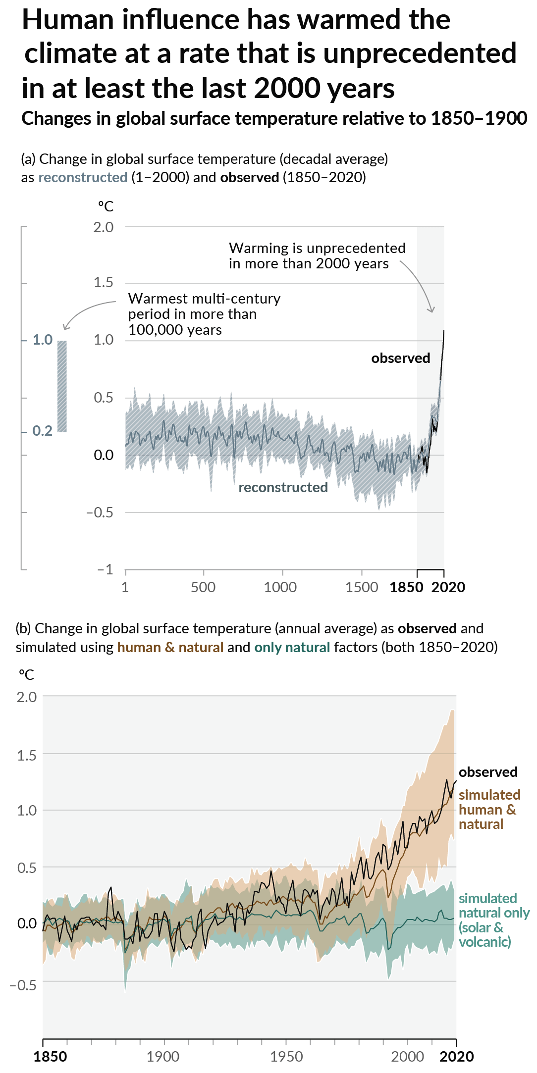
As a starting point, the burning of fossil fuels, and to a lesser extent deforestation and release of methane are responsible for the warming in recent decades:

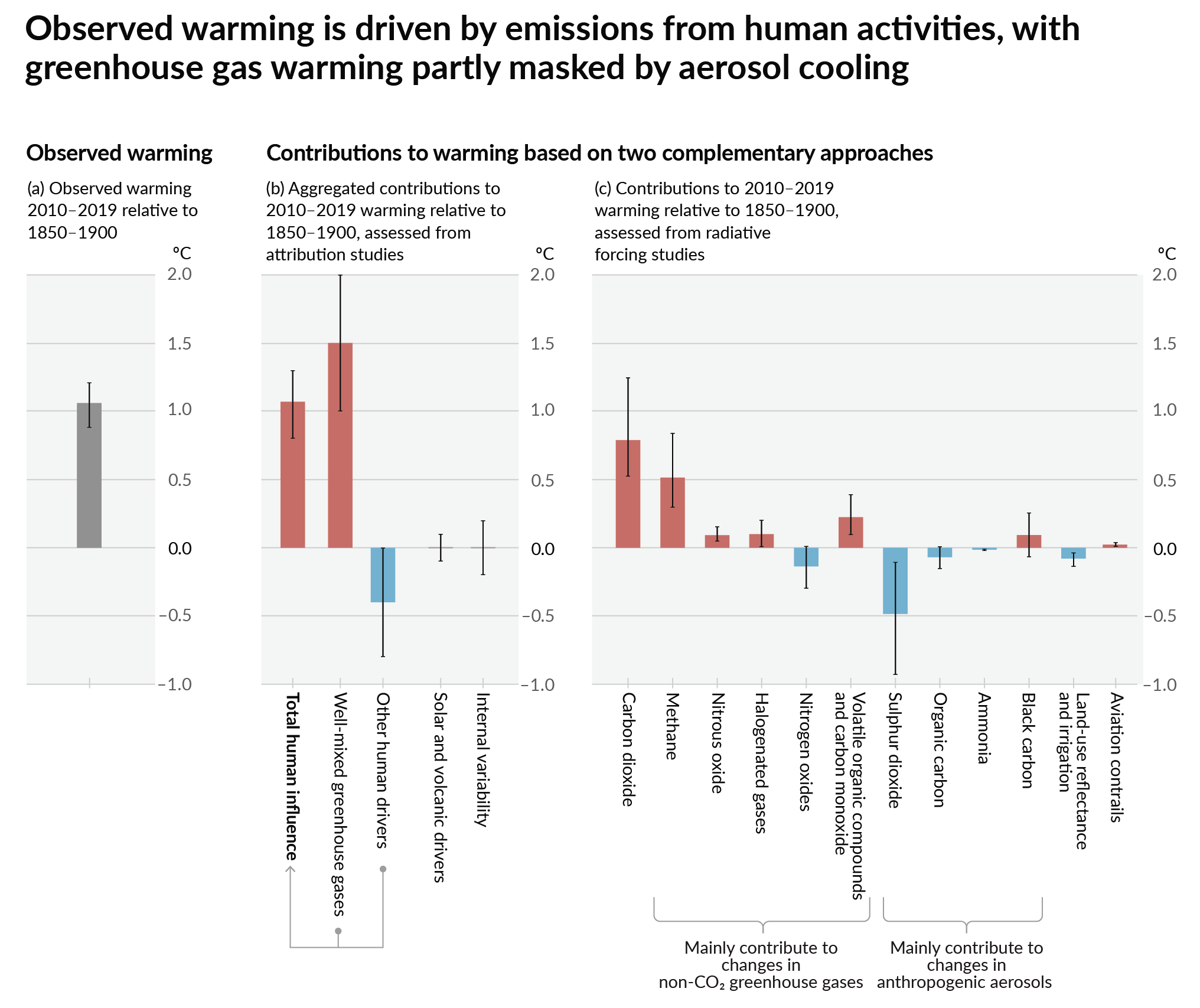
How much each change to the atmosphere has warmed the world:

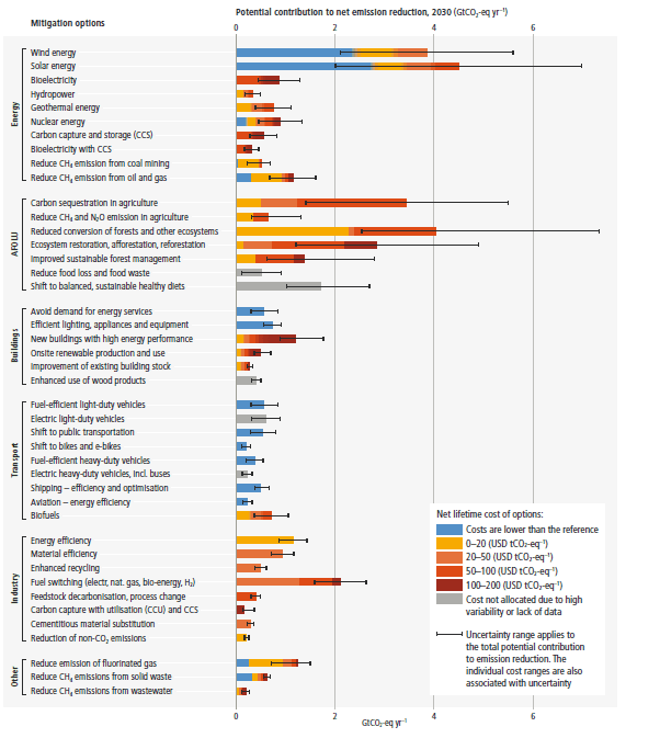
Recommended actions to cut greenhouse gas emissions in the near future:

Anti-science, inactivism, and unsupported conspiracy theories are not ok here.
founded 2 years ago
MODERATORS
you are viewing a single comment's thread
view the rest of the comments
view the rest of the comments

I think it's referring to the yellow-shaded portion between the energy contained and energy gained. The energy contained is the potential chemical energy that is released when burning in the form of heat. We can only harness so much of that energy as no system is flawless like the theoretical Carnot engine. The theoretical amount you can gain compared to amount actually captured is the efficiency, so this graph is meant to highlight how inefficient coal burning is.
And while, on paper, renewable energy is less efficient in that a smaller percentage of energy can be captured, we are also not losing something in exchange for that inefficiency since there is no fuel involved. We just get less than we'd like. Everything not captured from burning coal is not just a waste of resources, but also adds things that are a detriment to the environment like greenhouse gases. It's harder to get as much from renewable sources, but they're also not making the problem worse at anywhere near as big a scale.
The graph is poorly labeled, as it should only refer to the gap, but implies the full value of energy contained instead of the difference between energy gained and electricity obtained. But I think it's valid