Accidental Renaissance
AccidentalRenaissance is for photos that look like Renaissance paintings.
This means that they look like Renaissance art in their composition, their coloring, their saturation, the angle of the scene, the types of settings, etc.
👉 Must be a photo. Not a meme, drawing, art, ai-generated or ai-enhanced image, screenshot, low-effort post, meta posts, video, or anything else but a photo.
👉 Must be SFW. No gore, porn, extreme violence, blood, corpses, or similarly disturbing content. Absolutely no pornography, even if it's "tasteful".
👉 Comments must be civil. No slurs of any kind or using words to insult, demean, harass, or abuse other individuals or groups.
👉 The Renaissance part (not the photo itself) must be accidental to the photograph. In other words, no photos of Renaissance fairs, people dressed in medieval/Renaissance clothes, etc.
👉 NO influencer selfies, professional photoshoots with watermarks, any type of OnlyFans-like content. We are not the place to work your side-hustle.
📸 If you know who the photographer is, give them credit in the comment section. This is the only type of self-promotion we allow.
👩🦯 Alt-Text for vision-impaired users in the post body or in the comments is highly encouraged. Just pretend you are describing a photo to someone on the phone.
🤘 Created by the former mod team of r/AccidentalRenaissance
view the rest of the comments

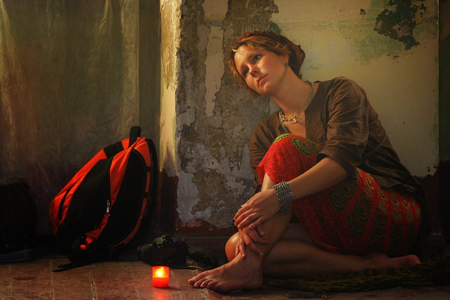
The colors look photoshopped, too, to make it look more like a painting. I find it hard to believe it came out of the camera like this
More like "lightroomed" and that's a normal step in photography. The colours are extreme and that was a choice. One that I don't quite understand because when reducing saturation, I like it better and I don't think it looks less like a painting. Probably not much about this picture is accidental, which doesn't fit the spitit of this community, but in my opinion it's a great pic.