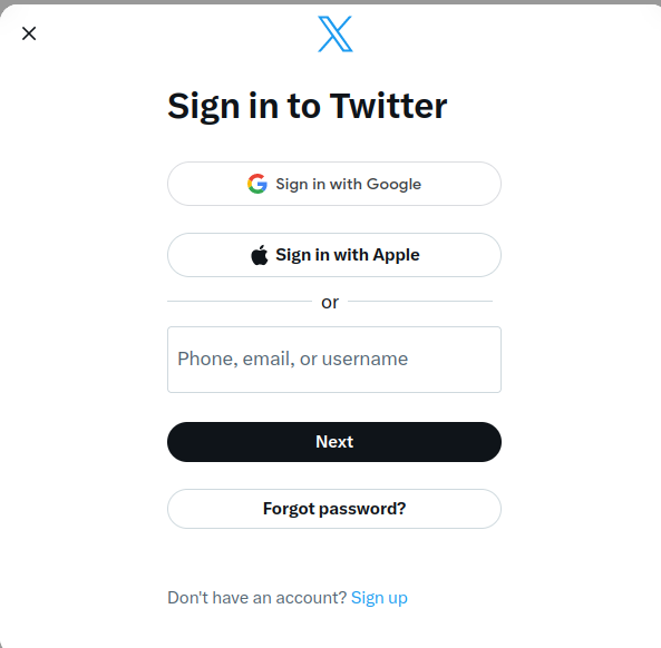
Typo. The devs meant to type "Xitter" (pronounced Shee'ter), but old habits die hard.
Bad UI Battles
E̖̰͚̠̟̗ͨͫ̚͠͡r̶̢͕̠̹̙̞̯̠̄̏̐̈́ͦͫ͛̿ͨr̴̞̪̦̖̊̄̈́̐o̘͛͐͒ͬ́͜ŗ̶̲̥̣̟̠̭̫̯ͪ̏͒̀ ̷̜̻̝ͦ̀̾̏͢͞ļ͈̺̟̹͔̔̄̊̓͐͟o̶̷̶͕͎̲̙͆͐́̓̃a̛͇̼ͥ͂ͬ͐ͦ͒̽͜ḑ̔͂̊͛͗̓͏̞̤̮̦i̴̞̬͍͔̖̝͓͆ͣ͢ņ̵̮̄́ǧ͎̈̂̓̍̇̽̇̕͡ ̧̗̻̙̣̤̖͑ͬ̓̊ͪ̋ͭs̵̥̯͇͔̦̞̖̘̓͒̆͑͘͟ì҉̛̼̖̭d̷̝͓̟̗̽ͦe̶̸̼̻̲̘ͩ͌́́ͬ͡ͅb̡͓̗̫̫̔̑ͥͤͫ̏̇̿͜a̴̶̾̓͛͏̻̲̠̤͍ȓ̡̟̲̼̱͓̀̐̈ͥͣ͜͞
For intentionally bad and silly user interfaces.
What do I submit?
- A video, gif, or link of your UI in action
Can I share the UI/source code in the comments?
- Yes, please do. It's fun to play with your projects.
- Please leave the source code as a git service (or similar service) link
RULES
-
Be kind. We're here to have fun
-
No racism, sexism, or other kind of discrimination will be tolerated.
-
All posts must be a video/gif submission for an intentionally bad UI design or a request for an intentionally bad UI
Icon base by Skoll under CC BY 3.0 with modifications to add a gradient
Oh, come on. At least center align the text. What is this, amateur hour?
Yeah, first thing I noticed. Why tf aren't the Twitter header and the text at the bottom center aligned.
Musk is such a dumbass. He thinks all he has to do to rename it to X is change the logo, do a domain redirect, and change the name in less than 1% of the places it needs to be changed. Most large companies would have all this in place before going live with it.
Honestly Im not so sure, he do exactly what was Trump did: he creating news by doing questionable things and forcing us (and other people) to talk about Twitter.
Hi, this community is for intentionally bad UI/UX. This may be better suited to !softwaregore@lemmy.world instead.
