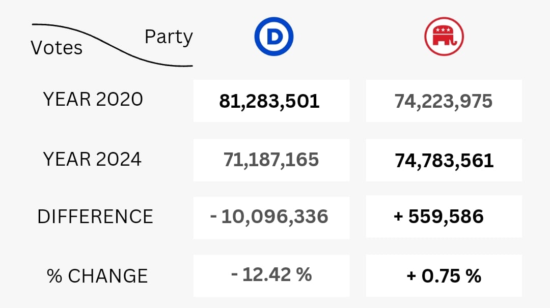
I'm reporting this. Not beautiful. Very painful. Make me cry.
Data is Beautiful
A place to share and discuss visual representations of data: Graphs, charts, maps, etc.
DataIsBeautiful is for visualizations that effectively convey information. Aesthetics are an important part of information visualization, but pretty pictures are not the sole aim of this subreddit.
A place to share and discuss visual representations of data: Graphs, charts, maps, etc.
  A post must be (or contain) a qualifying data visualization.

  Directly link to the original source article of the visualization
    Original source article doesn't mean the original source image. Link to the full page of the source article as a link-type submission.
    If you made the visualization yourself, tag it as [OC]

  [OC] posts must state the data source(s) and tool(s) used in the first top-level comment on their submission.

  DO NOT claim "[OC]" for diagrams that are not yours.

  All diagrams must have at least one computer generated element.

  No reposts of popular posts within 1 month.

  Post titles must describe the data plainly without using sensationalized headlines. Clickbait posts will be removed.

  Posts involving American Politics, or contentious topics in American media, are permissible only on Thursdays (ET).

  Posts involving Personal Data are permissible only on Mondays (ET).
Please read through our FAQ if you are new to posting on DataIsBeautiful. Commenting Rules
Don't be intentionally rude, ever.

Comments should be constructive and related to the visual presented. Special attention is given to root-level comments.

Short comments and low effort replies are automatically removed.

Hate Speech and dogwhistling are not tolerated and will result in an immediate ban.

Personal attacks and rabble-rousing will be removed.

Moderators reserve discretion when issuing bans for inappropriate comments. Bans are also subject to you forfeiting all of your comments in this community.
Originally r/DataisBeautiful
For fucks sake, THE VOTES ARE NOT ALL COUNTED YET. It is too early to be making graphs like this, its just misleading.
As of right now, California is reporting about 72% of the expected total, at about 12 million votes. If the ratio is maintained, we can expect about 2.8 million more votes for Harris from California alone. And Trump can expect another 1.8 million from California.
There are a couple hundred thousand votes to count in each of Oregon, Maryland, and DC.
I mean most states have less than 1% of votes left to count. What change are you expecting from this graph?
Millions more votes from California, Harris and Trump will both get 40% more votes than they have now by the time counting is complete. That's 2.9 million for Harris and 1.9 for Trump. Completely changes the graph. Harris lost something like 5-10% of Biden electorate and Trump gained a few percent of his. Still bad for Harris but doesn't support the narrative this chart wants to be true.
Soooo I thought they were still counting some states? Not enough to change the outcome, but perhaps enough to change assessments about voter engagement.
Yes and no. California isn't done, along with a few others. The numbers will continue to go up for both of them, and Harris will close the gap, but all in all it won't change things too much.
Cool but pop vote means nothing in presidential election. The missing Dems were all from states that don't matter thanks to the electoral college. Harris did nearly as well, or even better than 2020 Biden in the key swing states, and of the ones she didn't do better than 2020 Biden she could have done just as well and still been beaten by 2024 Trump, who got more votes in those swing states.
What are you talking about? She lost
Georgia
Pennsylvania
Wisconsin
Michigan
I'm what world is that doing better? She lost the popular vote and the electorial vote. She did not do better than Biden.
How did 10 million fewer Democrat voters, only +500k to Republicans, but have basically the same high voter turnout?
It's looking like a slightly lower turnout, but also there's 5+ million votes still to count. So Trump will gain votes even though turnout is down. Pretty bad times, never been more disappointed in the electorate.
where did you get that we have the same turnout both times?
Tbf, theyre still counting some ballots, although minimal
seems more lopsided than it should
Damn, Trump's cult secretly genocided 10 million liberals in 4 years!
Here's a chart I made of the differences:
2012 2016 2020 2024
Republican 60.9M ──────▶ 63.0M ──────▶ 74.2M ──────▶ 74.1M Democrat 65.9M ──────▶ 65.9M ──────▶ 81.2M ──────▶ 70.3M Libertarian 1.3M ──────▶ 4.5M ──────▶ 1.9M ──────▶ 0.6M Green 0.5M ──────▶ 1.5M ──────▶ 0.4M ──────▶ 0.7M (Votes in the millions)
- Interesting Libertarian went way up the first time trump ran then back down the second time and even further the third. Does that mean they switched to trump or didn't run? What makes a libertarian dislike trump the first time but prefer him the first and second?
- Green also went up the first and third time trump ran. One might assume they voted biden the second but maybe harris or not vote the third?
- Democrats went up the second time trump ran but it seems lost 10 mil the third time
- Appears around 12 mil voters are unaccounted for or didn't vote
