this post was submitted on 20 Oct 2023
152 points (96.9% liked)
Firefox
17907 readers
203 users here now
A place to discuss the news and latest developments on the open-source browser Firefox
founded 4 years ago
MODERATORS
you are viewing a single comment's thread
view the rest of the comments
view the rest of the comments

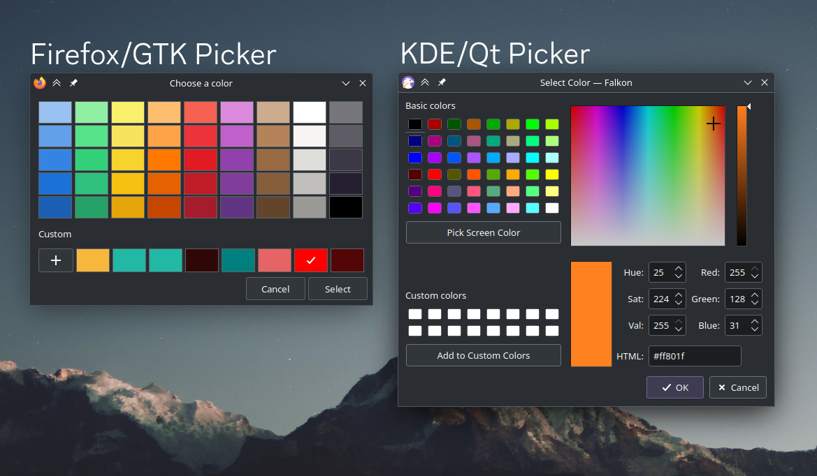
Are you kidding me? You mean the KDE Color Picker is basically an exact rip of the Windows Color Picker?
😂🤣
Edit: Look up the screenshots, I'm not in the least bit joking. That's an exact clone color picker to Win9X.
KDE couldn't be even marginally original?
And..? So what, if a design works, a design works. This is a colour picker.
IMHO a better design would be a mix between the two.
The left one has much better color palettes. Bigger, with a much nicer color selection than just "neon colors" on the right one. But without a color selector/slider it's unusable for advanced users. Should have an expandable panel with the hue sliders. And a color picker if I want to take it from somewhere else in the screen